
Work in progress / critical review / blog / running commentary…..all descriptions of the documentation of my work in this MA year at Camberwell.
15.9.2020
NEW WORK
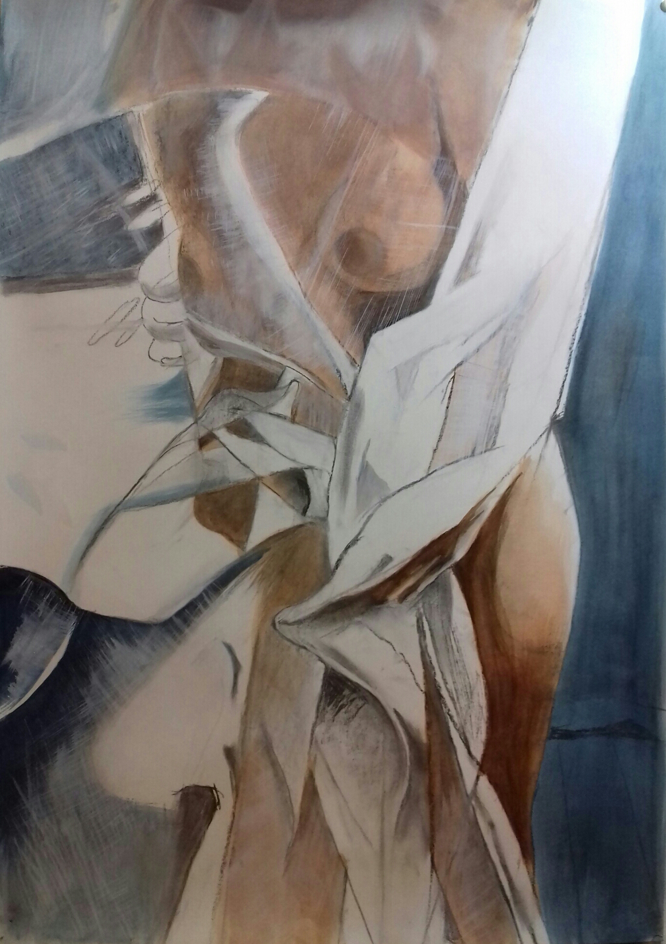
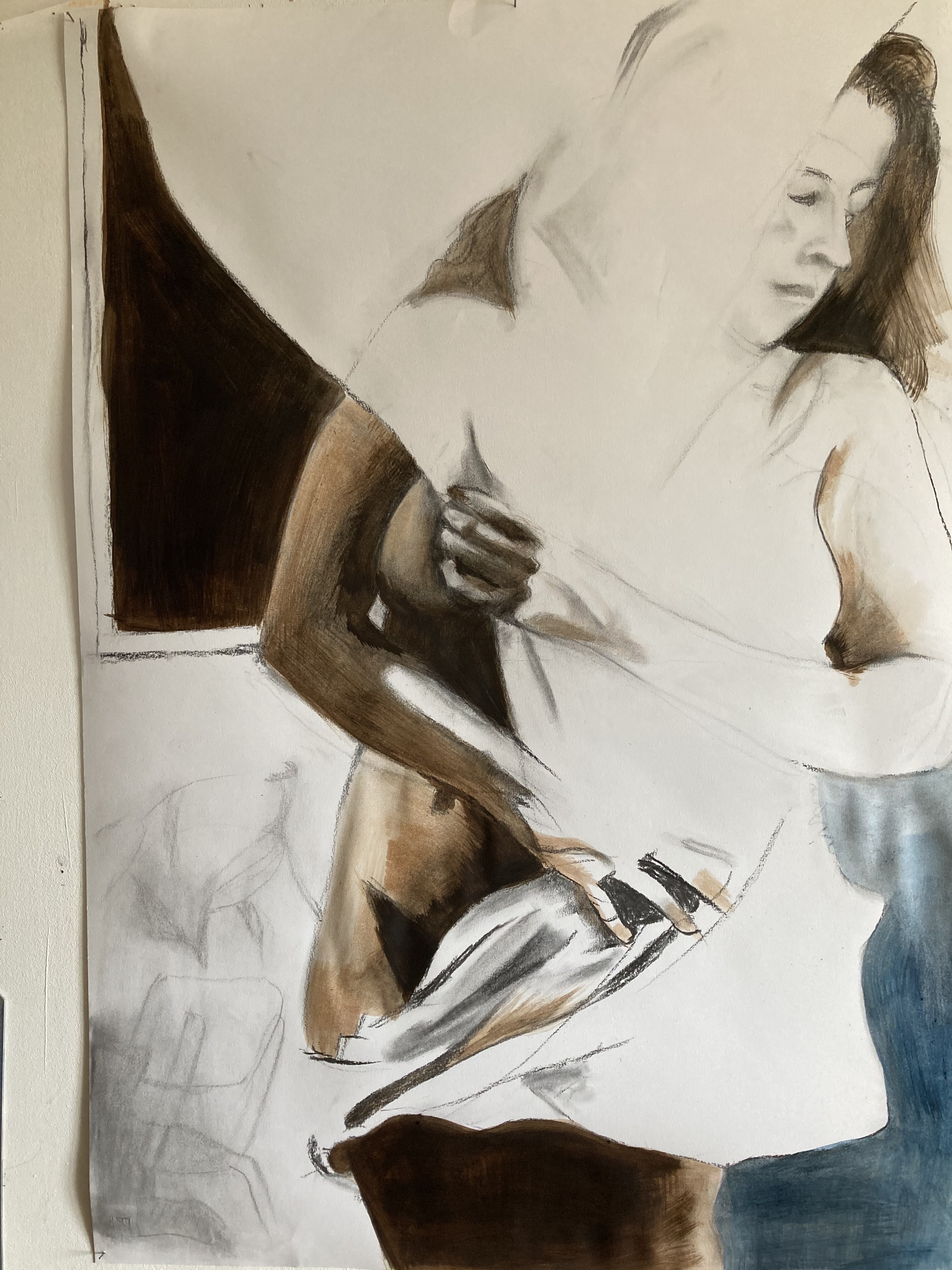
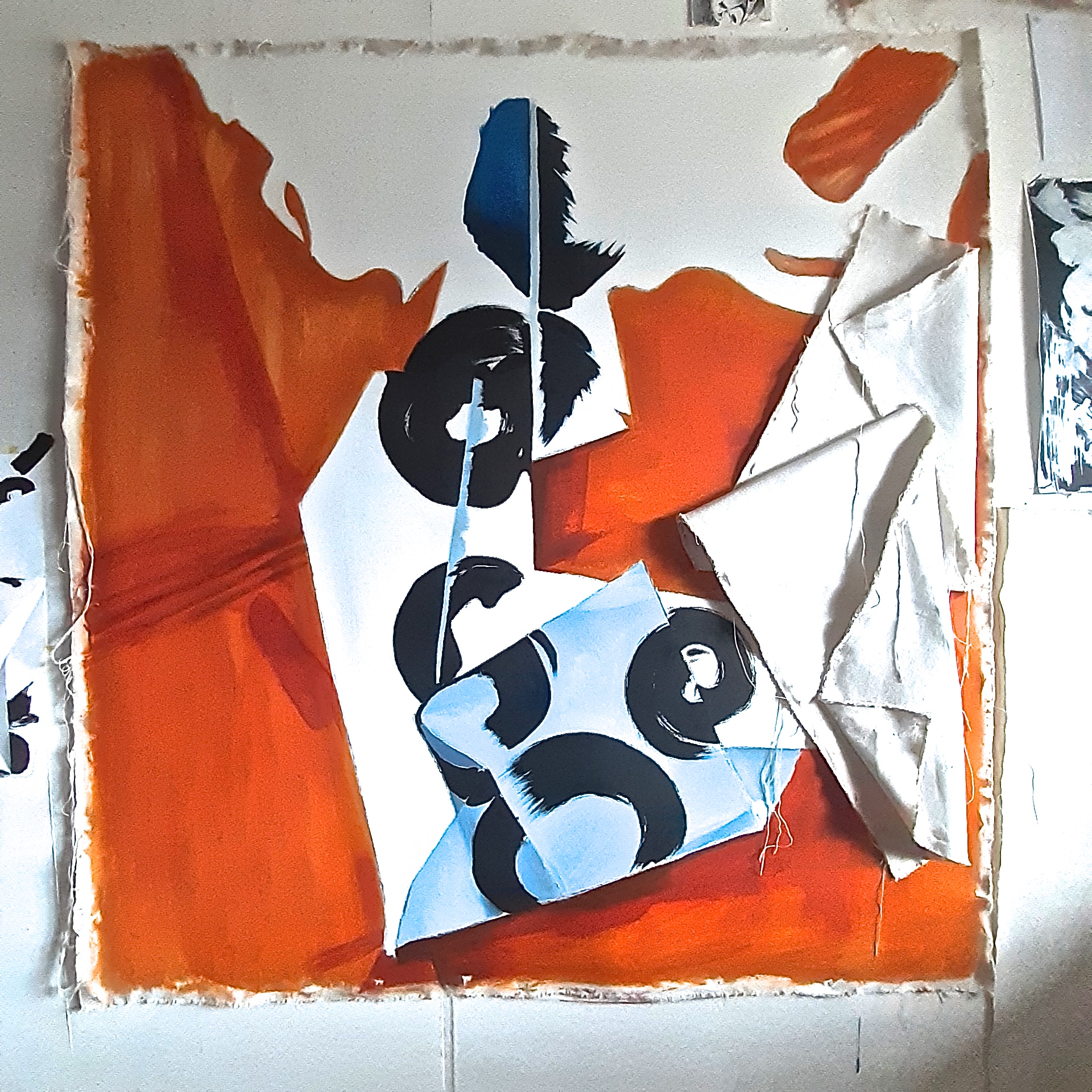
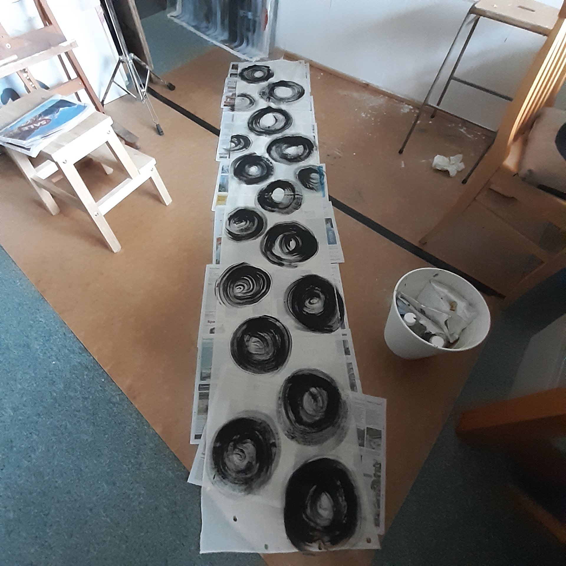
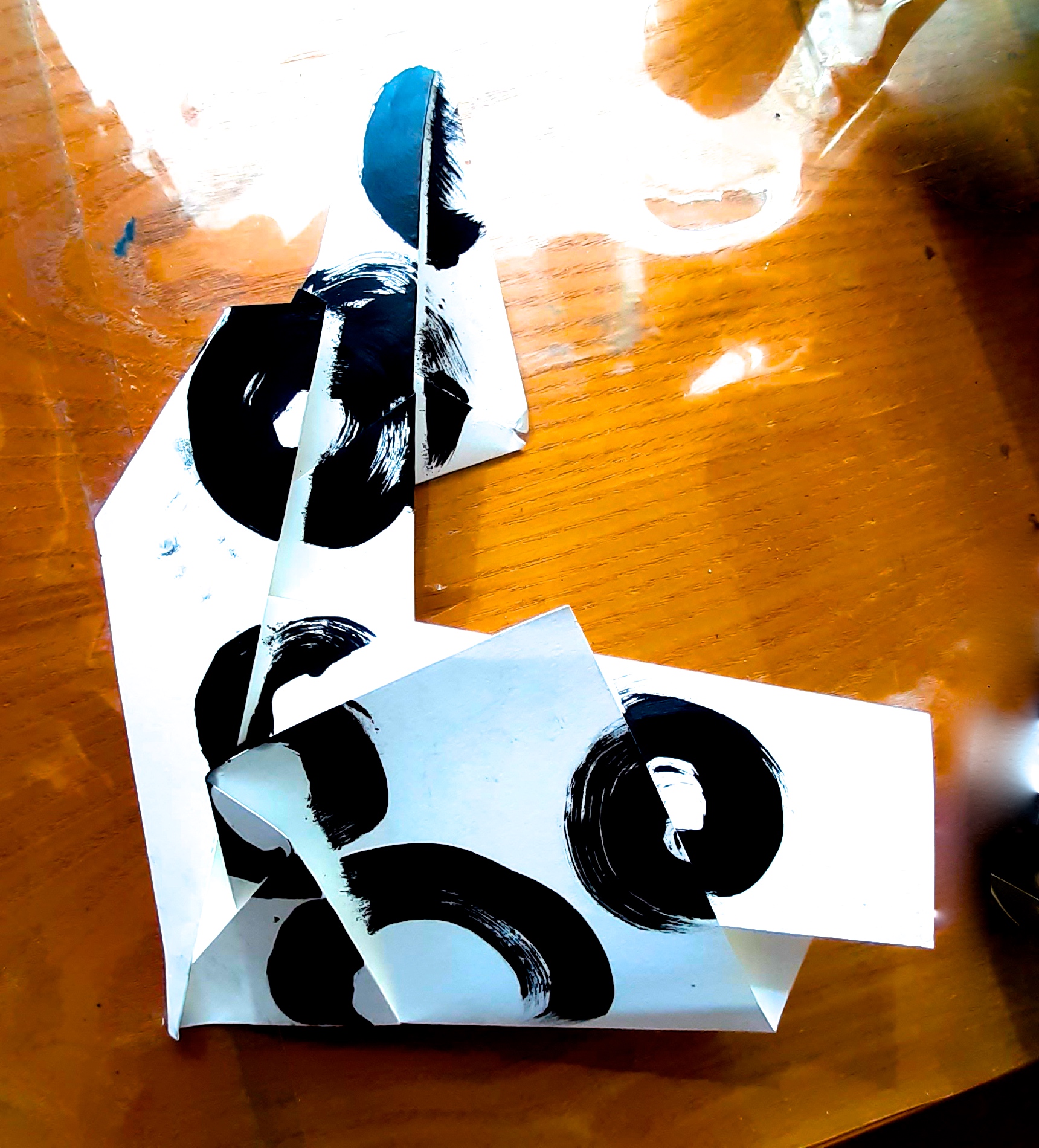
The last few days I have been finishing my exhibition proposal & visualisation, and doing some last artworks – paintings on paper, as I knew that would be quicker. Canvases I think of as being a bit intimidating, but actually they are much more easily changed than works on paper. But this was just for speed purposes, as I have had loads of ideas whilst having to write the big essay, but only a certain amount of time to do anything in!
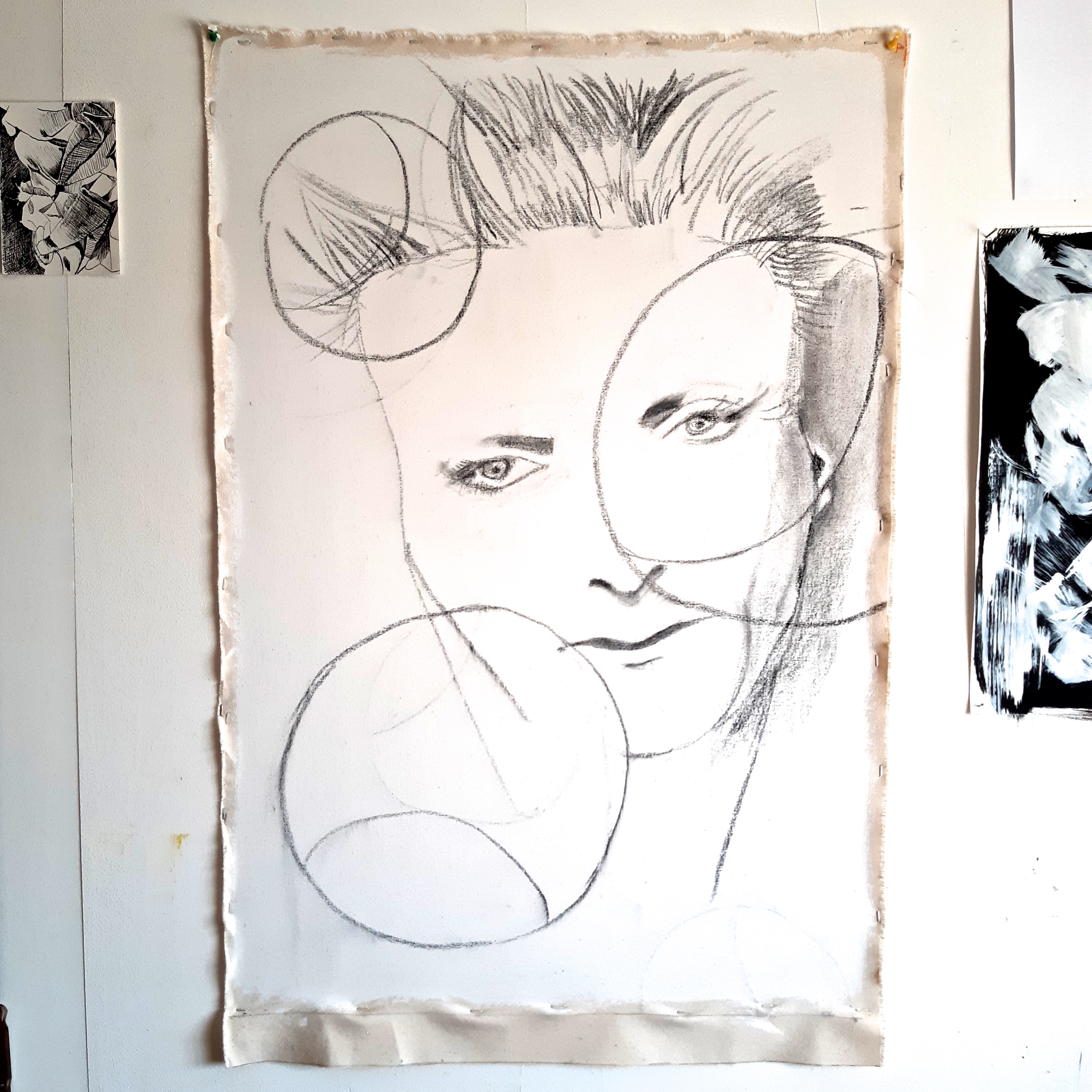
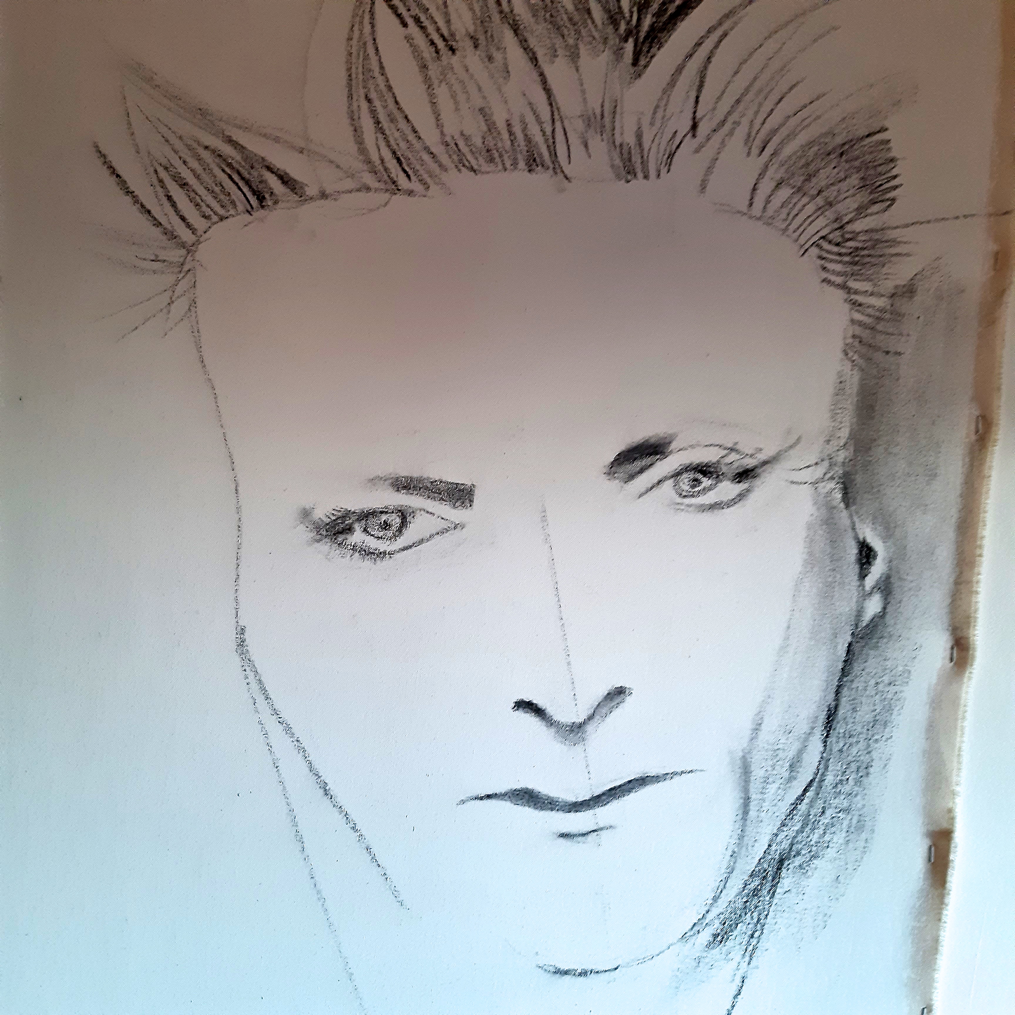
Here’s what I’ve managed to get ‘finished’, (below), although these are just in fact ‘studies’ for paintings on canvas. (Please click on each image for a larger view). I’ve included the charcoal drawings as well. I liked the rough, free look of the paintings, which was a result not having much time, and I’ve decided that that’s the way I must work in the future for several reasons: the work has more ‘life’ if it’s done like this, and also, the arm of the painter / artist is much more evident in the kinds of speedy brush strokes that have to be used. The evidence of the movement of the arm of the painter is something that I love in abstract expressionist paintings, and so if I work in this way (limiting the time allowed to be spent on any one painting) I will have more chance of achieving this result. I know that I can achieve a ‘perfect’ result if I take a lot of time and care, but perfect just becomes boring if it has no life….


When I come to paint these on canvas, with a little more headroom (!), I intend to make the threads of the fabric texture much more obvious they are too subtle here. I just had to do what was possible in the time allowed today.
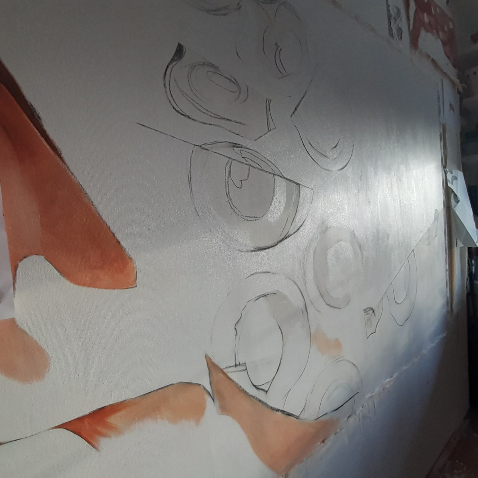
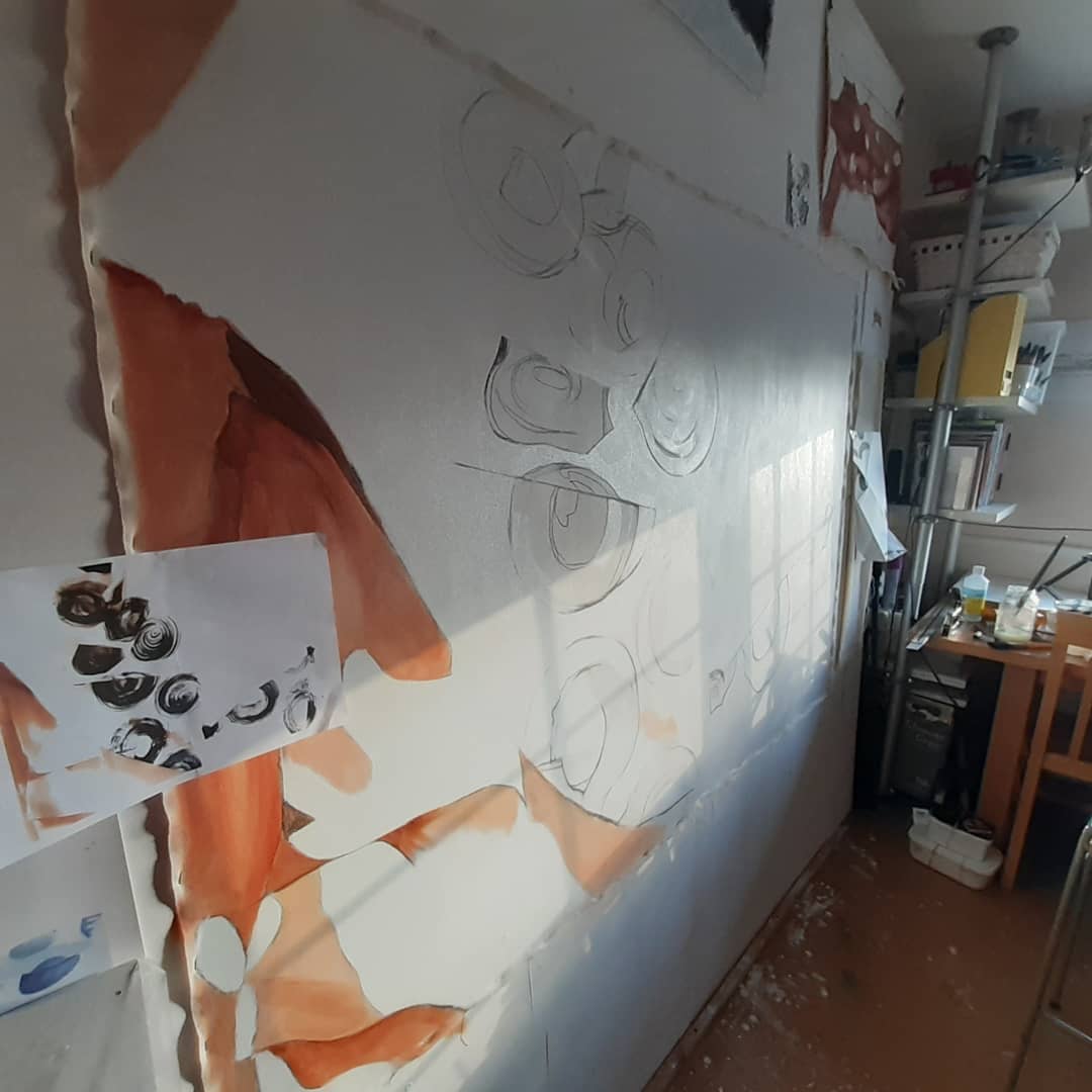
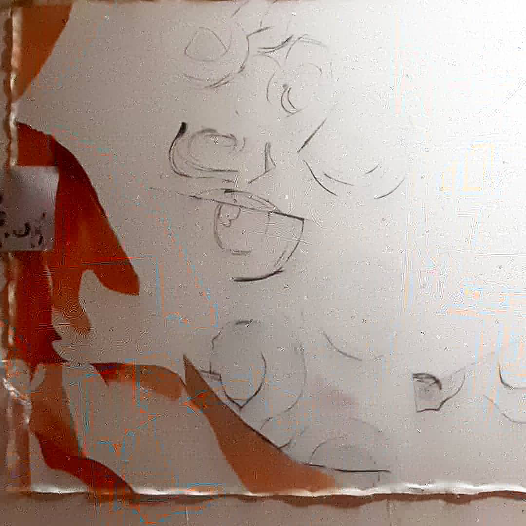
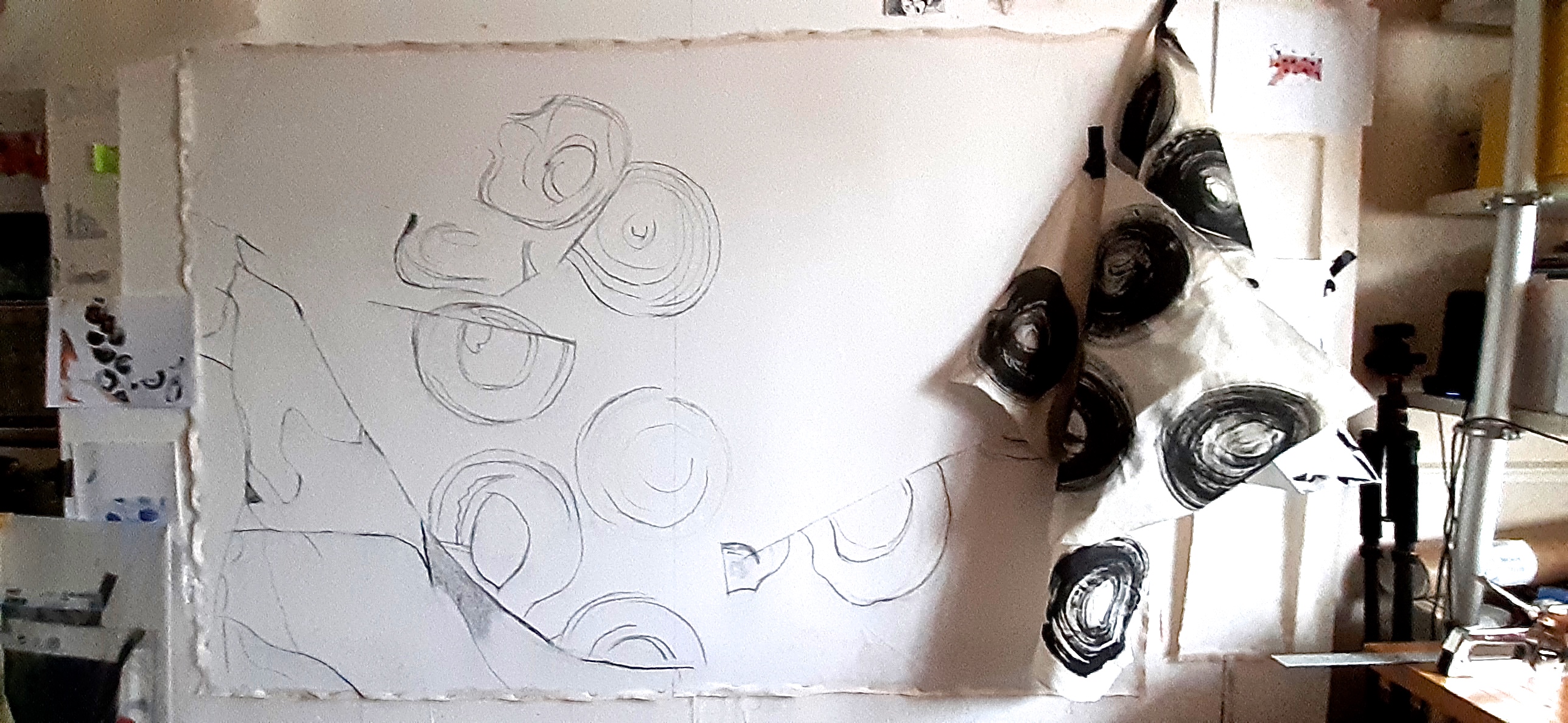
Here are the charcoal drawings for the paintings:


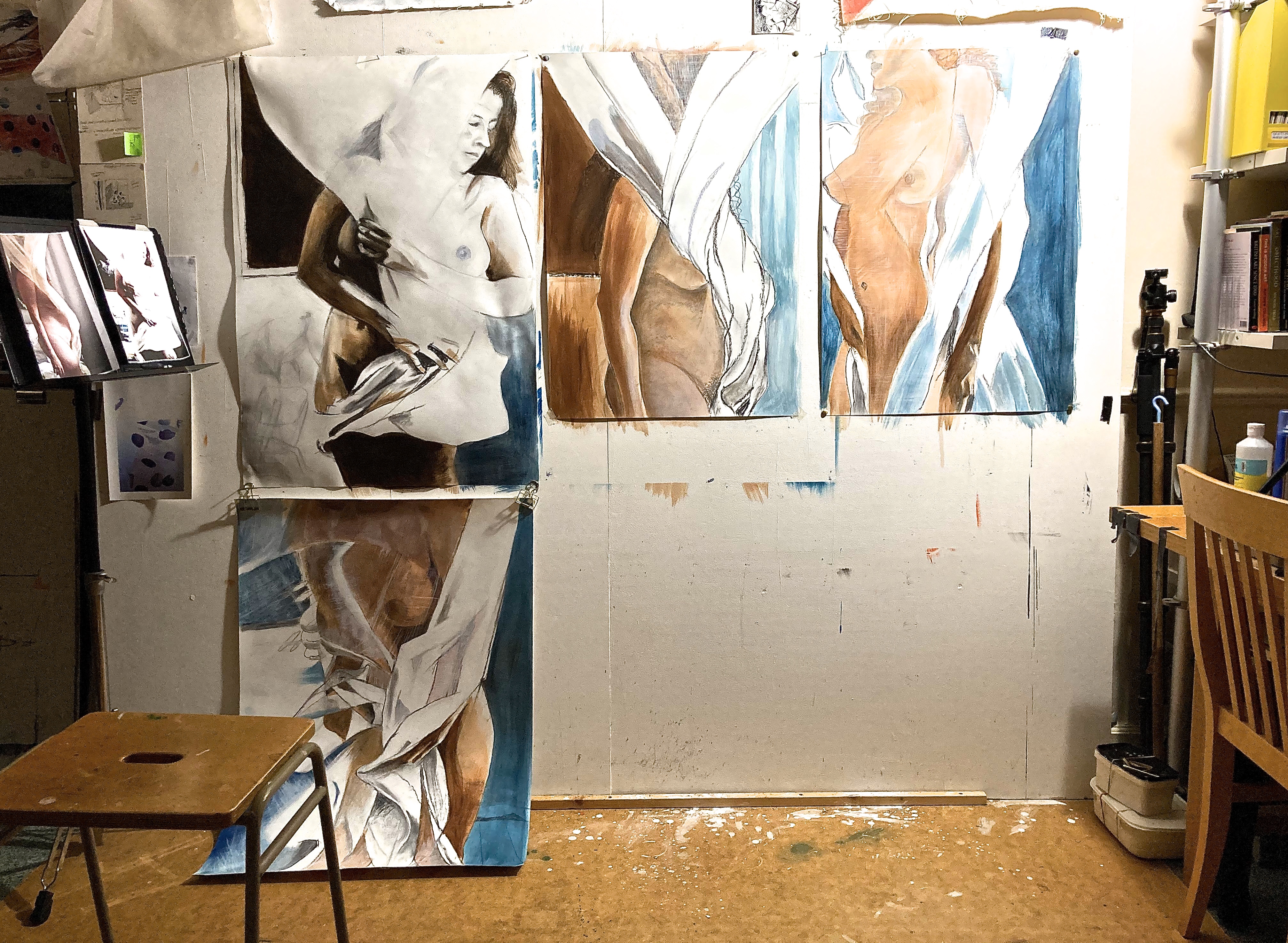
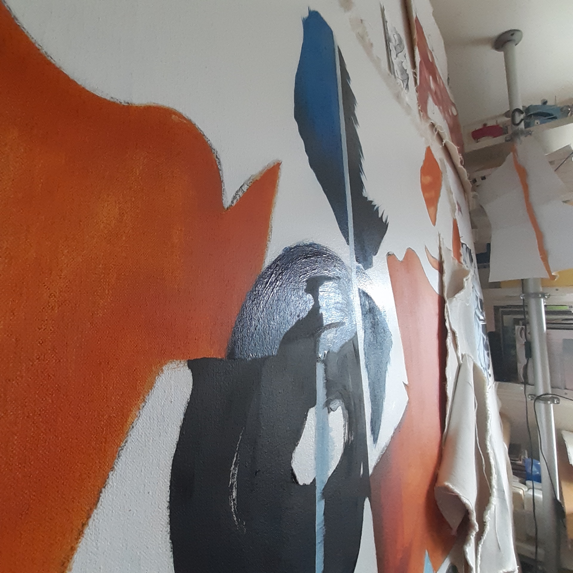
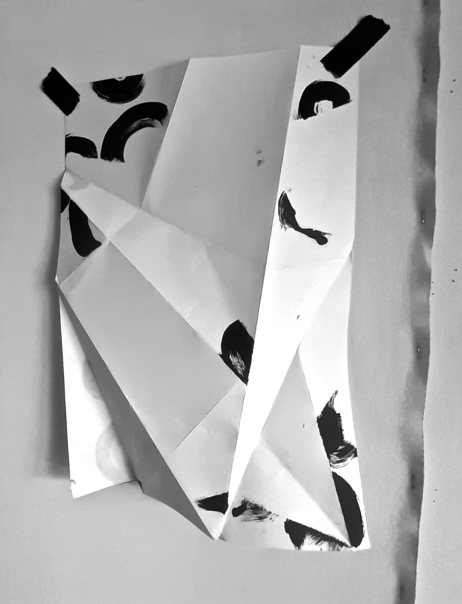
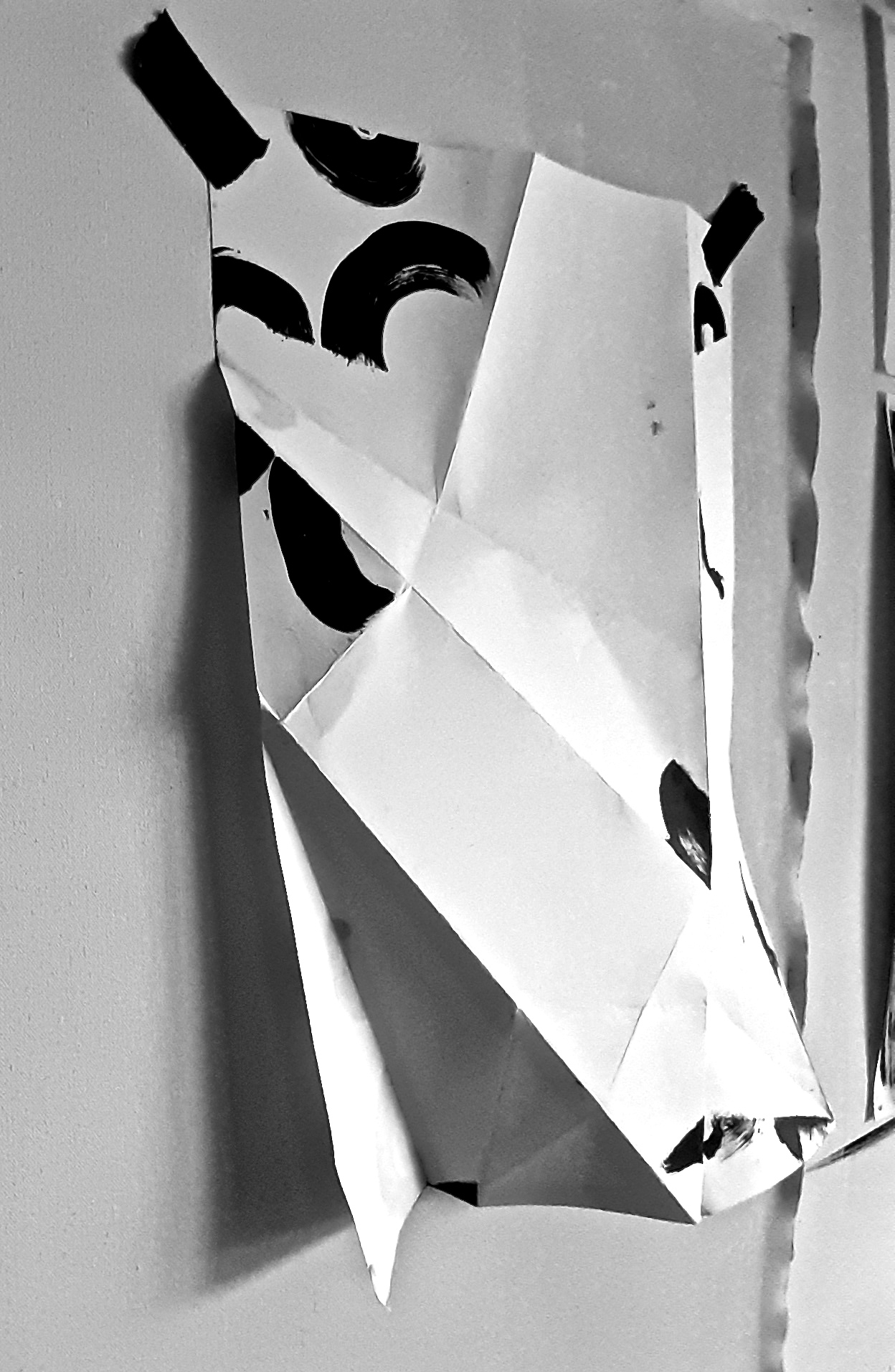
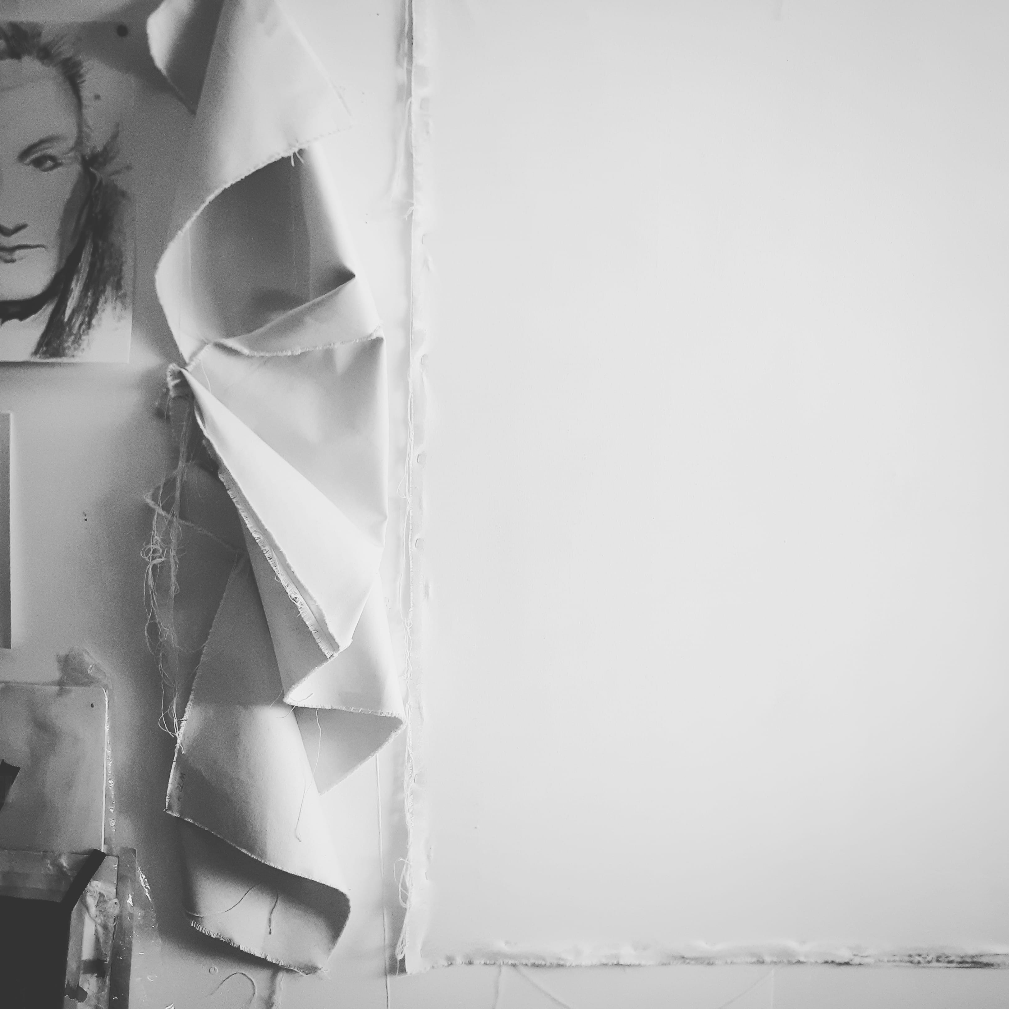
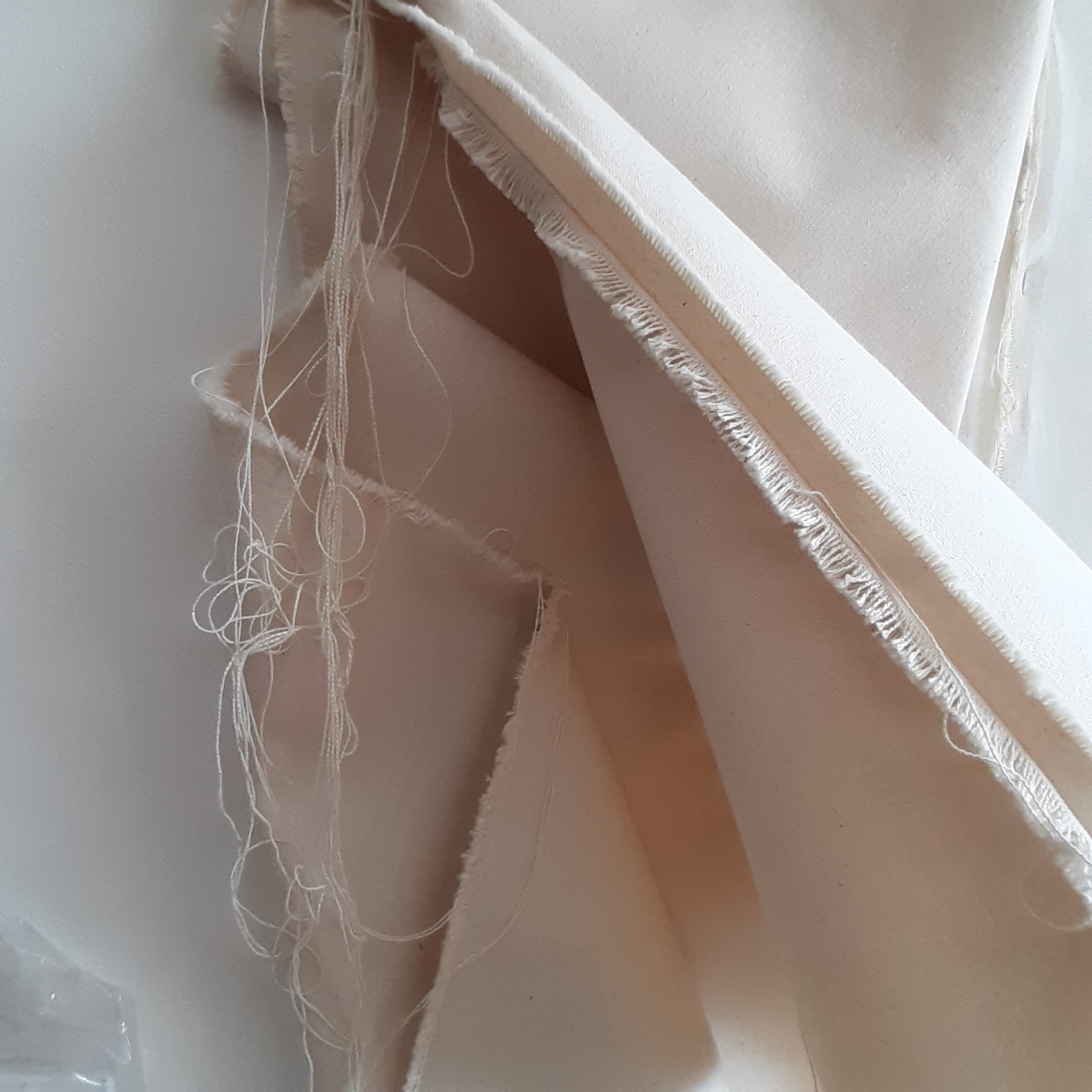
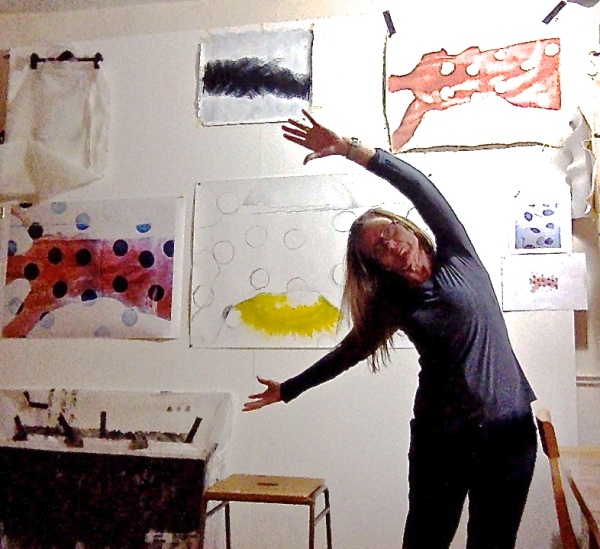
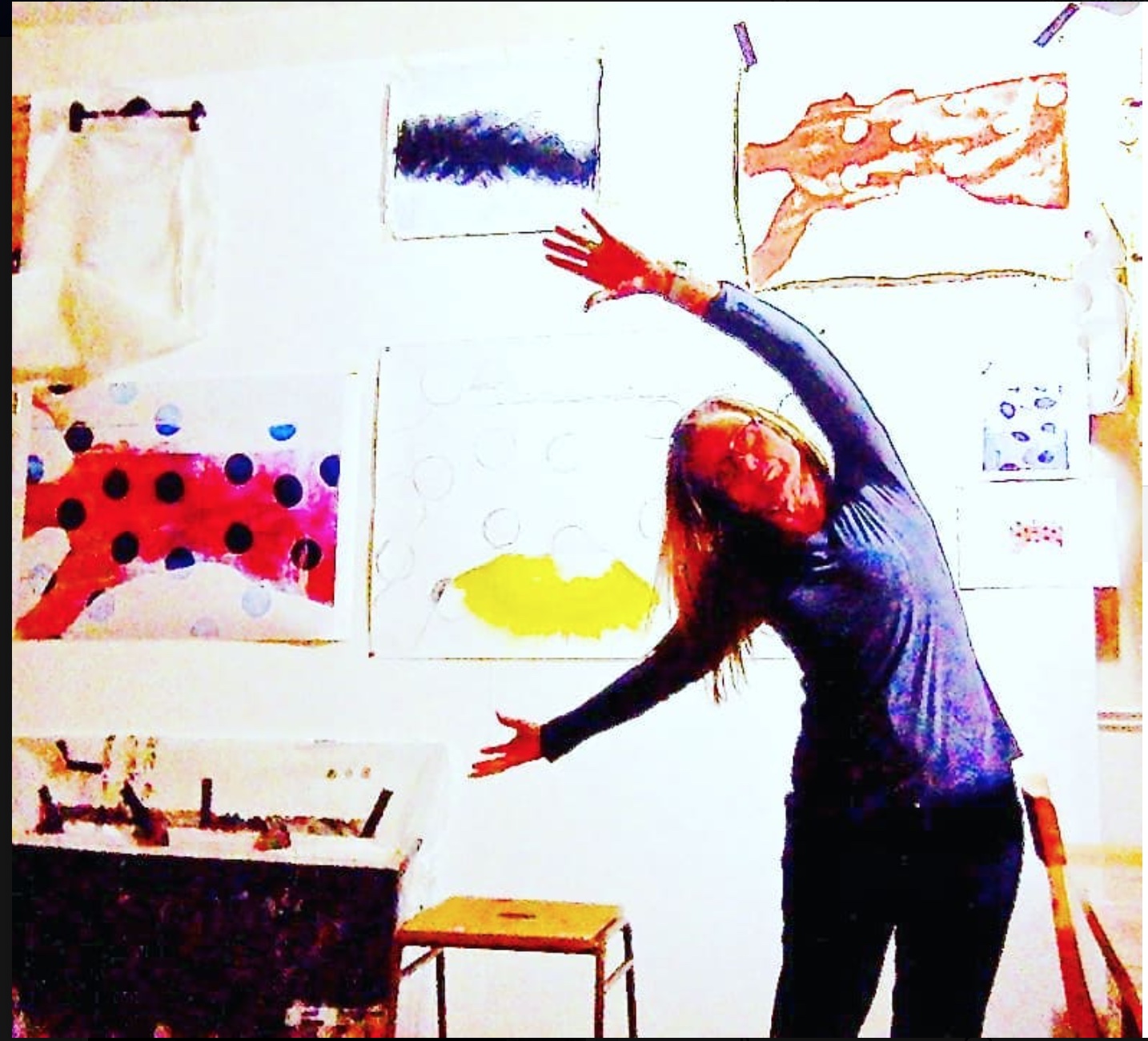
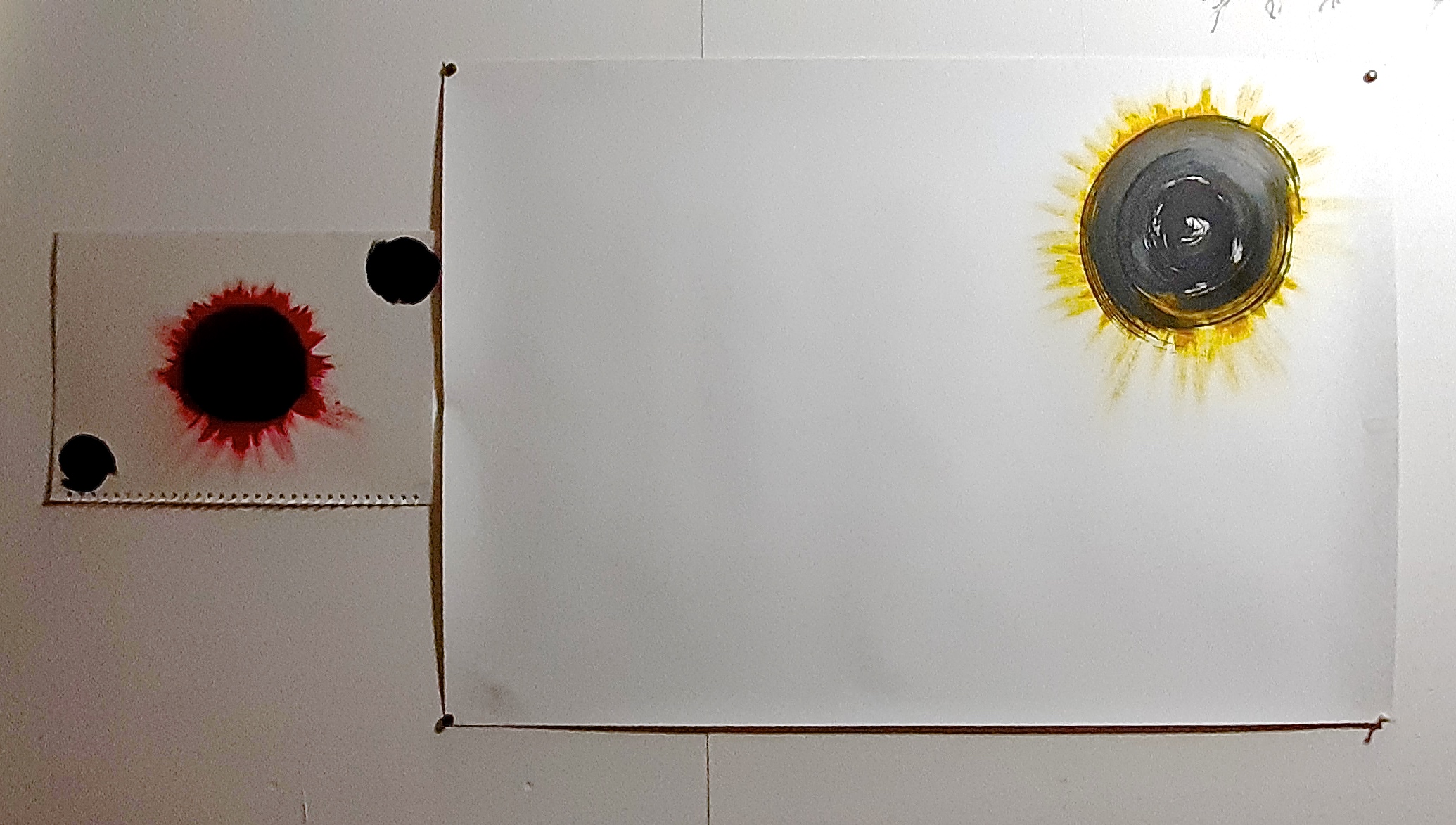
The studio wall last night:
Future plan (as soon as I organise this!) is to make a series of paintings called ‘The Hug’. It’s the one thing that you can’t do virtually with your friends in the corona pandemic. So, at last I will be making a sociological comment in my work, which pleases me.
My husband and myself will be the models, dressed in plain white, baggy shirts, clasping each other tightly, so that only our heads and hands / arms will be visible. I need to get a long shutter release cable or practice getting into position in 10 seconds – the length of time allowed on my camera!
13.9.2020
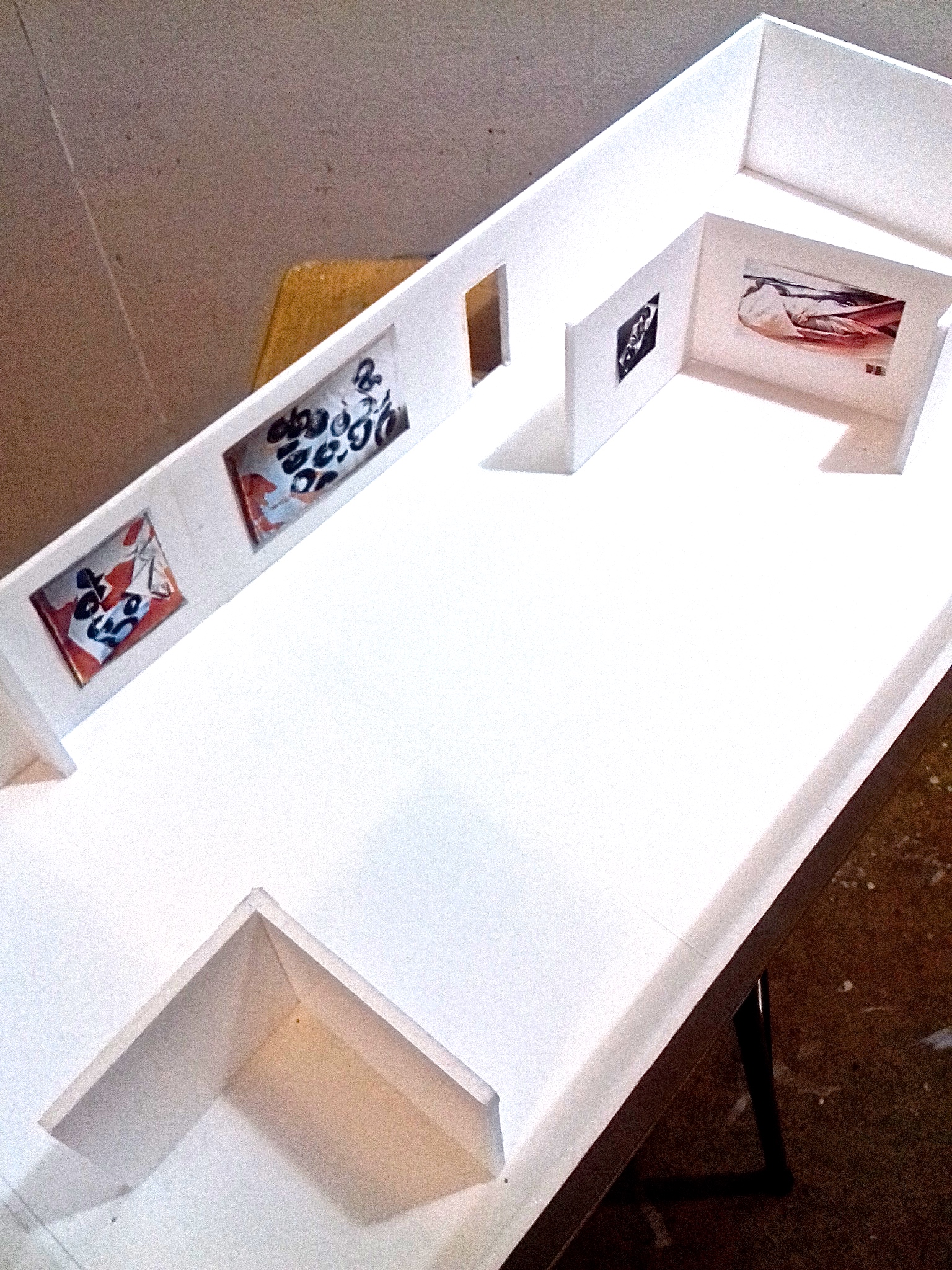
MAKING THE MODEL FOR THE EXHIBITION VISUALISATION AND NEW WORK!!
So relieved to finally be able to get back to painting – using another part of my brain that has had to be put aside while the essay writing was going on…
So that was a week ago, and I haven’t written anything here as I was also having to put together my ‘Doll’s House’ foam board Exhibition Visualisation. I say doll’s house as that’s what it felt like I was doing! But it was actually quite fun, but yet another diversion from getting on with the painting. But in fact it’s been really useful to research / organise and put together for future purposes. I feel as if I could do a professional job now in real life if I had to – coordinating with a gallery or curator for a real life exhibition. I’m sure there’s always variations to how any organisation does this, but at least I have some idea…
I downloaded a simple, small gallery template and scaled it up so that 1ft = 1cm. That was just a trial, but the size seemed to look suitable for making the foamboard model – not too big, not too small.
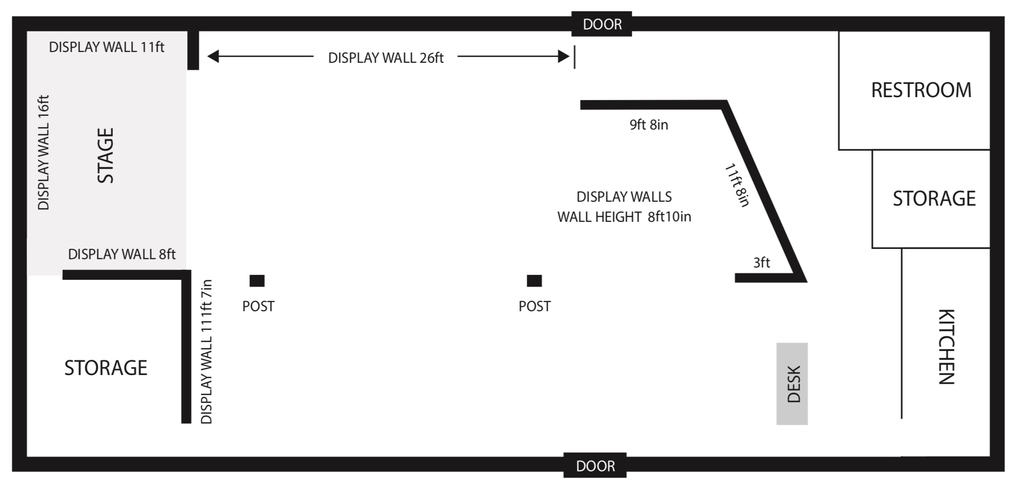
The foam board model idea came from a studio visit that we did to one of our tutors’ studio (Mark Fairnington) at the start of the course. This was a really useful thing to do, as it showed lots of detail of how he worked and stored his work, and he was in the process of making a model for an upcoming exhibition of his own. As I’m pretty good at making 3D items, and have lots of past experience, I decided to go with this method, although I did look at and start to use a template gallery site called ‘Artsteps’, and we did have a workshop on Sketchup, a computer 3D drawing program. But I decided that as they would mean learning a whole new program in a very short time, I would be better sticking to something that I could physically make, rather than getting into a panic if I was running out of time and trying to use a new program!! Please go here, to see the finished thing, and to read details of how the actual exhibition is curated.
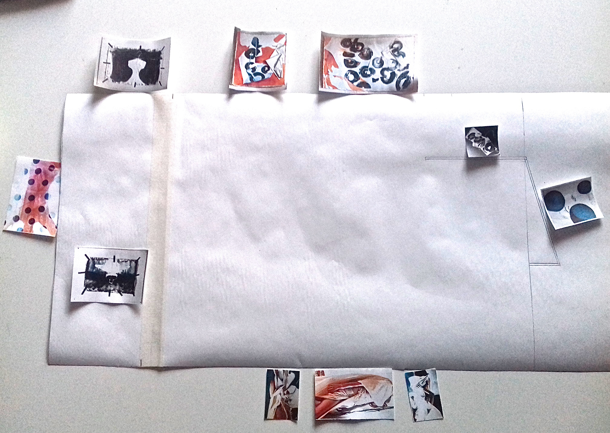
I decided to call the exhibition (appropriately) ‘Threads’, as all exhibitions must have a name, and made a logo for the artist statement for the wall of the gallery:
![]()
Here’s some preliminary stages of making the model:
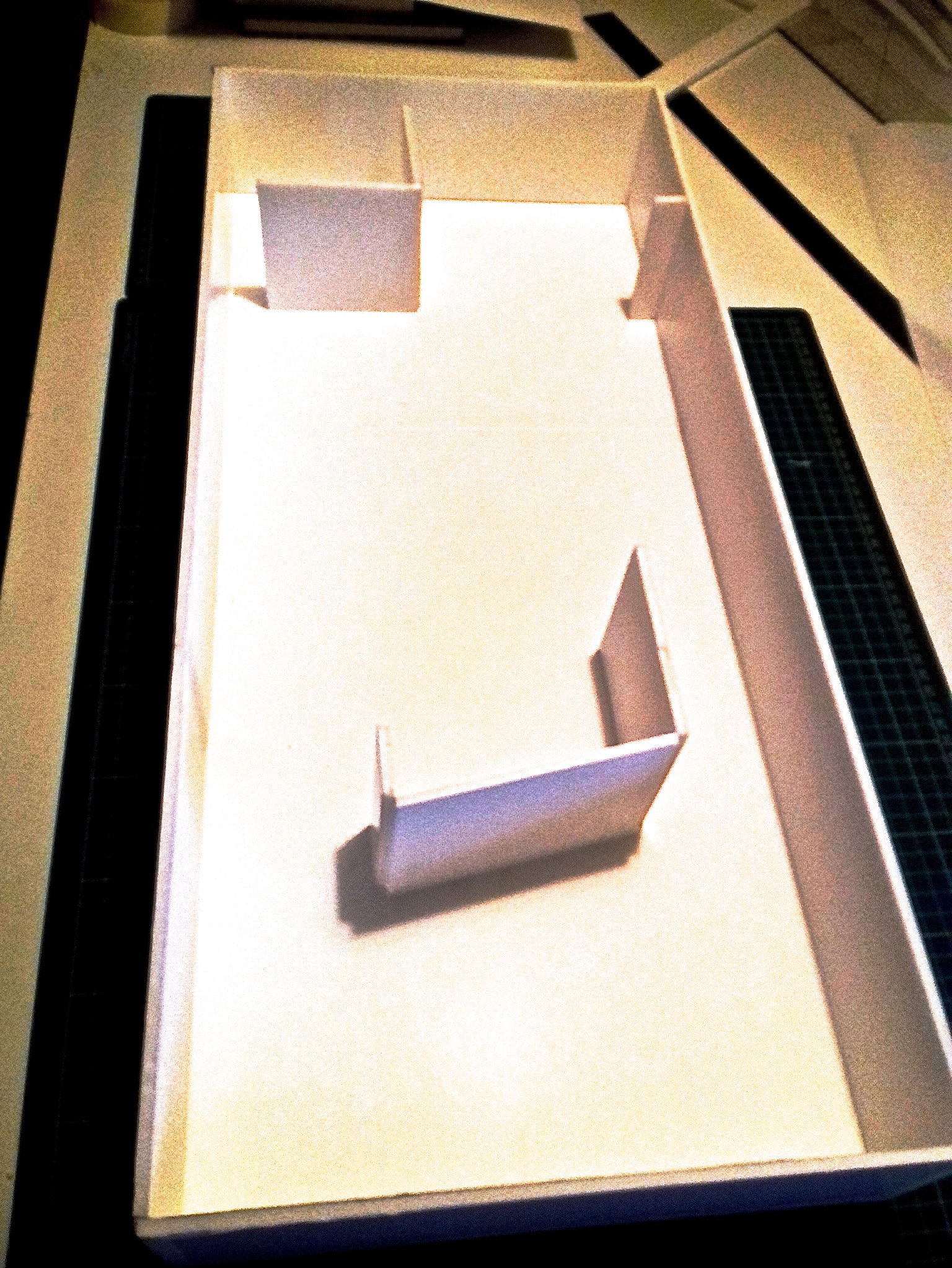
It’s been pretty stressful as it’s been yet another thing to do that I didn’t have enough knowledge about, and the fact that it has had to be done in a tight timescale – all other responsibilities taken alongside – has been difficult. But it’s amazing what you can do if you have to.
Here’s what I’ve been working on this week just gone:
1.9.2020
ESSAY ALMOST DONE & DESIRE TO GET BACK TO THE ARTWORK
I think the essay is practically done – just have to do the reference list, maybe put in another image (me as a child with the black doll!) as it’s pretty remarkable.
And I will update this Online Journal after submitting it tomorrow as there will be another 2 weeks more before the 16th – hopefully with some new artwork, as I haven’t done any for about 3 weeks unless you call designing the look of the essay and the website as ‘artwork’! I’m SO looking forward to that, and being able to use the other part of my brain.
I’ve never had to work so concentratedly on anything for such an extended period of time ever before. But I’m sure my brain must have expanded by at least 6″ (or 15cm if you are working in metric).
31.8.2020
Essay nearly finished – but there’s always something else needs doing…nearly there…
25.8.2020
EXHIBITION PROPOSAL AND VISUALISATION INSPIRATION
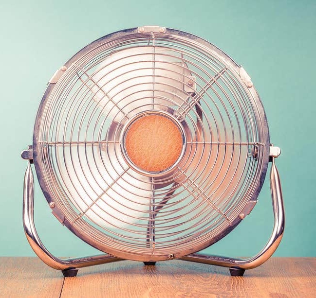
I’ve just managed to track down an exhibition idea which I saw yesterday whilst putting some Annette Messager images in my Exhib Proposal & Vis presentation. I love some of her ideas, and although materiality and fabrics and clothing are a big part of my work, I hadn’t really seen any ideas I could take inspiration from until I saw this! Enjoy:
The fans seem such an obvious thing to use if you want the materiality to be obvious for frayed, scoured works on fabric…And the fact that the leads from the fans laid flat on the floor have to rise vertically from the fans to a socket above the display (due to health and safety reqirements), just adds to the whole ‘threads/fabrics’ theme, so in fact enhances the overall look of the exhibition.
Although my work is not currently about pieces of clothing as such, many of the canvases are free hanging from a batten with shredded / frayed edges, or have shredded canvas attached to them, and so I think the fan idea would be great to use for these. They would give movement and make for a more memorable experience at an exhibition. Kind of audience pleasing……
These are the kind of fans to use. I like the look of them anyway, and I’m thinking that maybe I could use these images or the motif of a fan (especially as it is a circle!) in some future artwork….?

24.8.2020
ESSAY STRESS & DREADS!
I’ve been updating this journal today, adding detail, plus adding detail to my Exhibition Presentation and Visualisation powerpoint. All those little details – size of the work, media used and the correct positioning on the slide so that it looks coherent and professional are all important to get right, but of course they take longer than you think.
Greatly missing the time to do any artwork at the moment. Maybe if I get all the essay related stuff done (essay itself, bibliography in alphabetical order, reference list in alphabetical order, images added and properly referenced, appendix finished with permission to use all the answers obtained), then maybe I’ll have a bit of time before the hand in date. Seems like a tall order, but …..I’ll try. I have several ideas that are bubbling away frustratingly beneath the surface.
The essay writing is always stressful to me – I think because although I am pretty good at being organised and booking tutorials, and asking if there’s something I’m not sure of, or some information I can’t access, I have sudden dreads that I’ve done something completely wrong, or totally misunderstood the brief, or got the wrong end of the stick, or something. I just want to avoid making a possibly big mistake….I don’t usually do that kind of thing, but I still stress about it, as this is so important to me.
The results of my survey about whether an early upbringing in suburbia affected artwork produced as an adult especially the boredom aspect, was very interesting. My reading of these, plus the various recommended books and articles on the subject, revealed that whereas my own impressions were of stifling boredom and an urge to get away as soon as humanly possible, not everyone felt the same as me!
I’ve put this down to different personalities and how they cope with situations, but then the artists personality is what makes them do what they do, in their own individual way. That seems to be stating the obvious, but I guess I assumed that anyone with any aesthetic sense would feel stifled too, but some see it as a safe place to make their mark. I guess they are more tolerant, or able to quietly do their work on their own.
17.8.2020
WRITING PROGRESS
So the writing of the essay is progressing, but I seem to keep needing to do more research, or at least I get interested in some aspect of the research, and end up going down a side alley!
I’ve had some really brilliant advice from at least 3 of my tutors, and I feel that all I need to do now is to organise all my information as they suggest, and write the last 300 words or so.
Sounds easy, doesn’t it? But I also keep coming across really interesting information, but which isn’t strictly pertinent to the main question. (I am at least pretty good at sticking to the question, as I manage to keep that at the top of my brain so to speak.) Such as, I asked a friend who recently did an MSc concerning colour, if she had come across anything in her researches about sensory memory. I’ve discovered that I have a really good sensory memory, for colour, touch, sound….and she told me that although there seems to be a lot of unreliable information about sensory memory, there’s really interesting findings on how the different senses develop in human babies. Apparently for the first 6 months of life, all the senses are linked up together, so that might explain why babies always seem to put something new into their mouths? As my friend said ‘ It is the reason that when you give a baby something new to eat, it sometimes looks like you’ve blown their mind, cos you kinda have!’ Anyway, very interesting, but off the subject….
13.8.2020
PLAN FOR THE RESEARCH SURVEY FOR THE ESSAY
Getting on with my writing, but still doing bits of reading / researching as I go…things keep occurring to me, and today, having booked an academic tutorial about checking if my research question was doable / accurate / relevant, it occurred to me that rather than do an interview with a few people who I could research about living in suburbia and how it affected their creative life, I could just post a short survey on my social media, and see who responded. I have a very varied set of friends and contacts, so I thought I’d get a reasonable response, which I did! (See 2 posts above).
Here’s the survey I sent:
a) Did you grow up in Suburbia? (you know, houses all looking the same, in regimented rows, on the edge of a city or large urban area)
b) How did you feel about that experience? (then and now)
c) How do you think that suburban experience reflected on your adult creative life?
12.8.2020
EXHIBITION PROPOSAL & VISUALISATION WITH TRACKS
I’ve been making the powerpoint for my exhibition visualisation proposal presentation today, and as it has a soundtrack with two songs with lyrics and melodies by myself, and as the lyrics are all about my artwork, (as that’s what’s been filling my head!), I have added them to the presentation. These songs were co-written with my husband 4 weeks ago for an online festival, ‘Million Tongues’ curated by an illustrator / musician friend, Steve Krakow from Chicago.
Traps
Frayed
And here’s the actual presentation, not finished, but a start:
4.8.2020
ESSAY START
This week (now Tuesday), I am starting the writing of the 4000 word essay! It’s a big job, but I’m feeling reasonably organised, apart from the actual research question, which I think is too broad, but I have requested an academic tutorial, so we shall see….
PLANS FOR DRAWINGS / PAINTINGS?
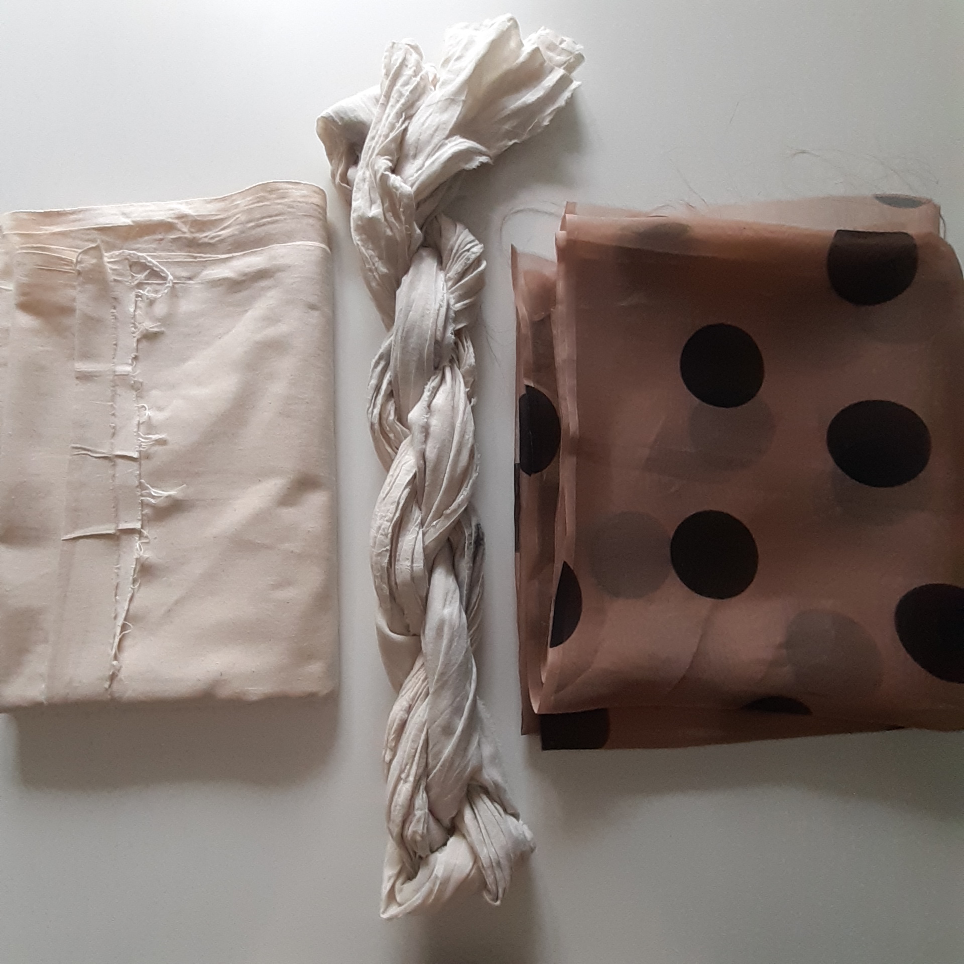
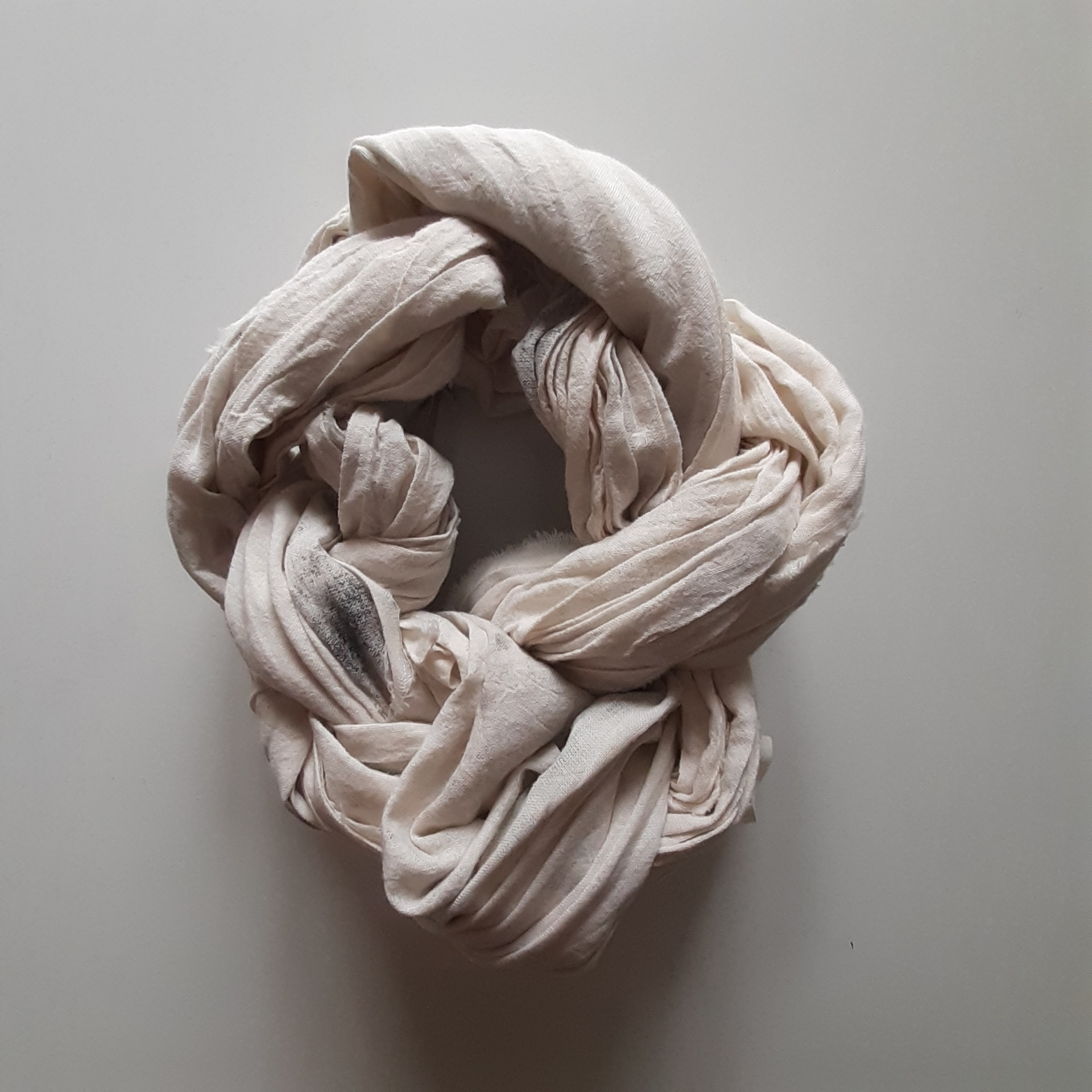
It’s frustrating to know that I can’t spend a lot of time making paintings/drawings/3D objects, due to the writing, but I’m planning to make some smaller stuff, so that I can get it done in small amounts of time. I have some photos I took, (fabrics left over from the photo shoot), not specifically to use for future work, but which I liked for various reasons – the fabrics encompassed aspects of my threads – the plain frayed edge on the calico, the polka dot semi-transparent silk organza, and the twisted, light weight washed calico self-twisted up like a hank or skein of wool. In conclusion, I liked the way the materiality was so clearly encompassed in these three items:
ONLINE RESIDENCY WEEK (BELOW)
25th & 26th July 2020
Last two weekend days of the residency, the last day being my birthday and my wedding anniversary. Please scroll down to the bottom:
https://geraintjevans.wixsite.com/mapainting2020/bobbie-seagroatt
24.7. 2020
Today’s online residency which was the day of my photoshoot with the life model and fabrics. These are the ones I’ve provisionally chosen to work with. I was reasonably pleased with these after I’d done some radical editing, including cropping. Please scroll down to the date:
https://geraintjevans.wixsite.com/mapainting2020/bobbie-seagroatt


23.7.2020
Today’s online residency:
https://geraintjevans.wixsite.com/mapainting2020/bobbie-seagroatt
22.7.2020
https://geraintjevans.wixsite.com/mapainting2020/bobbie-seagroatt
21.7.2020
Pease scroll down to the 21. 7. 2020 entry:
https://geraintjevans.wixsite.com/mapainting2020/bobbie-seagroatt
20.7.2020
ONLINE RESIDENCY WEEK!
I have my online residency this week! So will try to post links here to the progress…
https://geraintjevans.wixsite.com/mapainting2020/bobbie-seagroatt
18.7.2020
TEST VIDEO & THOUGHTS ON SCALE & JUDGEMENTS ON MAKING BIG PAINTINGS
I made this test video yesterday in preparation for doing my online residency on the MA Painting 2020 website. Two lots of two of us students have already done this, and as I had no idea what a residency entailed, it was really useful to see what was done.
This video talks about my progress with the monsta painting (biggest I’ve ever done, (approx 120cm x 180 cm), the problems it’s presented, how I plan to overcome them, and as a last comment, I have to add that the lovely fine, flat mottler brush I bought is SO much better for applying the paint – a lot quicker, as it’s much broader, and it doesn’t get overloaded with paint like a house painting brush does, which is much thicker, and designed to hold more paint.
And below is the painting I talk about in the video. It was mostly dry when I came to finally paint on the circles, but the bottom right area is still to be finished being painted, and then the fabric swathe has to be attached. Having quickly attached it temporarily yesterday, I’m not sure about it now! Although I left a big space for it, it seems too big for the space, and may need to be either reduced, or a different piece of fabric used. I have a good piece of shredded, gessoed both sides, thick canvas, so I may try that instead.
16.7.2020
A SAD DAY, THOUGHTS ON THE BIG ESSAY, AND GETTING ORGANISED
Been a pretty busy week, one of the days taken up with going to the college to collect the last of my stuff….very sad….I’ll write about this in my ‘Lockdown Thoughts’ page, (see drop down tab on the ‘Writing’ tab above), but there’s so much else to do at the moment, most concerning of which is the writing of the 4000 word essay. I have an idea of what I want to write about but I’m trying to frame it in a more interesting and engaging way than in straight academic writing, which I don’t find that exciting to do, or to read.
At the moment, part of my title is ‘Once Upon a Time in Suburbia’. I’m reasonably happy with this, as ‘Once Upon a Time…’ is how a lot of stories for children and fairytales start, and I intend to write about how my early upbringing and experiences have had such a strong and lasting effect on me and my artwork. Of course there needs to be a research question added, but I think I’ve got a lot of the references I need to contextualise my work, and so I just need to plan the trajectory of the writing.
I feel better generally about doing this essay, as I spent a good while after the UNIT 2 assessment, scouring my brain for what I’m really about, (as the feedback said that I hadn’t really engaged enough with my topic, and that I was just ‘going through the motions’, and I agreed with this), so I felt that if I could identify where my deep roots lie, it would be easier to write more convincingly – that I could write more from the heart, and that as an artist I could come across in a more ‘complete’ way.
I have my online residency on the Camberwell MA Painting Project Space website next week! So I need to plan that too, but it will be a good experience, (never having done anything like this before), and hopefully I should get quite a bit done, as I have to really plan and concentrate.
GETTING MATERIALS & GETTING ORGANISED
I think I’m reasonably well tooled up now, as when I went to the college on Monday, I stopped off at a good art shop and bought a lovely brush for painting big areas ( has proved so much better than anything I’ve had before – it’s called a ‘mottler’ brush), a large tub of Titanium white acrylic, and I ordered a LARGE tube of Titanium white oil paint online for a very good price. It’s so hard to get decent art materials where I live at a reasonable price, (not near a big town) so with the college shop still not being available, I made the most of being in London.
‘FOLDED CIRCLES #2’ TECHNICAL PROBLEMS
Here’s the progress on the BIG painting, which is the second in the ‘Folded Circles’ series. As it is so big 180 x 120cm, I found it hard to work on it in long enough time slots to use the same mix of gesso, acrylic paint, oil paint, so…as I say it was problematic, as I had to re-cover some areas, and PLUS, the paint in some areas was taking ages to dry, even though I used the medium that speeds drying.
14.7.2020
ONLINE EXHIBITION WITH VOICEOVER
Today we made an online show for our MA Painters group for which I presented two pieces – one photographic image, ‘Floating Polka’ and one painting, Mama’s Eye. I did a voiceover, which turned out to be 9 minutes long….too long I think, but we didn’t have loads of time to do this, so after checking with my course leader that the length was OK file wise, I left it on. It’s useful to just keep in practice for uploading images, editing photos etc…and to have it documented as a relic of the Corona virus lockdown. My piece is on the second to bottom row, in the middle.
Please have a look and listen here:
https://geraintjevans.wixsite.com/mapainting2020/coronarchive
7.7.2020
NEW PAINTING STARTED
New painting / collation on the go:
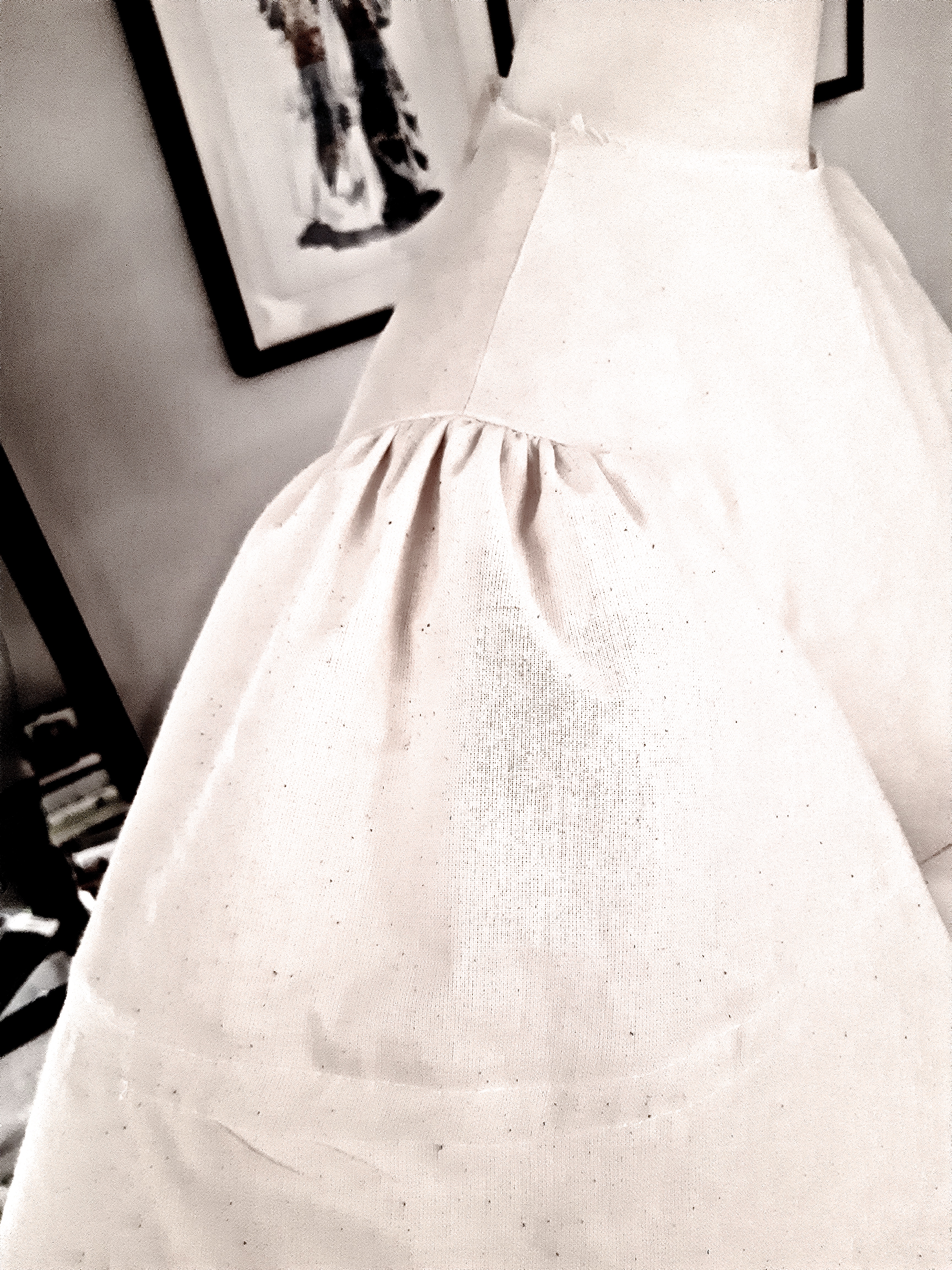
This will be the painting where I thread the painted fabric through the main canvas, so it can be secured. So, two slits, so that I can poke it through from the front, and bring it back out from the back. I’ll give it a go anyway….
This will be the biggest painting I’ve ever done! it measures 120 x 180cm, and I felt it needed to be this big partly to accommodate the fabric piece, but on more reflection, I think that really it needs to be this size to give the viewer the feeling that they are enfolded (!) in the work itself. It’s part of the multi sensory experience that I’m trying to develop.
3.7.2020
ALUMINIUM SHEET TRIALS AND GOOD WRITING TUTORIAL
Had a very good tutorial yesterday with my tutor, Geraint. I thought I only wanted to talk to him a little bit about my writing, but mostly about my artwork, for which I have a good deal of ideas.
But we talked a fair bit about the writing, and what I could write about for my 4000 word essay in connection to the Wim Wenders film, ‘Pina’ – what references I could make to other artists who have worked with performance/music/dress etc. It was really interesting, as Geraint referenced Robert Rauschenberg, who I really only knew as a Pop artist, but I found out that from the early 1950’s he worked a lot with choreographer Merce Cunningham, and musician John Cage in long lasting collaboration. Some of that work involved paintings being used as the set for a dance production. So that was all very interesting, useful for my writing, and a kind of affirmation that I could write about things that I feel a really strong link to, and not just picking artists who I think are related, but for whom I don’t feel a strong affiliation: in performance / dance / music / clothing / fabrics. I know myself that if you are really engaged with your work, that will come across to your ‘audience’, and it will engage them too. This is what you need as an end result.
My aluminium sheet samples came today. I was excited, as I’ve been trying to get the right thickness for several weeks now – ringing manufacturing companies, going to B & Q, only to find that the nearly A4 size piece was going to cost £11 something…more ringing round, cheekily asking about it during a Wednesday lecture as the artist, Kira Freiija used aluminium herself. She suggested 4D Models, in Hackney who, at last proved to be a company who did thinner than 1ml.
So I ordered – not knowing what thickness would be most suitable, so I got a sheet of 2 ml and a sheet of 3ml, AND a sheet of plastic, to see how that worked.
The plastic wasn’t bad – I basically liked the way it looked, but it tended to split in one direction, which was a shame….. you can just see the splits/cracks in the photo, near the bottom edge. If I was at the college I could go along and ask one of the technicians about this, but…
The aluminium sheets were a bit of a disaster! I ended up with something that looked like a half crushed tin can, and if I tried to score the lines for the folds, the metal mostly split! So, I ordered the next thinnest sheet (1ml), and it arrived on Tuesday (see next post, above)


The idea is to gesso these, and paint on them, so as to have a more robust 3D form (more robust than paper) but I’m thinking that the thinness of this sheet, (so as to be able to fold it OK), will kind of defeat the object of using the aluminium. So, I’m not sure of how to progress with it….
I’m thinking that smaller scale ideas would be useful as, if the aluminium was folded up into smaller pieces, the resulting object would hold it’s shape more easily. So that is my plan for future pieces – at least in the aluminium.
30.6.2020
HOW THE ADDED CANVAS WAS ATTACHED
Documentation of attaching the collaged canvas piece on to the painted canvas:


I managed to do this by taking out all the staples that were holding the canvas to the wall, (apart from the holding row at the top) so I then had free access from the back for stitching. I used a big wool/upholstery needle to thread thin string through the canvas, first making a hole with a bradawl. I also used PVA glue to attach the flat pieces. It was not easy… Plan for next time if I do a similar piece: this is difficult, as for this piece I used staples to temporarily hold the folds and drapes in place – this was necessary, as I had to arrange the canvas to look right. Next time, I think that I may arrange it with staples, then take it off the wall, lay it flat on a big table, and then sew.
Apart from all the physical difficulties (!), the conclusions I came to were a) that the piece of attached canvas was a bit too small, i.e. the scale of the two didn’t quite fit together. I think it’s acceptable as it is, but the next one I do will be a bit bolder. And b) I should leave more space around the image to make attachment to the mount a little easier.
The next one I’m about to do has painted calico threaded through slits in the canvas. That’s very light, so there won’t be a dragging problem…
30.6.2020
FOLDED CIRCLES PAINTING FINISHED & MOUNTING METHODS IDEAS
This painting, ‘Folded Circles#1’ is now off the wall. It’s acrylic, oil, and collaged canvas on canvas, 121 x 129cm. You’ve no idea how unexpectedly difficult it was to attach the collaged canvas! In the process I got cramp in my hand which lasted for about 10 mins, but hey, I’m still alive…! In the end, and not really wanting to use it, the trick was to use some glue to ‘push up’ and secure the collaged canvas to the painting. This stopped the ‘dragging’ effect of the weight of the canvas.
CHAT WITH MATERIALS & METHODS TUTOR TIM JOHNSON FOR ADVICE
I finished this yesterday, and had an online chat with UAL’s Tim Johnson (materials and methods expert technician) about the different areas of gloss / matt finish on the paint mediums I used, as I was running out of the regular one, Liquin – the speeds drying version. The one I used was the Liquin ‘slows drying’ version which has so far dried with a much glossier finish than the regular ‘speeds drying’ version. He says that this is probably due to to the higher stand (linseed) oil content, but that I should should do lots of tests with different combinations, but wait to varnish the actual painting as it has to be completely dry of course. Here’s a shot of the paint areas catching the light:
We also discussed mounting methods – one I had thought of would involve glue again, (glueing the canvas to a batten from behind so that the frayed edge would still be visible. so tests would have to be done of course.
Other methods discussed would be using heavy duty velcro, eyelets, magnets, a sewn channel behind the canvas, or even (and this may be the best solution, and which may become second nature for some works), incorporating the mounting method into the work from the start. This may be the way forward, but I’ll have to think about this. (probably in my usual ‘can’t get back to sleep’ early morning sessions!) The challenge is to maintain the frayed edges, and not to compromise for convenience sake…
I’m pretty happy with how this turned out, and am eager to get on with the next one, which will be loads bigger! I like the painted folds in one part of the painting, and the actual folds in the other. I think this makes the viewer think about how materiality is presented.
The last thing we discussed was my aluminium sheet idea for the paper version I originally made, and upon which I based the most recent painting. I have already contacted Sara Byers the specialist sculpture technician, (not heard back yet), but thought that Tim may have another angle on where to get thin guage aluminium sheet. He advised to wait and speak to Sara, but had useful information about degreasing with methylated spirit before gessoing or using other ground primers. Maybe I’ll have to think about using some other material? The problem is that I wanted it to be more robust, to stand the test of time, which a metal structure would do…maybe I’ll make a version in much heavier weight paper, and see what that produces? Or, I’ve just remembered that I have some plastic sheet for making pattern blocks, so I could try that!
Here’s the original paper construction:
And a couple of other shots:
24.6.20
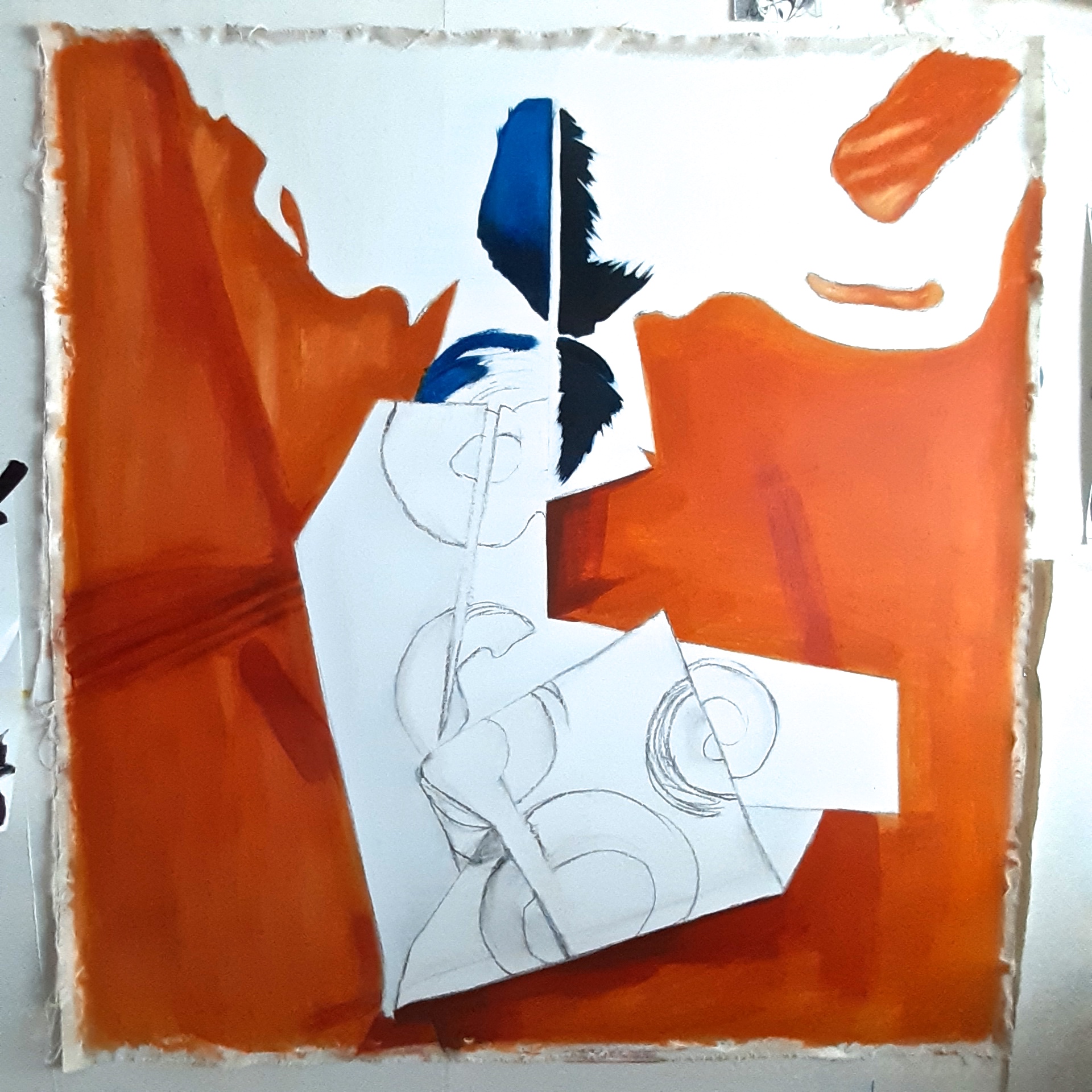
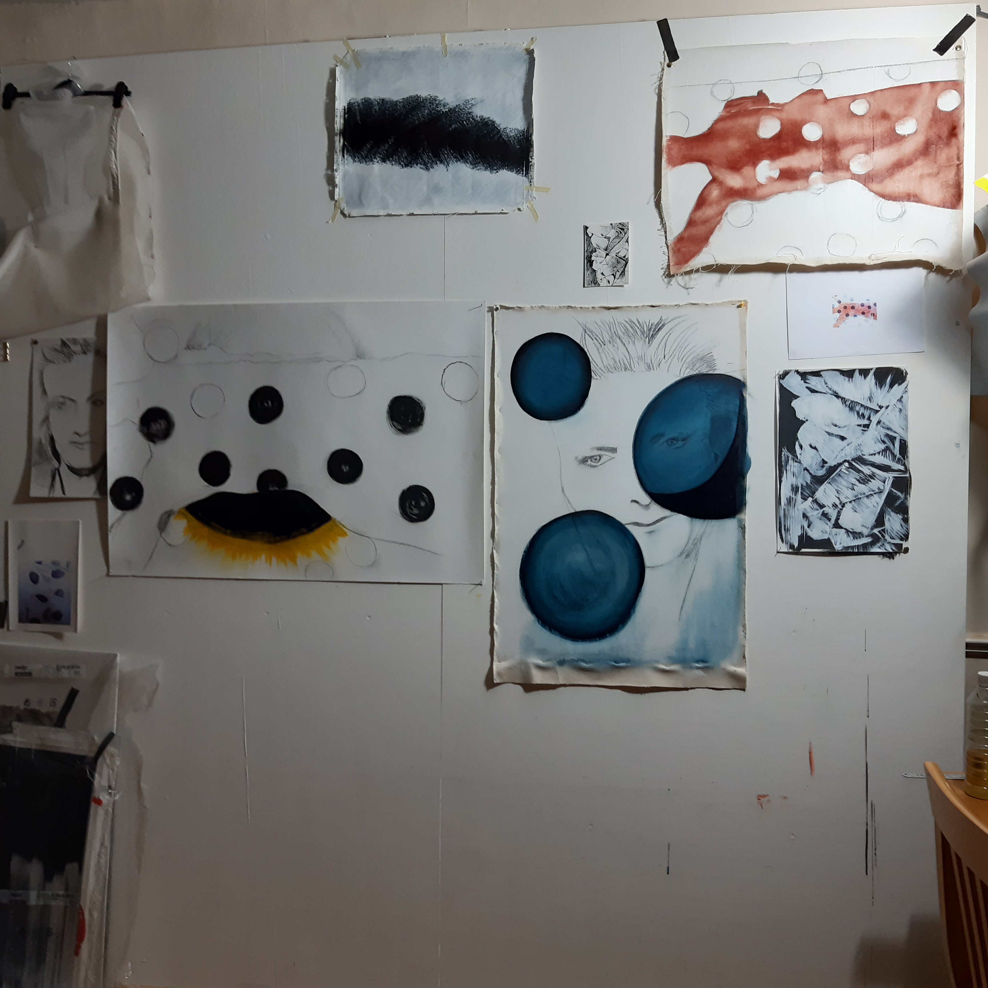
START OF ‘FOLDED CIRCLES#1’
Finally got back to this painting, after a week or so of rejigging my writing about my work’s influences, and things that really drive my visual threads. Also, I’ve been researching materials and planning ways to make the 3D extensions. Dying to get to the black brushy swirls on this painting, which I’m hoping will look good:
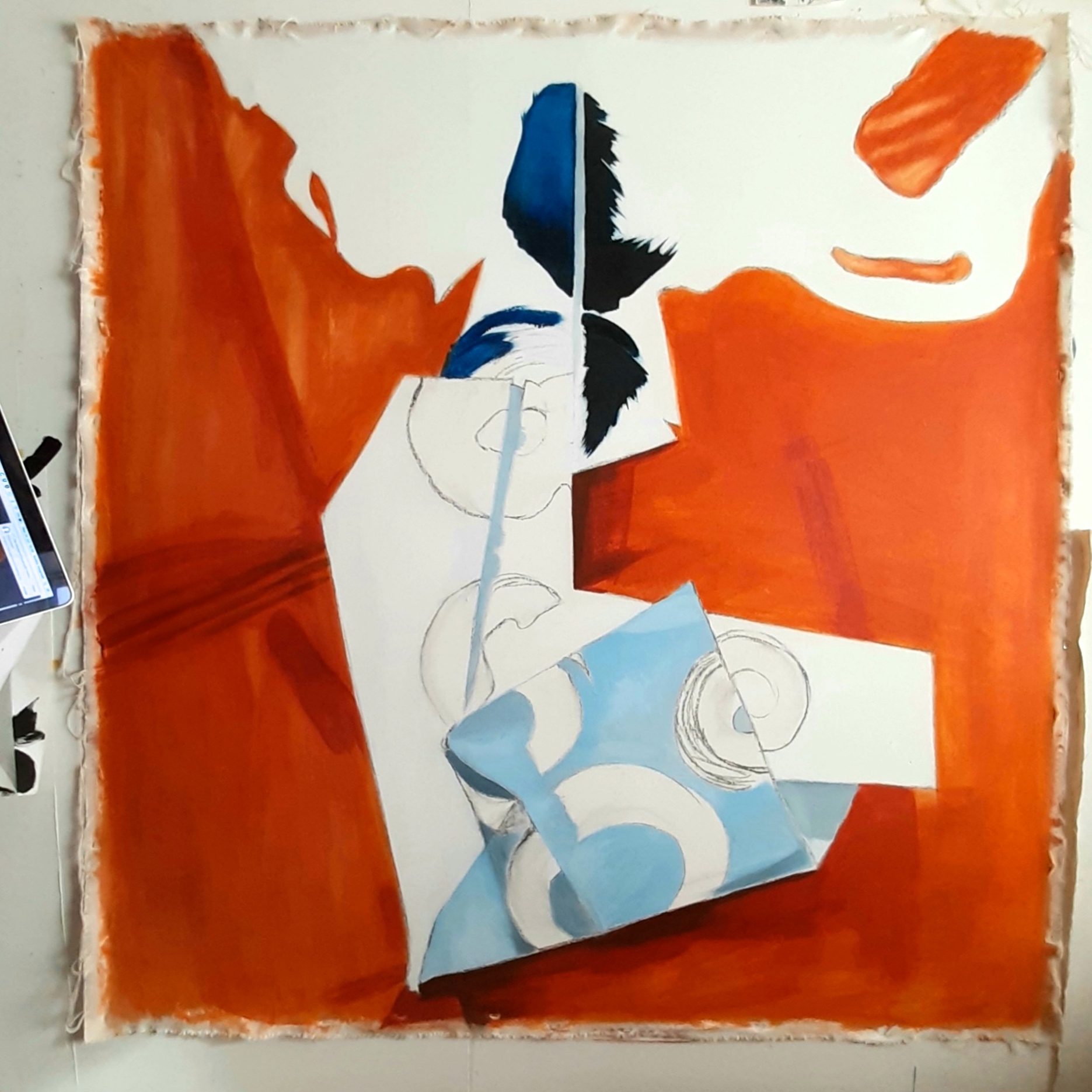
Later that day(!):
18.6.202
PAINTER’S INFLUENCES & PLANS:
RICHARD SMITH
It’s been a busy week – almost over but not quite – but I wanted to put up three images – two of painters suggested to me by one of my tutors, Mark Fairnington, and one that I came across doing my usual googling paintings of clothing / fashion / dresses.
Firstly, a painting by Richard Smith – a painter and print-maker of the 1960s avant-garde movement who died in 2016. I have to say I hadn’t seen his stuff before, but immediately I saw this,
I connected with it!
It kind of encompassed similar ideas I’d been having – extending or adding to the flat plane of the base canvas, whether free hanging (as I will use), or on a stretcher, by means of additions and extensions of canvas or other fabrics. This one looks as if it’s seamed together, so I could do that – make a pattern by using stiff paper as a test or a reverse ‘toile’, or develop other means of adding. AND it has polka dots / circles, but that was incidental in this case, as a link to my work. What I mean is that although I have been featuring polka dots in quite a few of my pieces recently, what really mattered here was the 3D object growing out of the flat painted surface. Being a pattern cutter in another life, I’m pretty certain this won’t cause a big problem for me to replicate – the technique that is, of a 3D extension.
JULIAN SCHNABEL
Another really interesting painter I came across at the end of Unit 2 was Julian Schnabel. I was watching an online exhibition of his in a gallery in New York, and loved the way he had shaped some of the stretchers of his paintings to look as if they had been ‘pulled’ out of shape or somehow squashed. I think he had also painted the ‘folds’ of the canvas going into these pulled corners to look more rippled and flared whereas they were in fact flat. Also, he said that the paintings were done on found fabrics so were joined with machine stitching.
Sorry these images are not brilliant quality, but they are screenshots from the video
Here’s a better quality image of the first painting here. NB this is not a video!
GRAPHIC SHAPES ON THE BODY
The third image I came across was a portrait of Michele Obama by US painter Amy Sherald. At the unveiling of the portrait in 2018, Sherald said that the fabric’s patterning reminded her of Mondrian, and the diligent quilt-making of the black women artisans of Gee’s Bend, Alabama. “My approach to portraiture is conceptual,” she said. The bold, graphic style of the painting appeals to me a lot…..totally different to the textural / material element of a lot of my own work, but the graphic element is just another side of my visual interests.
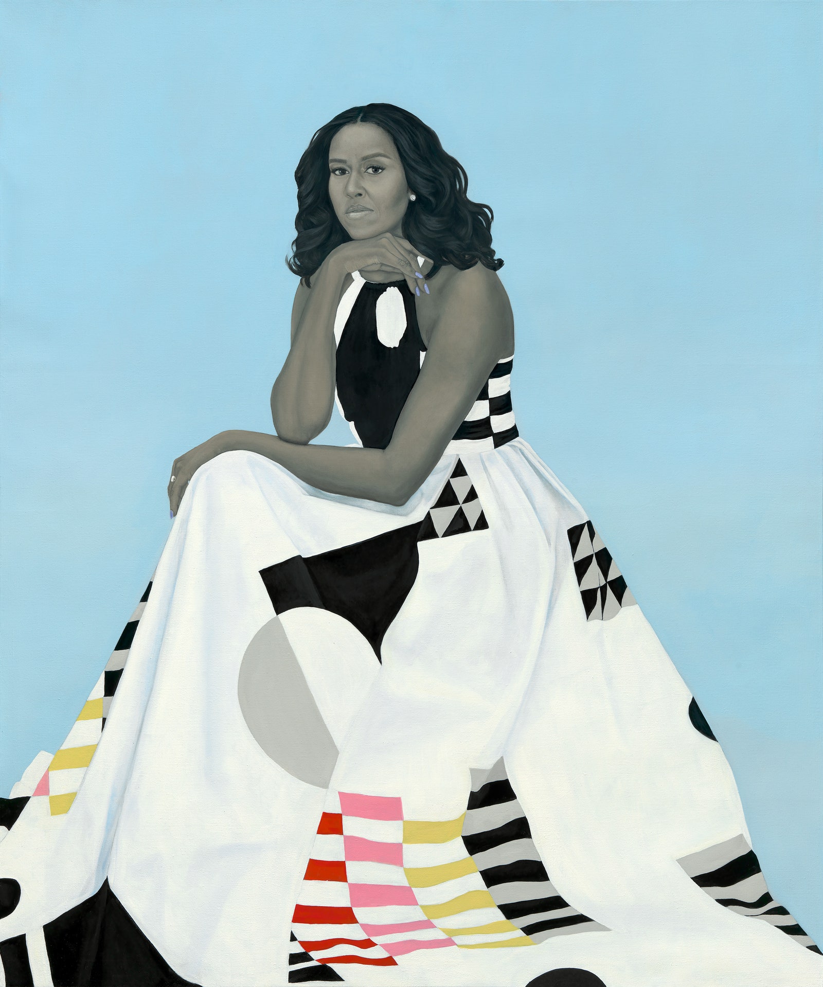
I feel that the fabric of the dress and it’s design in this painting, is more important than the actual portrait! As this is something important to me, (how fabric and it’s print or it’s weave drapes, folds and hangs) I was happy to have found it. About a year ago, I was working on something with similar elements, so I felt a link:


So, referring to these as inspiration, tests must now be done:
- Slitting flat canvas and threading other fabrics through
- Making a ‘pattern’ for a 3D extension to a painting
- Ways of working with flatter layers on the canvas by folding / pleating
16.6.202
ALUMINIUM SHEET IDEAS & TRIALS
My canvas finally arrived today. Only about 21/2 weeks since I ordered it from an art shop I’ve dealt with a lot in the past, and they are usually really quick at delivering…! Due to the corona virus pandemic, the warehouse where the canvas comes from has not been able to operate as quickly as it used to, and so the delays. Oh, for the college shop across the corridor… So I can finally get on with my plans for tests / ideas / trial pieces for the painting ideas. And the local Hobby Craft (the only kind of art shop near to me) finally opened this week, as all non essential shops have been closed since the lockdown in mid March. I don’t think artists would call an art shop non essential, but anyway….!
The samples of aluminium sheet arrived – but they’re too thick. I need to be able to bend it as easily as thick paper, for example, and these took a reasonably firm pressure to even bend, let alone fold, which is what I may need. So I’ll keep searching.
Here’s the samples I received from a company – the black material is a kind of protective plastic film applied to prevent scratching.
This is a new thing for me, inspired by one of my tutors, Anna Bunting Branch, who had made pieces of her own on aluminium sheet, gessoed and then painted, (I think), and she showed them as part of her lecture last week. The talk was very interesting, and showed a lot of her very varied work – animations, paintings, 3D objects. I liked the graphic, cartoon/comic strip-like elements of her pieces.
I’m hoping that using the aluminium sheet is a way for me to extend the 3D fabric based ideas into something more permanent, or at least, more robust. For some reason that feature has alway held some importance for me – that my artwork should be able to withstand the ravages of time, and movement. I don’t quite know why that’s important, but I should try and work it out. Maybe it’s related to preserving something really special – not that I view my work as more deserving of preservation than anyone else’s, (!) but I think that any artwork is special because it comes directly from the artist’s heart and brain, and it is a unique original. (In the case of printed artwork, if the prints are made by hand, each one is very slightly different from the next, as the the result depends on varying factors – how much ink was applied to the plate, which print it was in a series, i.e. near the beginning, or the end of a run….so each one is unique.)
PLAN FOR PHOTOSHOOT
Thinking about my ‘semi transparent fabric’ thread, I have a model booked for photoshoot, here in my home studio. Luckily, I have just about enough space here to set up the camera on a tripod, use natural light (my preferred choice, and be socially distanced enough to do the job safely. The idea of using a figure in relation to the fabric, keeps periodically coming back to me, and ‘fabric in relation to the body’ runs alongside my purely fabric based ideas and experiments. So it’s important that I do this shoot as soon as possible. I’m going to have a variety of fabrics – mostly semi-transparent to be wrapped around the model’s body. So, silk organza, muslin, scrim, lightweight calico, foam sheet packaging material etc…see little drawing on previous post below.
8.6.2020
DEFINING MY MAKING / WORKING METHODS
To explain my methods of working and processes:
- I make a 3D object (even if it’s only a length of fabric, draped)
- I photograph it
- I edit the photo – this is the ‘surprise element’
- I make a painting / 3D collation from the photograph
In this way, I can go a small distance towards combining my multi sensory threads that have permeated my most successful pieces so far, and which is a strong feature of other pieces of artwork that make a big impression on me. Elements of touch, sight, even sound are part of my work.
The visual aspect is self explanatory – a painting, collation, or sculpture is a piece of visual artwork.
TOUCH
The touch element mainly concerns my use of fabric, that is, the fabric used additional to the base canvas, as well as the canvas itself, and although works of art can’t be touched too much (or they will deteriorate over time), I’m intending to make the innate materiality, and how the paintings would feel when touched, as obvious as possible. This would be by means of fraying / scouring with a wire brush / cutting / folding / draping / creasing and gathering or pleating, for a visual effect. In other words, to accentuate the 3D or textural aspect. Most people would be able to imagine what a piece of stiff cloth like canvas would feel like to the touch, compared to the feel of a piece of silk satin – very soft, smooth and drapey, but, to communicate the features of the fabrics even better, I have had an idea to make it possible:
DISPLAY / EXHIBITING IDEAS
This would be a selection of strips of the different fabrics used, fixed on to a block or bar at the side of the painting – some ‘feel strips’ – with a key so that the audience can feel the various textures within the artwork itself. Maybe it’s just me that likes to touch everything (?!), but if you’re the same, you would appreciate this. Here’s some sketches, and also an idea for another painting with the fabric and a model:
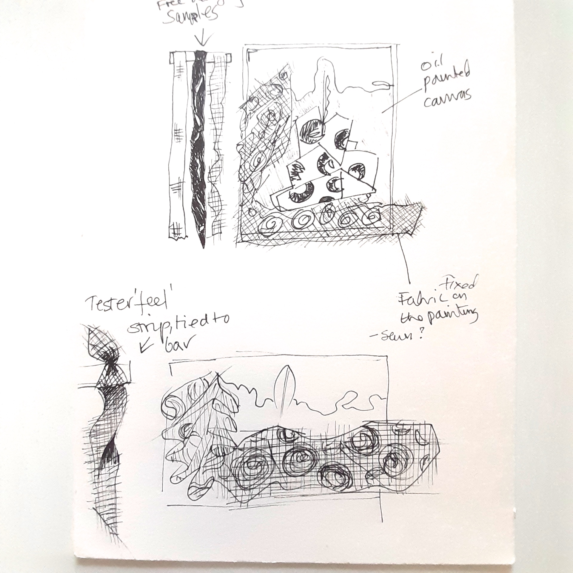
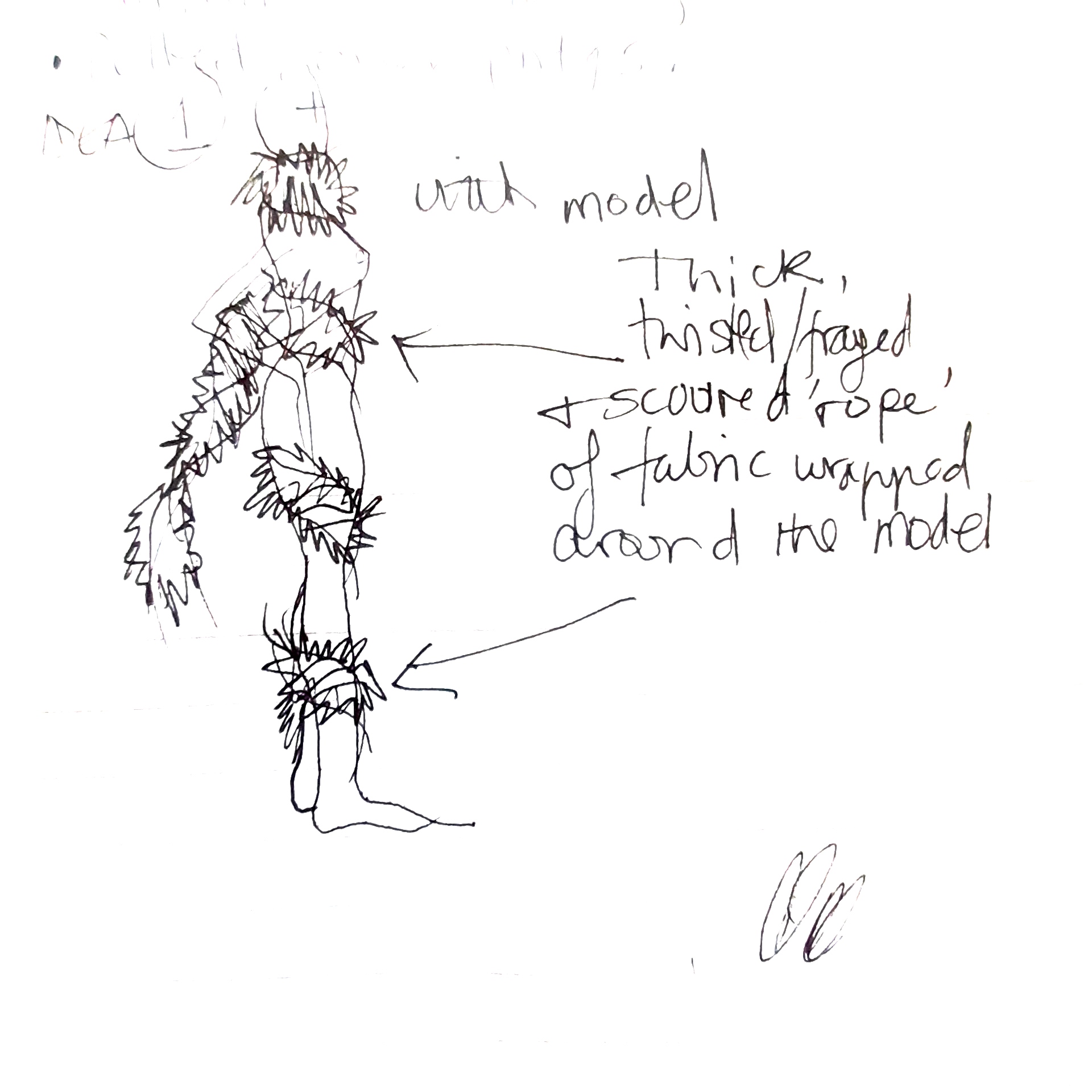
PHOTO EDITING
The ‘surprise’ element of using photo editing in my work, is that even if I know that increasing the exposure, contrast or saturation in iPhoto will have a somewhat predictable effect, it can never be predicted accurately, as the results depend on the original photograph. I have known a very ‘grey’, undefined, unpromising looking photo look really good when edited. For example:

SOUND
The sound element is something I wish to incorporate, but it will be based on the sound of fabric rustling / sweeping past / and including the sounds of different fabrics such as wool felt (almost silent!) compared to silk taffeta. This is just an idea at the moment, but perhaps I can work out a way to do this. It would be recorded, have to be very close miked, and, not having a totally soundproof studio at home, it’ll have to be done late at night!
I am imagining the sound of something like silk taffeta (a very crispy, stiff fabric) being twisted in the hands and recorded to catch the squeak and rustle of the fibres rubbing against one another. Or maybe the sound of wind blowing and flapping silk satin fabric, which has a particular recognisable sound, if you are familiar with that sound.
Speaking of which, a film that for me fulfils and combines all these elemental forces is ‘Pina’.
THOUGHTS ON THE FILM, ‘PINA’ BY WIM WENDERS
A film that I love, ‘Pina’ by director Wim Wenders, is about the Dutch choreographer Pina Bausch. She unfortunately died during the making of this film, and dotted through the film are small ‘cameo’ appearances – very short (sometimes only about 30 seconds), by some of the dancers in her company, speaking about her. One of the dancers talks eloquently about Pina, saying that ‘She was the painter, we are the colours’, a quote that not only links this film directly to visual art, but is also so descriptive of the choreography. If you have this in mind when watching the film, I think it will be more meaningful. The dancers are used as visual motifs – a dot of background colour there, and a swathe of multi textural colour here. Other scenes are like abstract expressionist paintings – the ‘water pool’ scene on the massive stage, for instance:
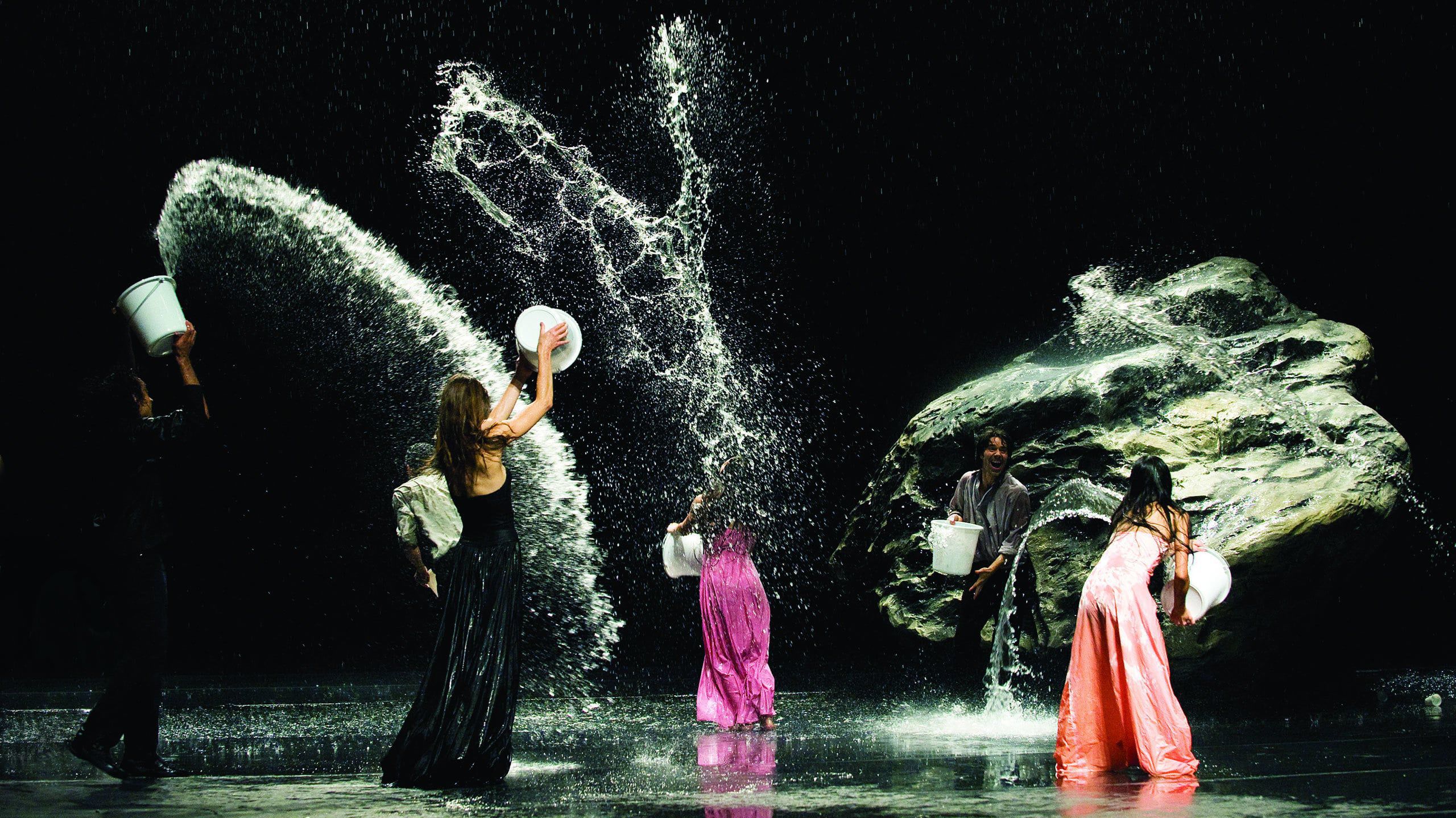
It features so many of the elements that I love in a sensory experience – all the elemental aspects of the choreography the things I have described above, are in this film. There are beautiful and also totally surprising visual experiences: dances set in the centre of a road junction with traffic all around the dancers, some on a massive stage set, and her multi generational dancers perform several pieces wearing a variety of what look like designer outfits of all types and fabrics, filmed in many different locations, so that the materiality of the fabric of the dresses is shown very clearly. The costumes are shown as an integral part of the film – designer dresses, some tailored suits, and the sets – one staging was covered in loose earth, another became a huge pool of water (above), another was set in a café, ‘Cafe Muller’, which was an obstacle course of chairs. The camera work, (some on outdoor location, some on a ‘stage’ set), and the sound (music, incidental sounds), all add to the multi sensual experience of the film as a whole. The ambient sounds of the dancers feet moving across the stage are not is often heard in a film about dance unless it’s tap or Irish dancing, but it’s totally purposeful in this film, even to the sound of a dancer slapping her hands against her thighs at one stage. WARNING: If you don’t like dance, you won’t like this film….!
I want to try and transmit these forces in my paintings, which is a challenge, but I aim to try.
As another visual inspiration I found, purely by accident at having an unaccustomed radio station playing is a stunning film from the Sadler’s Wells online offering while the theatre is in lockdown, ‘Spatial Reverse’. Although this is a very beautiful film (one of a series of around 6 on the Sadler’s Wells website), by Warren Du Preez and Nick Thornton Jones, it’s sad to think that theatres and concert halls will be some of the worst affected by the lockdown due to social distancing of seating, not to mention the performers themselves. But here is the very short film, 3.30 mins approximately, with the amazing costume – more a suit of constellated lights by fashion designer, Iris Van Herpen with music by Salvatore Breed: Iris Van Herpen film
https://player.vimeo.com/video/271465022
It’s so ‘other worldly’ and mysterious, and the sparkling lights I see as type of fabric – there, but not there. I relate to my use of semi transparent fabrics, and how they look on a body. I love it a lot, and will have this in my head when I do the photoshoot I’ve planned. I just need to decide on fabrics.
And another film of a dress by Iris Van Herpen, made by the same team as before, which shows in fabulous detail how the fabric reacts is ‘Flow’. See below.
2.6.2020
SELF ANALYSIS AND START OF NEW WORK IDEA
I’m trying to galvanise my thoughts / output after getting the feedback from Unit 2 yesterday. It wasn’t quite as good as I’d hoped (minimally better), but I really want to make everything a LOT better.
The practical work really suffered as a result of the lockdown, (and of course I’m not the only one), if for no other reason that I couldn’t do anything for 3 weeks and my trains of thought were so derailed…. Anyway, to be positive, (as I usually try to be), I think I am now back on track, and although it’s too late to improve Unit 2, I can improve from this point on…I find it hard to keep my confidence, (although I AM mostly managing to do that), and I think the reason is this:
I have always been near the top section of whatever I’ve done in my life so far – I mean in terms of achievement – and have always had more compliments than I could have hoped for – in singing, pattern cutting / clothing making, teaching.
I think I have got where I am now, on this MA course, by some abilities evidenced in my work and my artists statement explaining my interests, but also with a lot of self determination, as it was an ambition of mine, for various reasons, just to get on the course.
I realise now that there are other students on the course who have dedicated their whole lives so far solely to painting, and so I feel that I am lagging behind. BUT, being the kind of person that I am, I’m not sitting down feeling defeated…
So, my intentions are to concentrate my ideas and stick to the working method that I’ve realised works best for me. My plan is do more ‘combinations’: 3D paintings / collations, as this is the thread that seemed to be working the best before the lockdown, and to really identify what it is in my work that has the most success. I need to write all this down, but just wanted to get on with the practical work, as I have some ideas.
Here’s what I have on the go today:
‘Making a painting’ is more relevant in my case than perhaps some other painters! See tomorrows entry for explanations.
26.5.2020
FOLDED PAINTED PAPER TRIALS (as canvas hadn’t arrived)
After the hand in of Unit 2 last Wednesday, I’m so happy to be back to my artwork as of yesterday.
I can do writing, (I love language and words, and have written quite a lot of song lyrics), and enjoy expressing myself in words, but I don’t particularly enjoy the specific documentation of everything I write about. I get impatient, and as in the case of maths, I can do it, but my brain just doesn’t like it.
Here’s some ideas from last night. Not having easy access to materials – running out of various items (art suppliers either out of stock of loads of things or with big delivery charges) I did intend to make these out of canvas, but in the end made these out of heavyweight paper, and used diluted oil paint, just to get the ideas down. I then photographed and photo edited the results as seen below:
The photo editing above has the effect of abstracting the image which I find hard to do naturally. It simplifies the image which is in line with my thinking of wanting to make the ‘making’ techniques – brushstrokes, rubbing off, blending etc., the materiality, more obvious.

The less edited photo above I include for comparison. The fact that you can see the different planes of the paper and the creases I’ll definitely use for another piece in this series.
The photo above was the first in this series, and the ones above are with the paper unfolded.
HERE ENDS UNIT 2
16.5.2020
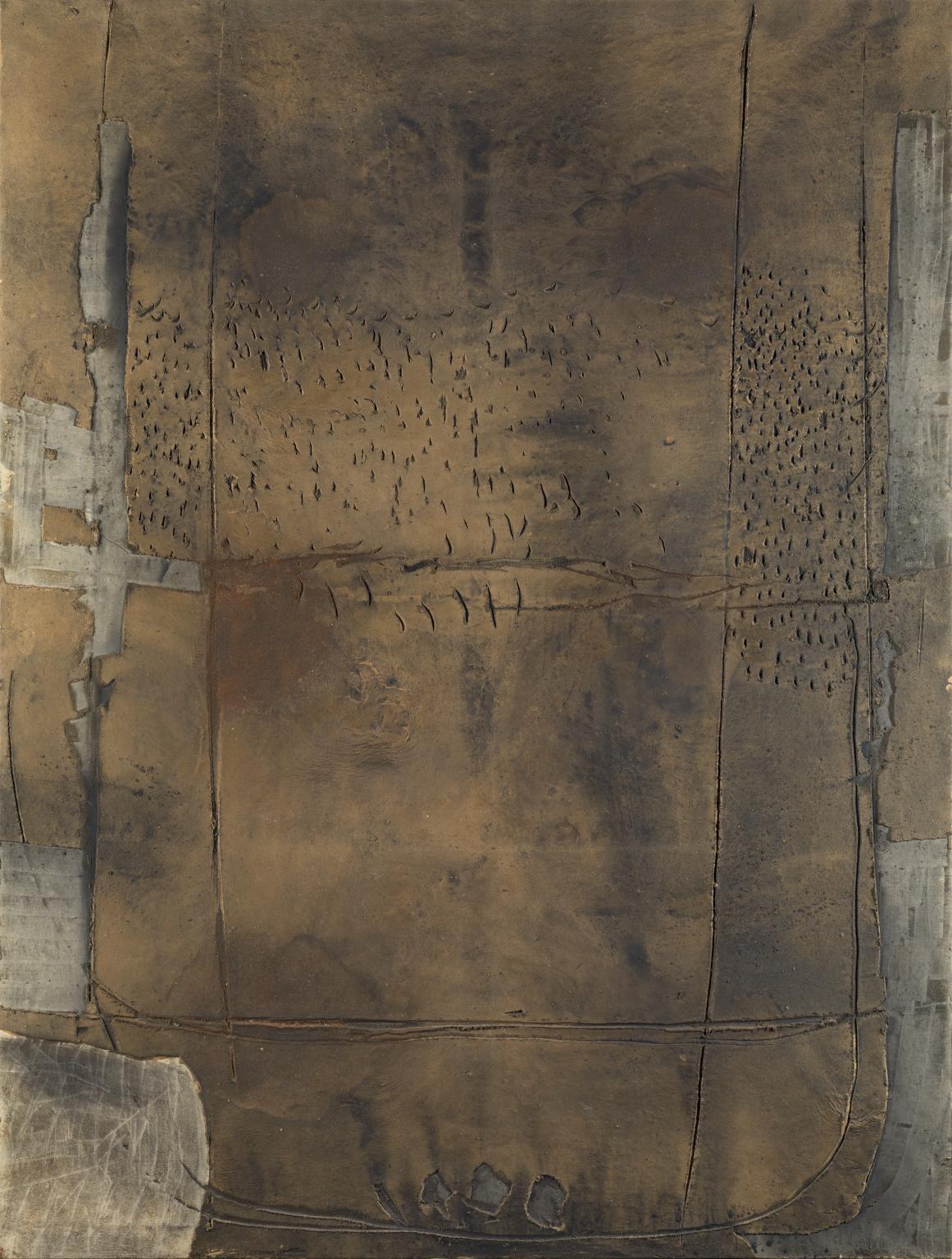
We had a seminar on paint, materiality and meaning yesterday in which Geraint, our course leader, talked about and showed us MANY artists work to illustrate that connection. I found this very inspiring, as some artists I didn’t know existed were presented, and I loved some of the works as they had links to the kind of work I am trying to do. Jean Fautrier was one artist and Spanish painter and printmaker, Antoni Tapies I especially liked due to the combination of varied textural areas in one piece – some thin washed colour areas, some broad, solid, defined brushstrokes and the use of text etched or scratched in. The style of these first two pieces here is very free, light in feel, not heavily coloured, but in contrast the last is heavily textured, looking almost like a piece of brass plate or a slab of bronze.
PROPOSAL for UNIT 3 work:
I intend to make paintings with mostly oil on canvas, as the oil paint is best suited for some of my techniques (rubbing off, thin drizzling), and I intend to make them large scale, as I want the size of the canvas to make the viewer feel a part of the painting, and feel drawn into it. These will probably not be on stretchers, as I wish to make them free hanging and have frayed edges when displayed to accentuate their materiality, so they will probably be fixed on a batten on the wall and bracketed or hung from the ceiling of a gallery space.
In current conditions of social distancing, I am sad that this probably won’t happen in a public space, but I think I may be able to access a friend’s gallery near my home studio, and I intend to make a little movie with commentary, as a kind of ‘walk round’ in place of public exhibition.
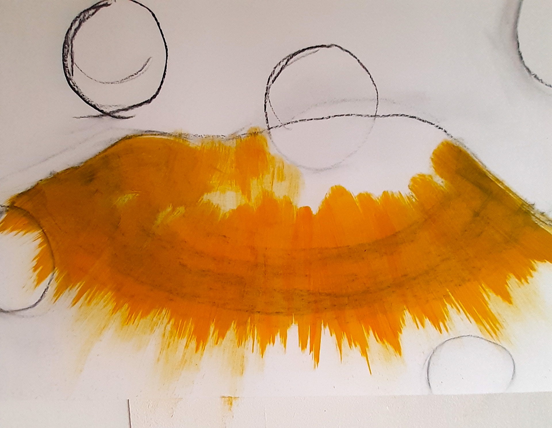
DETAIL: I intend to develop the unconsciously recurring theme of the polka dot, which has started to transmute into a kind of ‘lens’, or a negative space, by incorporating this graphic device more consciously in my paintings. These will not be perfect circles, but be more ‘hand drawn’ on to the canvas. This is so that I can bring the evidence of the ‘arm of the painter’ and movement into my work which I admire so much in the abstract expressionist painters such as Robert Motherwell. The artist is ‘there’, even when he or she is not physically there, by the evidence of the how the paint is applied, the underlying drawing, and by the use of different consistencies of paint, and possibly the inclusion of thin layers of fabrics, as in the work of Antoni Tapies and Jean Fautrier.
I also want to develop or incorporate the use of the actual canvas as a 3D element as part of the paintings. The idea for this has come from several different sources, but I hope to emphasise the materiality of the work as a whole by this method. It could include layering, stitching, folding, constructing. These pieces could be a series of slightly smaller works, so as to be manageable in the slightly restricted space of home.
I also intend to use any pre-painted or pre-used fabric I can obtain, as re-use and recycling have always been a part of my life, and for me, that element is important in today’s society. I also enjoy the unpredictability of found materials.
*********
I think that the fabric and materiality of it is really becoming my main thread, and I really look forward to getting down to my artwork now, as I’ve spent about 2 weeks writing for the end of UNIT 2, and practically no visual work (apart from making the essay look pleasing) during that time.
12.5.2010
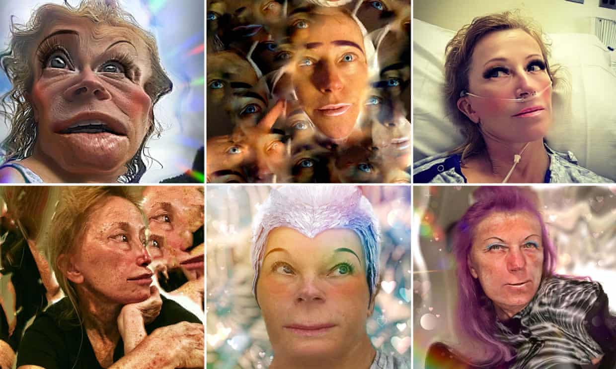
In the course of researching the work of Cindy Sherman for my critical practice essay, and her often repellant, more recent images, I tried to find out what computer programme she was using, and it seems to be https://deepdreamgenerator.com I found this out by looking at her Instagram page, and tracking it back. Although the images are so unattractive in an accepted sense, they are somehow fascinating in their ugliness. Something which it seems impossible not to look at!
In terms of ‘accepted forms of beauty’ Cindy Sherman’s work is very relevant today, as many varied types of physical body (and how it’s adorned – make up / hair / clothing) are now much more acceptable in society than even 10 years ago. I would like to interview her, but as she doesn’t even comment or answer comments on her instagram page, I’m not very hopeful.
However, she started her art career with a series of photos called ‘Untitled Film Stills #…’ numbering 70 in all. Here’s a short video of Robert Longo speaking about Cindy.
Here is Cindy Sherman’s Instagram page with some of the horribly fascinating portraits.
7.5.2020
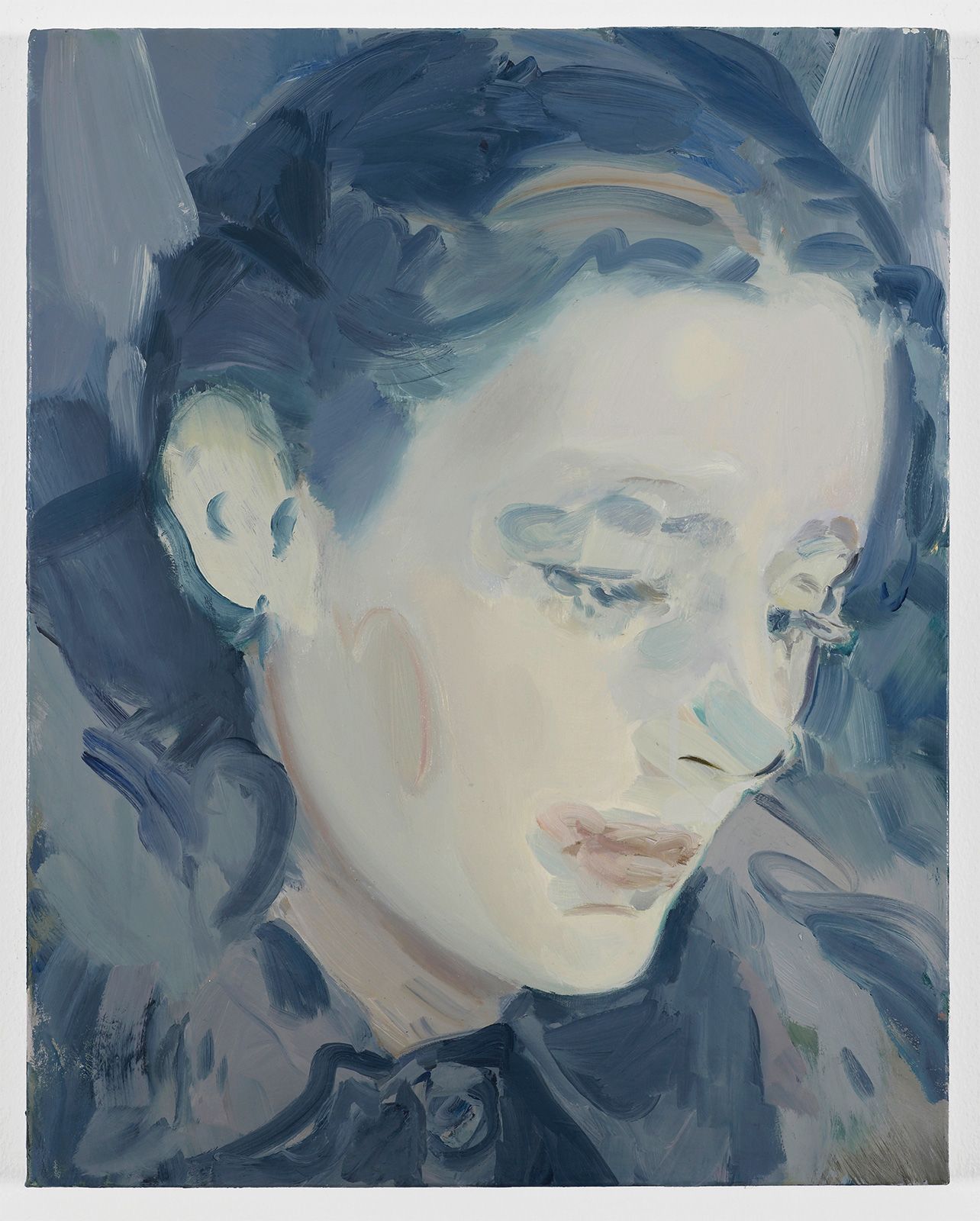
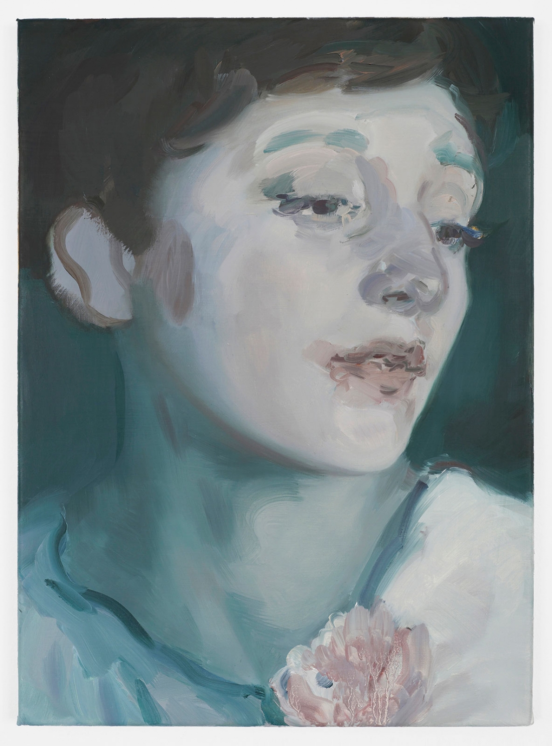
Anna BB mentioned an artist to me today, who I didn’t know called Kaye Donachie, who’s (mostly) head and shoulders portraits were described by her gallery, (the Maureen Paley gallery in London) as ‘Muted, and dedicated to female protagonists’. To me, at first glance, they looked like illustrations – colour plates, as they used to be described – from novels of the 1940’s. Soft focus, and gently waved hair! But close up, they were really interesting, and strangely, they used a technique that I had just that day thought of using to finish my Blue Polka Dot self portrait – that of using just a swing, a gesture of colour on the cheek for example, instead of finishing the face in a conventional way. See below:
6.5.2020
Today, I did a bit of work on my essay writing for the Critical Practice for Unit 2….I kind of organised the sections in a document, listening to Victoria Ahren’s powerpoint every time I’m doing something mindless… It gets the information into my brain, better than reading text.
I also had an academic tutorial with Jordan McKenzie, who managed, cleverly, to put a name to what my essay should focus on: Semiotics. I now have a simple term that I can use for the basic research, and although I have already done some of this, I was always a bit confused as to a word for the essence of my enquiry). He’s hit the nail on the head as to what my real concerns are, and I’m thankful that I can link everything up now in my brain. He also suggested a couple of artists to use for my examples of their work to explain the research – one I had already decided to use – Cindy Sherman, and another who’s work I like, and hadn’t really realised the messages she was portraying in her paintings, Carla Van De Puttelaar. Interestingly, I’ll be able to link up all this up with aspects of feminism, (how women have been regarded and expectations made of them), and link it also to fashion, which is a big part of my background. I felt relief after this, and feel I can move forward now.
I also did some work on the Big Blue Polka Self Portrait, which turned out really well. I’d previously wondered if I could possibly paint on the canvas, without obliterating the charcoal which I’d drawn on a day or two previously. Not having loads of money (!) to spend on expensive methods to fix it, I just thought that there was no harm in trying the cheap hairspray idea which I knew could be used on paper. I sprayed it on heavily 2 or 3 times, and it dries really quickly, so I didn’t have to wait for ages.
I then mixed the colour I wanted to use in oil paint, and tentatively tried to paint in an inconspicuous area. Everything seemed fine, so I proceeded to a noticeable area, and it was still fine. I then just painted as if there was no charcoal there, and it was still perfectly fine! I was so pleased as I thought it wouldn’t work, but I continued to paint as I wished. My aim was to scrub off the paint with a cloth and white spirit, as I have done before in other paintings, as I love the depth it seems to give to the work. So I gritted my teeth and proceeded. The charcoal was still perfectly stable, and I loved the transparent, almost lens like appearance that it gave. So, I will definitely use this technique again, as I really like the effect.

4.5.2020
These are some stages of the self-portrait WIP:
Acrylic and charcoal on canvas WIP. Polka dot circles drawn on, ready to paint
There’s something about charcoal that I love – maybe because it’s essentially so transient, and can be brushed away with the sweep of a hand until it’s fixed. And I love the fact that you have to make fairly bold decisions, without dithering. I guess I’m saying that it’s a bit of a challenge, so that’s always a good thing. It stops the artist being predictable.
I keep thinking that it’s all coming out a bit fragmented, but when I look at my current work as a whole, it isn’t as fragmented as I thought…I’ve made 2 self portraits in the last week, a very small pen and ink drawing from the hard pressed fabric sample, and an acrylic tryout painting on cartridge paper of the same fabric sample. So everything is linked, even though I wasn’t intending to do actual, literal, self portraits. But I just had to do something to get out of the sudden lockdown depression, and having taken some reasonable photos the week before in Photo Booth on my laptop, I thought I’d try and make something of them.
I was trying to just do SOMETHING, as opposed to nothing, and this seemed an fairly easy way to go. I was trying to be kind to myself, (!) and photography has always come pretty naturally to me, having had a camera from when I was 10 years old.
I was thinking about portrait painting and portrait photography, and I assume that the artist asks the subject to wear what they like. So, presenting themselves to the world in the way they want to be seen. This made me think that if the portrait is to be placed in a public place, or even to just go online to the public, would that affect what the subject chose to wear? I have asked this question of Dennis Nothdruft, curator of the Fashion and Textile museum in London, who puts up a ‘What I’m wearing today’ post on his Facebook page everyday during this lockdown, including what fragrance he’s wearing, so I’m hoping that his answer will be interesting.
I’m afraid that Dennis didn’t come back with an answer to this question – maybe it was a bit too nuanced. I think interview questions have to be quite straightforward.
I made a video of what was currently on my studio wall, so I could approximate being in the studio at college, and talking to someone. I think I sound a little bit down here, but I don’t feel bad at the moment…just a little unsure, due to the disruption. I loaded this up onto IGTV – Instagram’s video platform, but I didn’t really film this with that purpose. I was just experimenting – it took ages to upload, but was a good experience for future posts. And although I know that a video isn’t a real substitute for real life interaction, it’s a bit nearer than writing. Video and writing both have their pros and cons, but it’s good to use variety – it engages one’s audience more effectively. I have personal experience of this, both from performing, and teaching.
3.5.2020
These two videos here show the work of artist Alison Watt, and they also reveal how she thinks about her work, and how she expresses the way she feels. (I’ve come to realise that expressing a lot of detail about your working methods, how you regard your work and why, is a positive thing, whereas I thought it might be a bit boring to other people, so I didn’t put in much detail).
Thanks to my tutor Geraint, who told me of this artist, I have found these videos really inspiring, as I feel that seeing these gives me permission to make paintings of fabric alone. This artist has got to where she has, partly by exclusively painting fabric. I always worry about what subject matter is ‘permissible’ for a painting, and though I know that sounds strange, I think until you’ve seen someone else do it, you can’t be certain. And again, I don’t know what makes me so concerned about such things – maybe it’s because it’s so important for me to be well regarded when it comes to painting – I guess I want to ‘prove’ myself, and although I’ve been involved with making, designing, illustration, drawing in the past, painting is different as it has such a history associated.
My current work and ideas have been inevitably affected by the corona virus lockdown, and all artists will find ways around obstacles, but at what cost?! It’s the physical aspect of not having the use of studio / workshop / technician / shop facilities at the college, that have made some plans impossible, so I have had to improvise. Time will tell (i.e. of the kind of work I’m able to do successfully at home) but I am a pretty determined kind of person, so at the moment I am fairly optimistic of a reasonable outcome.
30.4.2020
Today I had a virtual meet up with Sara Berman, who I was told had been a fashion designer before turning to painting. Therefore, I felt an immediate affinity with her, and was also intrigued by her recurring motifs of diamond shapes and a ‘Harlequin’ design. I wondered if there was a specific reason for this, as I had often thought about why, in my own work, a polka dot motif recurred again and again. I had managed to trace this back (I think), to the fact that the first garment I ever made, aged 10 years old, was in a pink and white polka dot fabric. These childhood events can etch themselves onto your subconscious, and I found that the polka dot design came up again and again in my paintings. (Most recently, during the first weeks of the corona virus pandemic, I felt as if all I heard about on the radio, read about, or saw on any screen was the corona virus….then one day I realised that the word ‘corona’ in fact meant a visually circular image of the edge of a solar total eclipse, which was something beautiful. And of course it was related to the polka dot by it’s graphic shape.)
So I brought this question up during our chat. It turned out that Sara had seen this Picasso painting below, and that it had provided a ‘way in’ to her subsequent paintings. This is the painting she saw, and her comment about why it was this particular one was: ‘I just felt it was a good outfit and made one painting with it as an outfit. From there it became a route into the work – a sort of abstraction.’ (Ref. Berman, S. , Skype call 30.4.2020. Supplementary question by email, post interview.)
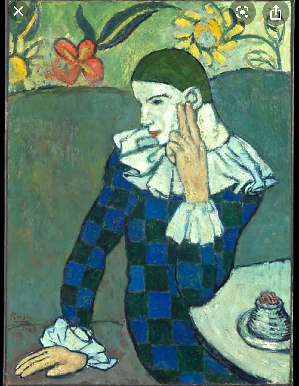
I think her comment references her fashion design background, as she first saw the painting as an outfit, but then the chequerboard design in the painting transmuted to the diamond harlequin and hexagon motifs of Sara’s subsequent paintings.
28.4.2020
Had a really interesting conversation this afternoon with Dennis Nothdruft, the curator of the Fashion and Textile Museum in London.
I had met up with him once before when I was doing some independent research of my own. (I was trying to find out the secret of the construction of the ‘Bar Suit’, a famous Dior outfit, as I wanted to find out the techniques used so that I could use a similar technique for an experimental dress I wanted to make – a sculptural, bell-shaped radical black wedding dress).
It was great to meet Dennis Nothdruft, and I kept in touch by his ‘Art Break’ page on Facebook, and Instagram. He’s a very good communicator, and I’m sure that’s one of the qualities needed to do a job like his – you have to be easy to deal with… By his Art Break, I could see that he had an abiding interest in art in general, so I knew he’d be a good person with whom to re establish contact. I discovered during the course of our conversation that his degree had actually been in Fine Art Painting, but he had become more interested in the history of art and clothing as his course progressed.
We discussed many aspects of clothing and style, and a lot of this concerned accepted forms of dress, conventions, non conformism etc. He agreed that after the Corona virus pandemic had subsided, formality will relax even more, as online encounters and meetings will be more common and more convenient, so that our physical dress code is not as important (ref. Nothdruft, D., Skype call, 28.4.2020).
We discussed ‘formal’ dress – i.e. suits for men and women when in a situation where you need to make a good impression in the business world for instance, and concluded that such codes of dress will become less important over time. This we discussed is something to do with society’s greater acceptance of types of personality, greater freedoms in the LGBTQ community, and whether the signifiers of competence (such as a doctor’s white coat), is now much less common than it used to be in the recent past.
As all our teaching on this course is now online, I know that so long as I look OK from the waist up, I am presentable to the outside world. I may have worn, baggy clothes out of sight of the screen, but who knows?!
27.4.2020
There were so many online events last week, that I hardly got any actual artwork done. Getting us familiarised to the online platforms was the driving force of these, I think.
The Post Graduate Online show was last Wednesday, (which I was part of), and I was kind of relieved to see some other people (a lot of whom I didn’t know), being reasonably cheerful and managing to do some artwork. I think it’s the solitary aspect of this situation which is so hard. The people running the event were great – encouraging and efficient.
My immediate plans for artworks are:
- a drawing or painting from the pressed fabric item I made earlier
- finish the Polka Dot Corona started weeks ago
- make some self portrait drawings / paintings from the photos I took with Photo Booth on the mac, using overlaid materials as a ‘mask’ idea – tracing paper / vinyl / muslin etc.
- take more photos of the ‘Holey Sleeve’ idea – not have the face as it’s distracting. But I like the basic idea….
22.4.2020
Online classes started this week, due to the corona virus pandemic….
I watched the Royal Academy ‘Picasso on Paper’ exhibition video a few days ago. I’m afraid to say that I wasn’t impressed! NOT unimpressed by the fabulous work of Picasso, but unimpressed by the video experience. The more I watch online gallery tours, and the more I read about people’s experience of being in front of an actual painting, as opposed to an image on a screen, the more it reinforces my thoughts about the online experience in all aspects of life – i.e. it can NEVER be as good. Here’s the virtual tour:
‘Picasso on Paper’ virtual tour
The music, the filming, were both great, but…whenever I see exhibitions in real life, I usually spend ages looking at the edges, and if possible the backs / underneaths of artworks, the texture of the brushstrokes, how the light reflects off the surface, how they are framed / mounted / hung…..all those incidental elements that hopefully tell me something about the artist. This information seems to be important to me because it tells me something about the thought processes of the artist – whether for instance, it’s important that the canvas / tapestry is free hanging, or whether it is simply mounted on a solid base. If it’s free hanging, that must say something about how the artist wants the viewer to see the work – whether the materiality of it is important, or if it’s mounted for example on a solid backing, it may just be about the image painted there. Looking in this way gives me an understanding of the work, that can’t be gained from a pre-shot video. If you could tell the director what exactly to shoot, that would be different! I suppose I don’t like my freedom taken away.
Dennis Nothdruft, curator of the Fashion and Textile Museum in London, runs an art blog on Facebook called The Art Break. He mentions the physical experience of standing in front of a painting, and how different it is from looking at an image. This is his post from 20th April 2020 about a painting by: Henri Fantin Latour He describes the experience as ‘When you see one in real life, they are positively tingling with life – particularly when seen from a few feet away. Extraordinary. Electric.’ (Ref. Nothdruft, D. The Art Break [Online], (Accessed 22.4.2020)
And again, in this post, he talks of the image not doing justice to the real artworks by a Canadian abstract painter, Agnes Martin (Ref. Nothdruft, D., The Art Break, as above).
18.4.2020
Since the 30th March, (18 days ago) when I did the small ‘Corona’ paintings on my new studio wall, I’d made only two other attempts at work due to my depression, but yesterday, I actually started the first piece of work on canvas since then. It’s a bit ambitious, but more about that below.
This one idea I had was for a larger version of the Corona image, emerging from behind the floating ‘Big Polka’ figure which I want to work on, so the circular motifs could be combined. I started to ‘sketch’ it out, but lost heart again, and abandoned it temporarily. See below:
Looking back on this now, I think it could make quite an reasonable painting, simple but arresting, so I think I will continue with it, or at least make a painting on canvas, as this was using oil on paper, as a tryout. It’s quite big, so that’s a step in the right direction. Scale is so important to me at the moment. As well as always having leaned towards bigger pieces, I think the physical and psychological effect of scale is really interesting.
In these restricted current times, where a lot of viewing of the ‘actual’ can’t be done in ‘real life’, scale translates very badly, and even if you have something in the photograph to give a comparison, it doesn’t always work. For example:
I had an idea which just seeped up between the floorboards of the depression. (This floorboard analogy keeps recurring – I better do something with that.)
It started like this: I was sitting in the studio, trying to get my head back into my previous space, but it seemed impossible, and I was looking at the images of the ‘floating’ big horizontal polka dot figure which I’d had printed out very large, just before the lockdown, and which I loved.
I had my laptop on the table opposite my new big white wall, (a tiny bit intimidating!), which had one or two related images pinned up. I was thinking that I needed some images of my own face to base an idea of a mask superimposed upon it, which was a direct connection to the virus situation, but also with connections to ‘self portrait’, and how we present ourselves to the outside world – well actually how we HAVE to present ourselves these days, due to Covid 19! So instead of setting up my camera on the tripod, and all the time that took, I thought that I’d just use the ‘Photo Booth’ program on the laptop to get going quickly.
The quality of the photos on photobooth looked pretty good, so I was encouraged, and made a couple of decent shots to use with the ‘masked’ idea.


My plan is to add a mask of some sort (NOT a surgical mask – that would be far too obvious), maybe superimposed with photoshop, or maybe take some photos with some polka dot fabric tied like a cowboy scarf mask, and merge the two images together. Sketches / tryouts to come…
I did aa quick tryout with photoshop, which wasn’t that successful (not knowing the program well enough) but which I quite liked, but I decided that it was better to spend time on a painted / drawn develpoment, as I was keener to get going on that.
I then just had a thought to imitate the pose of the ‘Big Polka’ figure. When you press the ‘shutter’ on Photobooth, you have 3 seconds to take your pose, and then it takes the shot. So I just had time to dash over to the other side of the room and strike the pose…imitating the original. I took about 10 shots, and it worked reasonably well, so I started editing in iPhoto. I like to abstract the image if possible, as it then becomes one removed from me personally, and it stops me from being too literal and making too realistic an image.
I think this image shows me trying to recapture my ideas and threads from before the lockdown trauma – my previous images as I had left them a few weeks earlier were on the wall behind me, and I was imitating the pose of my polka dot image, in an attempt to embrace my previous work which I felt had all slipped away….
I don’t really know what to make of this idea. It just kind of came out of nowhere.
14.4.2020
11 days since my last entry here, due to depression arising from the Corona virus pandemic. I’ve sent in all my details for the UAL Post Graduate Online show, with my Corona#1 & #2 paintings.
3.4.2020
A little bit of good news yesterday – my images of the Corona paintings were accepted by the Post Graduate community open call exhibition ‘Walls in Online Places’! I’m probably one of maybe hundreds, but a yes is always better than a no.
I am concerned however about artwork only appearing online…scale seems to be the main issue. A really big painting can never make the same impression online as it would in real life. I suppose you could photograph it with something to indicate scale…? Also, a seemingly small insignificant painting can be hugely improved with editing on iPhoto or Photoshop….so not really a ‘true’ impression, but then, what’s ever ‘true’ in how things are perceived? A tricky question.
I was wondering how to proceed with the polka dot theme last night, and wanted to use the ‘Big Polka’ photo image – the horizontal floating female figure with big polka dots. And I wanted to somehow integrate the ‘Corona’ paintings. I had a bit of an idea, and have to see if it’ll work today….
I.4.2020
We had a meeting with our course leader this morning. He was very empathetic with our situation in this Corona virus pandemic, and just kept us informed of plans – even though it’s so difficult to plan when there are so many unknowns.
Trying to get going on an idea I had BC – Before Corona…
This was to do with making recycled or scavenged garments or fabric into solid objects formed by…… ‘I don’t know what’. I was trying to find out BC, and had tried to contact ‘Guerra De La Paz’, who’s work had first inspired this idea. As I wrote before, it proved impossible to do that, despite two emails and two facebook contact attempts, and so I decided to speak to a sculpture technician, thinking that maybe the technique involved dipping the garments / fabric into resin, and then putting the items into a mould. But not being able to speak to a technician so far, due to the college being closed, I decided to try a steaming idea inside a cloth bag, thinking that when cold, the fabric would hold it’s shape.
This worked reasonably well as described above, but didn’t really have the right look – it was too flattened and squashed looking. So tomorrow, I’ll try something different….don’t quite know what yet, but I will mull it over before tomorrow morning! Here’s what the experiments looked like:


31.3.2020
Had our second online seminar this morning with Dan Sturgis, which was OK, but I wish Teams was more intuitive to use or more user friendly…when you go to a link (which you have to view in another section), everyone’s faces disappear, which is OK for a bit, but then it’s good to see other’s faces to guage their reaction to the conversation. By a lot of trial and error I eventually managed to work it out. Anyway, Skype has some good features, according to a friend and my own research, but we’ll all have to decide which looks best to use.
In this seminar we were looking at Chris Martin’s paintings which were interesting to me as they were very large scale and in his friend Paul Feeley’s writing about him, he told of curators or critics saying to him that he would never sell these works, as they were too big for a lot of environments.
(ELABORATE!: black, white lines – patt cut, put pic here of one of them)
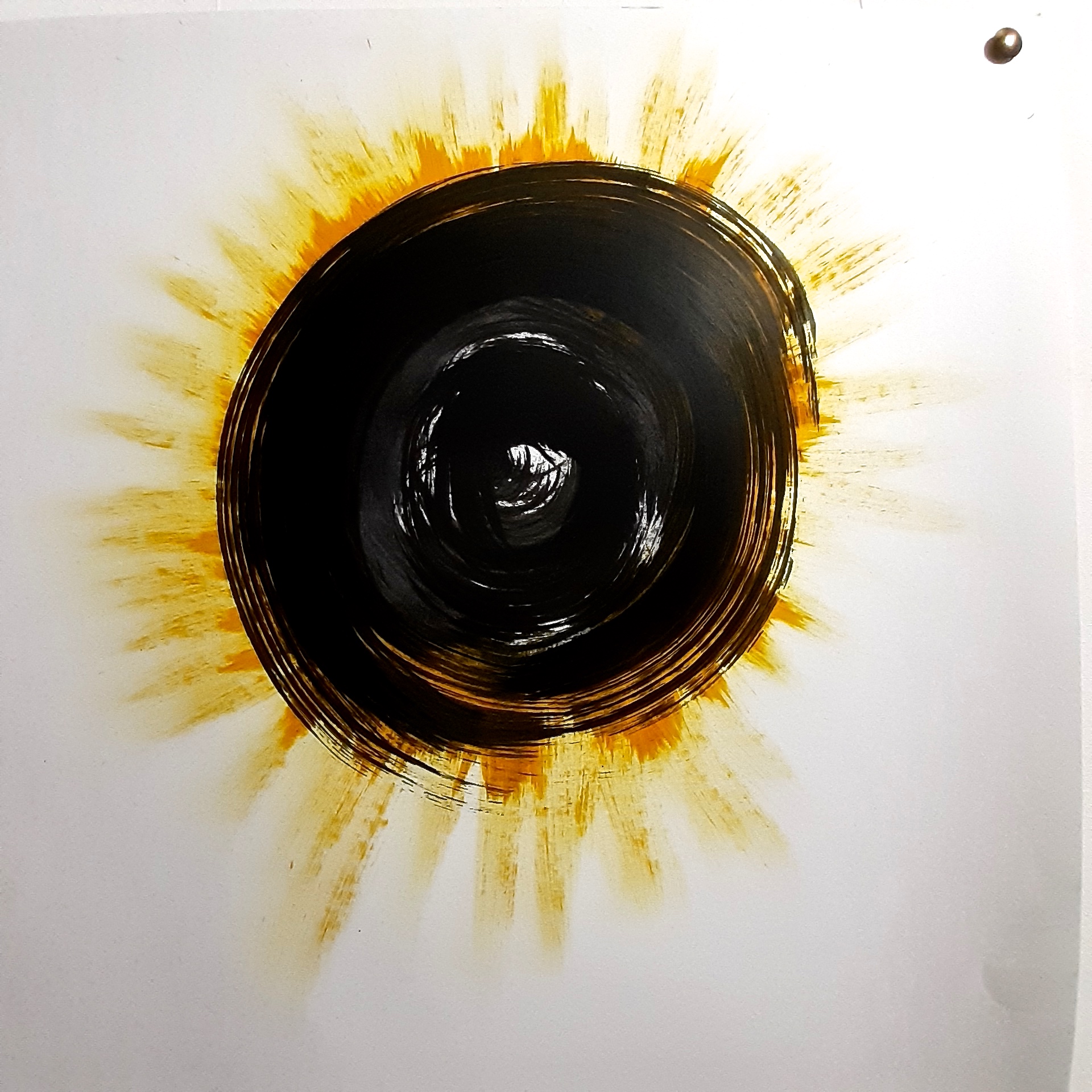
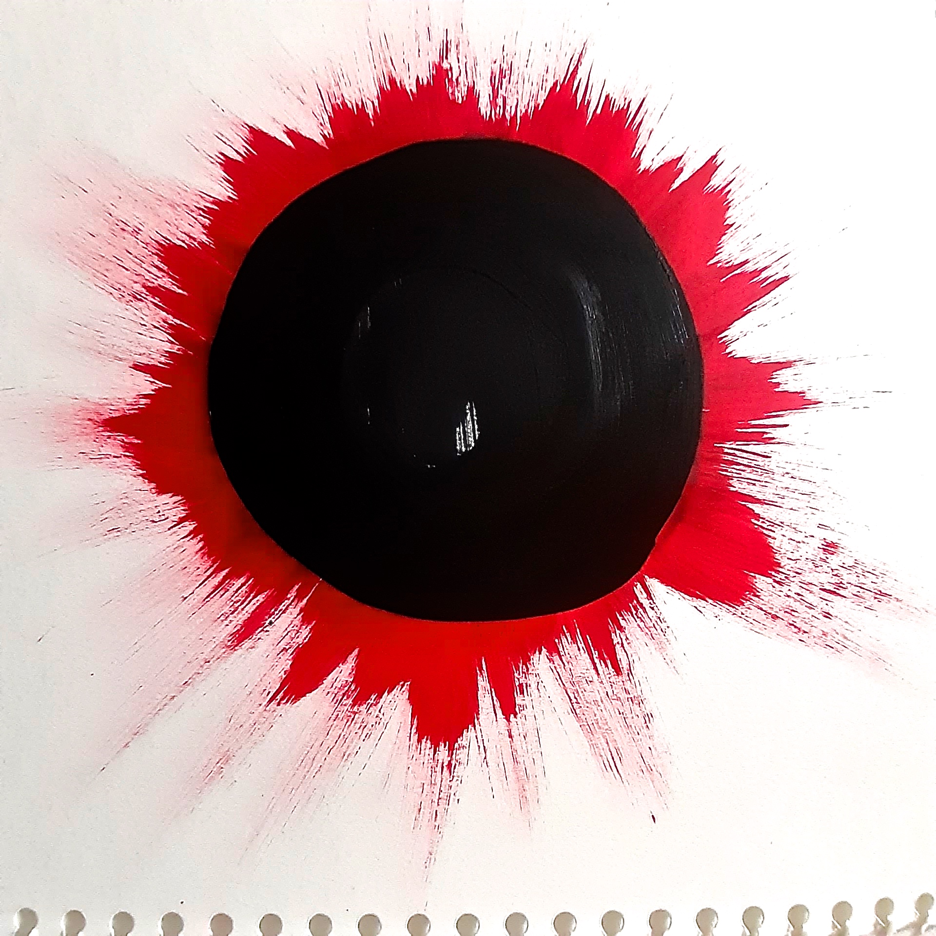
In other news, I felt a little weight off my chest last night, as something I’d been thinking about for about a week or two, I was finally able to get down in oil just on paper as a ‘sketch’, to see if the idea would work as a big painting. The idea came from the knowledge that the word ‘corona’ does not just describe a disease, but it describes a halo of light around the sun or the moon or any bright light shining from a spherical object or circular disc. I came across these images below, when researching ‘Corona’, showing that that word could be applied to something very beautiful as well as a serious disease.


Here are the paintings, first work on my new big wall:
30.3.2020
I have just discovered Tenant of Culture, who is a very interesting female artist who used to be involved in fashion….so I feel an immediate affinity, as that is my background too.
In this video, she describes what she does and why, and I was excited when I saw this because a lot of what she describes is how I think about making clothing related artwork. For example, she talks about fashion and the incredible amounts of waste it creates in manufacture; recycling, scavenging and how important that is to the resulting work. Also, her thoughts on our actual bodies, (which of course use clothing as apart of everyday life), and how necessary or not they are to artwork and even the world are fascinating – the points about the world being overpopulated, and that having a child is possibly the worst thing you can do for the environment, are kind of tragic, shocking and thought provoking all at the same time.
26.3.2020
Have finally almost got my refurbished studio space up and running…it’s taken the best part of 3 days. (Make that a week, after everything that had to be moved had found a new home). My husband has worked really hard on it, and I’m so grateful. I guess it’s a kind of part replica of my space as it was at the college, at least the main wall space, so that I can start to do the bigger paintings that I’ve had in mind for a good while. Of course it’s so hard to get back into the headspace I was in before all this happened, but now is the start of that.
Yesterday, (25th March) we had our first online seminar – some technical hitches at first which was to be expected, but not too bad on the whole…as part of it, we had to watch a video of Colin Wiggins of the National Gallery, London talking in detail about John Constable’s ‘The Hay Wain’. I imagined that the talk would be really boring talking about a clichéd painting that has been reproduced millions of times over, and that I though had very little interest to me. But the way he went into so much detail – describing everything about this painting, John Constable himself and his background, was really fascinating. I was joyfully surprised, but the take away from this was really about Colin Wiggin’s presentation – not only his deep, detailed knowledge, but his engaging personality, his use of humour, and the way his passion for it came through. I am thinking that if someone in his position can speak in the way he does, that could definitely be a role model for how I would like to communicate about art. Plus, I have a feeling that if I met him, I’d like him a lot! I think that this must be a factor in his ability to engage his audience.
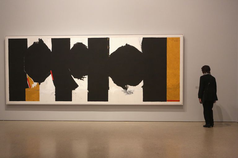
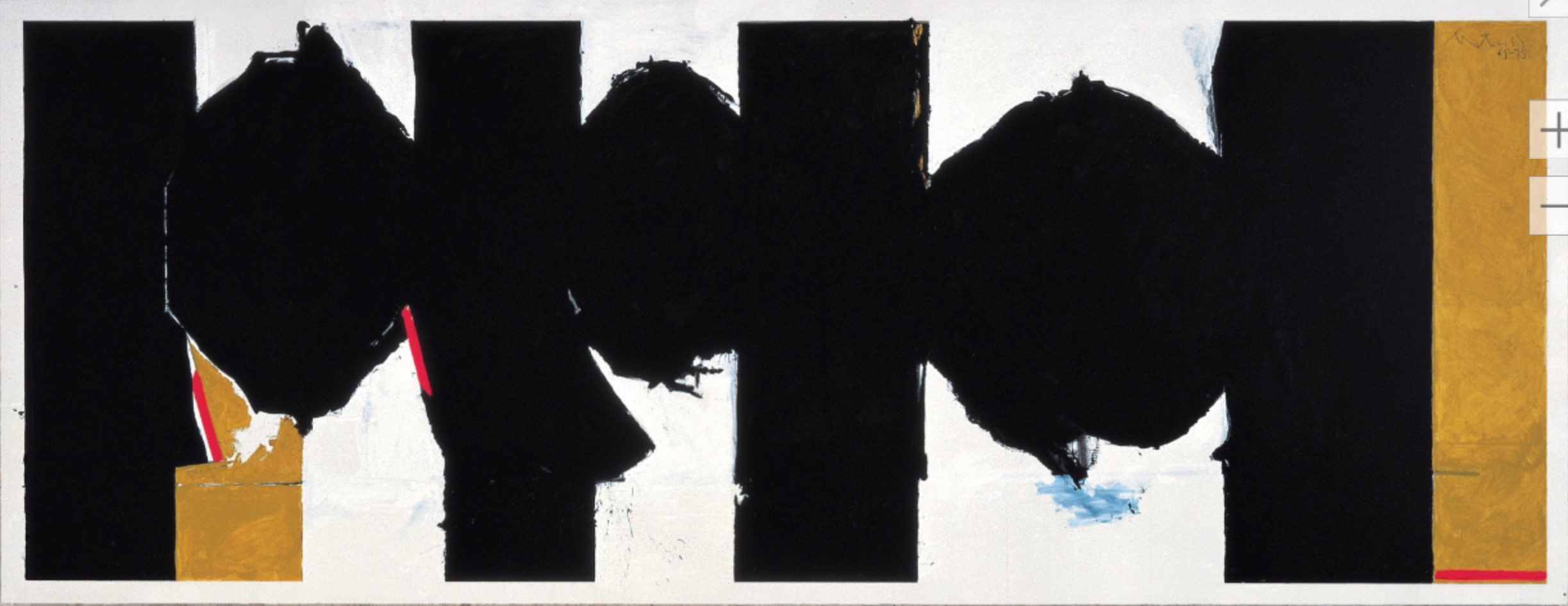
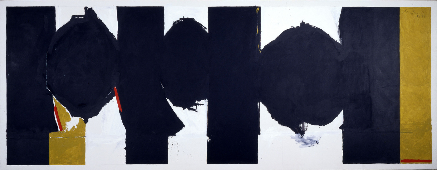
During the same seminar, we had to talk about a painting that we’d seen in real life and why it had made an impression on us. I chose Robert Motherwell’s ‘Elegy to the Spanish Republic #126’, one of a series of 140 paintings that he did over 30 years of his life. He painted these obsessively, as if to ram home his deep feeling for the context of that war, and his pity for the Spanish people, where a fascist dictator, General Franco, eventually overtook the country. (Picasso’s famous painting ‘Guernica’, painted contemporaneously, was also inspired by these terrible events, just before the Second World War).
I loved being able to try and express my love of this painting (and others in that series), as when I saw it at the Royal Academy Abstract Expressionism exhibition in 2017, I was completely blown away, and just wanted to put it under my arm and take it home with me.
The artist chosen by one of my fellow students was Victor Willing, the husband of Paula Rego. He died quite young in 1968 at the age of only 60, but made some very interesting paintings in his life, and I learned a lot from this article I found by Hettie Judah. Some of the paintings were in a Symbolist / Surrealist / Visionary style, and one that resonated with me was at first glance a fairly conventional portrait, but the detail on the woman’s dress – lines for creases – were extended beyond the actual dress and the figure, as shown below:
I like that idea a lot, I love the ‘drawing’ element combined with the painting, and it reminded me of some paintings I did about a year earlier, based on clothing pattern drafting images, where the lines ( pattern drafting lines in fact), were a central feature. I’m thinking that I could bring those kind of images back into my current work, as it all continues the thread of clothing related subject matter.
Before the corona virus lockdown, I was about to investigate how to solidify fabrics or clothing into sculptural shapes before the lockdown, so I’m thinking that I could do something similar by pressing fabric or articles of clothing into 3D shapes with the industrial steam iron I have at home, and then photograph and make paintings from the photographs. Not the same, but at least an approximation. See journal entry: 1.4.2020
18.3.2020
A really fast moving situation with the Covid 19 virus exists at the moment. We have gone from diligent hand washing and a few less people about, to most public venues and now schools and colleges being closed down and massive injections of public money into supporting businesses in 3 days. The whole country is closing down. Seems unimaginable, but it’s true.
I’ve had to cancel my meeting with fashion designer turned artist, Sara Berman next Thursday, which is another great shame, but she says she will be up for rearranging when things are a bit more normal….whenever that might be.
15.3.2020
A lot has happened since I last wrote here…and a 10 day hiatus is very unusual for me.
The UCU strike is finally over – 5 weeks of progressively increasing days in a week, but our tutors have been very good at keeping continuity going for us – we have had museum and gallery visits combined with reading groups, I’ve had a skype tutorial, which was very good and my course leader is a great communicator, answering emails in great detail! But it’ll be great to get back to face to face contact on Wednesday.
And that brings up the next pretty unsettling situation – the Corona virus pandemic. This is doing, and will continue to affect many things in work, college and personal life. Suffice to say I have a recipe for hand sanitiser, as all the shops have run out, and so long as everyone uses it or washes hands before eating, after any public place/transport usage or visits, and personal interaction we should hopefully be alright! It’s a shame that this should happen now, in this crucial year of my life, but these things never come at a convenient time, as with all life changing events. I’ll just keep my mind on the job in hand – making my work, both 2D and 3D.
However… a series of one day shows has been going on for the last two weeks, where each group of about 8 or 10 curate an exhibition, have a crit on their efforts with a tutor, (in our case, painter Yvonne Feng), and then have a mini private view, and take down – all in a day. It was great actually, and as it was in combination with Printmaking and Drawing, it gave us the opportunity to get to know each other better. Plus it was really good to see new work in another environment than one’s cluttered workspace! It gives a totally different aspect, and a more objective view – you can see your work in the context of others’ pieces, and how they work together.
When I was asked by Ian Monroe, the drawing course leader, who came to the private view, what I thought, my initial thought about my pieces was that they weren’t big enough!
Yvonne Feng, who did the crit of our curating, was really good again, discussing the curation in general terms and getting each of us to speak about our thoughts. Talking to her afterwards she mentioned an artist, Sara Berman, who she used to share a studio with, who had been an established fashion designer, and had turned to painting. So there was a connection between her and myself immediately… on looking at her work on her website, I saw another immediate connection – Sara seems to have a print motif recurring in her work of a diamond or harlequin design, in the same way that I seem to have a polka dot theme recurring in my work.
So I thought it would be really useful to speak to her – ask a few questions and if possible a studio visit. I emailed her and was really pleased, not to say surprised, to get a reply at the end of the day! So I just need to organise a time with her and I really look forward to meeting up.
This afternoon, I also managed to get my photos digitally printed out large scale! I was really pleased to finally see them this size, (roughly A1), and I will be able to see them up against my other pieces to see how the whole lots sits together. This will hopefully help me to plan my ideas for my next pieces.
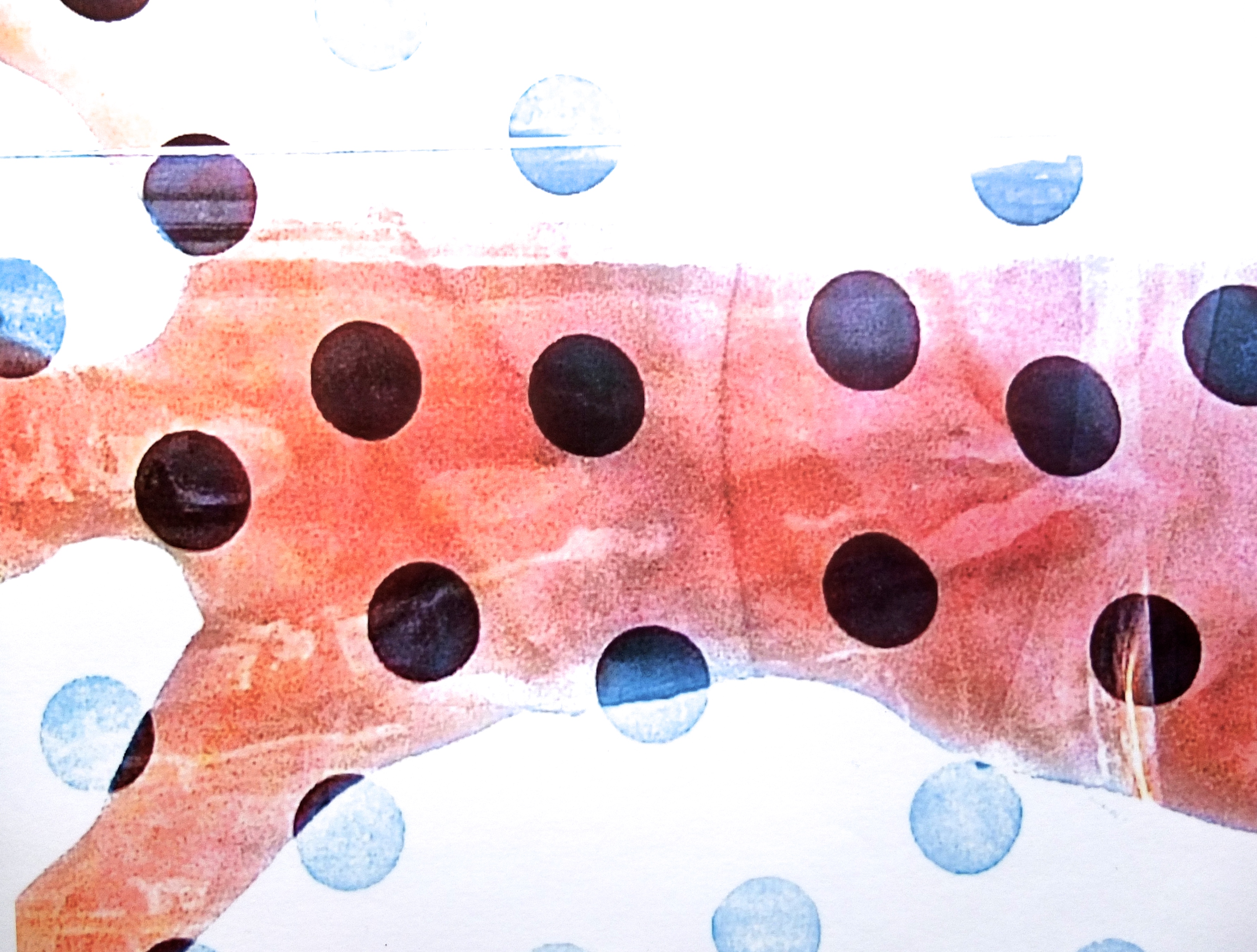
5.3.2020
I had to work at home today, as places to stay in town are getting fewer, due to an indirect affect of the corona virus – see below for details. I find this quite sad, as I love being in the college, and feel detached when I’m not there….
Spent quite a lot of today experimenting with two of my photos, and trying to decide exactly what to do with them re. printing out and making a screen with one of the images.
Photography has always been a significant part of what I do, a starting point and I recently decided to recognise that fact, and to make more of them. My plan is to print out two I’ve had on the periphery, large scale – just to see how they look, and to judge them against my other current work. In other words to see if they are worth proceeding with. I like working with photos a lot – the editing especially, can give some great, unexpected results. So this means that the control is taken out of my hands to some extent, which is good for me. I tend towards being too controlled in making work, so the unexpected produces interesting results. I’ve spent such a big part of my life making totally refined and ‘perfect’ looking items, whether paintings or clothing, that I am now (and have been for at least 6 months), really bored with doing that same thing over and over.
So, my ‘problem’ with these two photos was to do with quality of the image. To explain: these two images were severely cropped from much bigger original images, so the resulting image was really grainy which I like very much – i.e. they weren’t a version of an accepted ‘perfect’ photographic image. But the problem was, to have it printed A1 size – which I thought was the minimum it needed to be – the grain in the image just looked really blurry when I tested it out in photoshop. BUT….what I didn’t take into account was the fact that generally, no one would be looking at it really close up, and that from a normal viewing distance, it should look fine. So my plan is to print out one of these images and if it looks OK, print the other one as well. Although these images are £10 each on regular paper, I feel I’ve got to do this….this year at Camberwell will be over before I know it!
I also have a plan to make a screen with one of these images, and use a technique described to me by the Digital Print technician to make something a bit more painterly than a straight screen print. It sounds pretty good.
I’m being hampered in the production of these ideas a) by difficulties of coming in to college, due to my places to stay in London dwindling due to the corona virus (friends who would have been travelling abroad and hence allowing me to stay at their places, now not travelling), b) the cost of the prints, and c) the fact that I can’t book a digital print session except by visiting in person, apparently. That’s a bit difficult due to the aforementioned situation…! I have emailed a question, but no response so far, and no phone number available. So progress is going to be slow, which is of course frustrating. I just want to see where my ideas are going.
4.3.2020
Today, the second in the series of Art & Tales series interactive lectures was held offsite at the Hayward Gallery on the South Bank, which was a great location!
Stephen Wilson, our tutor for this had us read a page out loud one by one (about 15 of us), of a book by Claudia Rankine which was an unusual read. The writer is described as a poet, but the book was more like a novel – well, halfway between the two perhaps. As it was mostly in novel format, I approached it as such, but I think that if I had thought of it as a poem, it would somehow have made more sense, as one’s mind tends to be more open to something described as a ‘poem’…I’m not saying that I didn’t like it, because I did, but as I said, I think I had the wrong approach.
After this, we had the chance to go to the main exhibition at the gallery, ‘Among The Trees’. this was by a mixture of artists work on the subject of…trees! As usual, I loved the huge scale works – a massive sideways-on video of a Wellingtonia tree blowing in the wind, by Finnish artist Eija-Liisa Ahtila with a soundtrack of that and birds singing, and with a figure standing at the base to give an idea of scale.
And the other impressive work was a massive relief forest of twigs and branches all made of cardboard – the sort that sturdy cardboard boxes are made of, and all in the typical cardboard box colour.
These paintings, below, are by Toba Khedoori, an Australian artist with the massive cardboard relief / sculpure in the background of one shot.
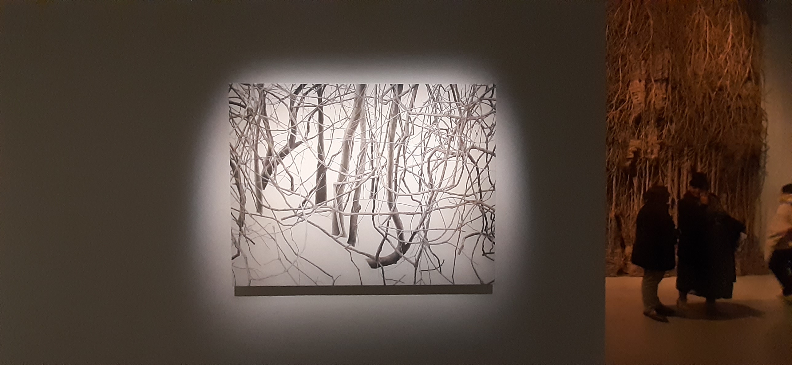
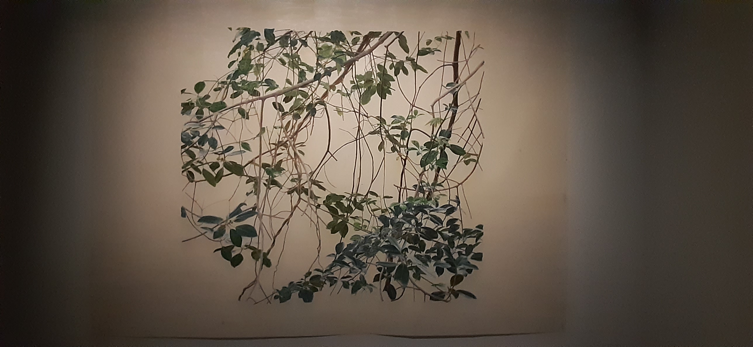
3.3.2020
This morning I messaged Guerra De La Paz – again. I’ll have to give up if I get no reply this time…I had a brief reply on their Facebook page a week or two ago, saying that they had never received my email, so I sent it again, but still no reply…
I’ve also contacted Oscar Murillo’s latest project website – where he asks for artwork / painting contributions from children around the world. It’s an impressive project, in it’s reach and organization, and although I responded to the invitation to access more of the archive on the site, I have had no response from there either…I’m usually pretty good at tracking things down and getting to the person I need to speak to, but I’m not doing too well so far on contacting artists. I’ve asked in what I think is the most appropriate way – simple questions, not too many of them, not a brief, to the point email, a little information about myself, but not too much…..etc., etc…giving my credentials for why they should bother to speak to me (!) – MA studies at UAL, my current and previous interests, but not so much as to bore them….I may have to follow another tack if it doesn’t work out, but I’m not too sure what, as yet.
I am pretty tenacious though, so not given up yet.
27.2.2020
There is a UCU strike on, but the tutors had made a great effort to make sure that we weren’t just abandoned….other events and meetings had been organised outside the college.
One of these was a visit to the ICA gallery in The Mall, in central London to see the Cameron Rowland exhib with Steven Wilson. He’s a great tutor, really focussed and enthusiastic.
The exhibition at first glance consisted of not a great deal, but in fact was a hugely detailed and shocking presentation of the history of slavery. Visually, at first sight not impressive, but the moment the detail of the printed contracts concerning the plantations and slaves became apparent, one realised how important it was to see this printed matter displayed as a museum / gallery exhibit. The fact that these mortgage agreements and contracts existed at all was shocking.
The artist purposely didn’t make it easy to find out about the exhibits, you had to work a little – there was no labelling of the pieces, and you had to have the catalogue and follow the positioning via the map. But then life was horribly difficult for the slaves…to say the least, so the viewers having to do a bit of work to understand the exhibition, seemed appropriate.
It would certainly warrant another visit – we had to leave sooner that expected…
25.2.2020
We have a short critical practice presentation on Thursday which should be really interesting, re hearing about other’s projects and main concerns.
In preparation, I was doing a bit more investigation of Oscar Murillo – a big influence of mine – and I found this piece about him from the Artsy website:
‘Oscar Murillo’s calligraphic mixed-media paintings and sculptural objects illustrate his fascination with failure, incompleteness, and the studio experience. Using work taken from the peripheries of his studio, typically left on the floor to gather dust, dirt, and fluid stains, he restructures these objects into new creations: paintings initially discarded as failures are appropriated and reconfigured as an opportunity to explore archaeology, ruin, and failure itself. Though conceptually different, Murillo’s calligraphic aesthetic evokes the signature style of Cy Twombly.’ (ref. Artsy.net website)
I wouldn’t say that I have a fascination with failure, (!) and I guess that’s easy to write about, bearing in mind Oscar Murillo’s success as an artist, but the items he uses to construct his works from – discarded scraps, re used bits of paintings that he’d abandoned, existing items and objects from his studio – all of this resonates with me and the way I end up working. I say ‘end up’, and by that I mean that I think this is a more interesting way of working – I prefer it, as the scraps and re appropriated items have a ‘previous life’ and are therefore more meaningful in the thread of my life.
20.2.2020
So the crit went pretty well, and as ever, it was really interesting to see the work of my fellows.
Yvonne Feng, a tutor I had never met before supervised the crit, and she was great – concentrated, serious about everybody’s work, and close questioning.
It was interesting that the two non painted features of my latest pieces – the gaffer tape and the wire coat hanger – were both remarked upon as possibly unnecessary, although the paintings were generally pretty well received. I was relieved, and feel that I have taken a bit of a step – the freeing up has worked and I’ve seen that people are accepting of it.
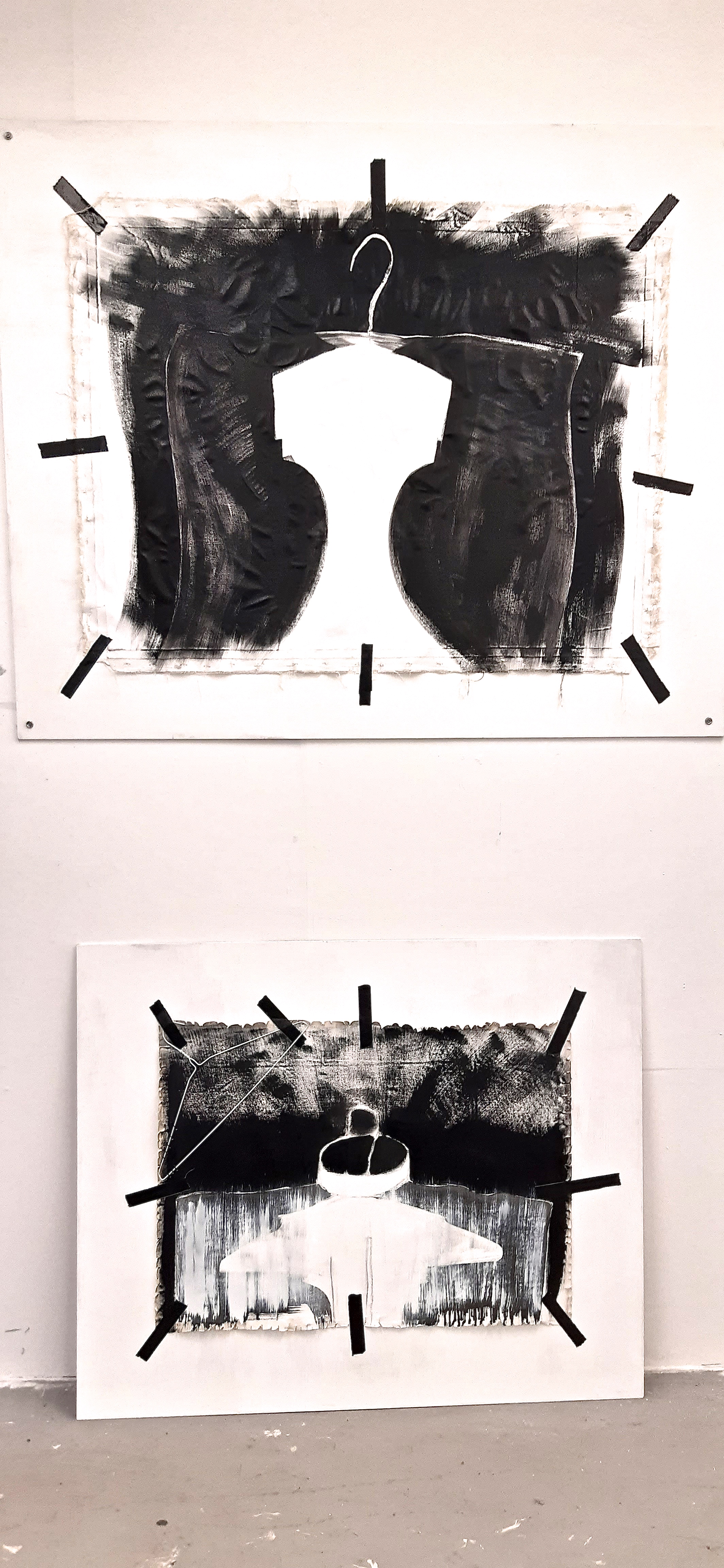
So now, I have to try working on my other threads – the ‘Big Polka’ photo which I have used to roughly start a medium sized painting on some scrap canvas, (the recycling element that runs through everything), and the ‘Wrapped Underwater’ photo.
I’m thinking that I may have the Big Polka photo digitally printed large scale, and then do something interesting with the print, such as maybe cut out the polka dots and thread some big lengths of calico through it, or something similar.
I also have several other ideas in the mix, which I must get on the go –
- the 3D Japanese pattern cutting based sewn constructions with the frayed seams on the outside
- the bodice block stencil painting idea
- the fraying tweed fabric as a component of a painting idea
- fabric gaffer tape (coloured) abstracts
19.2.2020
Today, I managed a fair bit of work – not actual painting, but presentation of the ‘Shirt’ series of paintings as we had a group crit coming up.
I got some plywood, had it cut and then painted it with white emulsion as a mount for my ‘Shirt’ paintings. Only problem was, when I put the PVA on the back of the canvas, it wrinkled pretty badly… the first piece I tried it on seemed to be OK, and I think that was because the canvas was thicker than the second piece. Maybe I shouldn’t have used a water based glue, but I really didn’t think it would have such a dramatic effect..maybe use spray mount next time, or something similar?
Having spoken to a fellow student, I have discovered something called ‘starch paste’ (from a company called A P Fitzpatrick), that I can use to stick canvas to the back board – plywood or other….so that should do the trick for next time!
Anyway, they’ll hopefully look loads better properly mounted – here’s some ‘before’ pictures, and I’ll post after pics when these are up tomorrow for the group crit:
L – R: ‘Shirt #1,#2 & #3’.


18.2.2020
Today I emailed directly the website of Guerra De La Paz, (about 12 hrs ago), but again, I have had no response.
Instead of being able to speak by email, I watched a few bits of some Youtube videos of them or their work. The most interesting I found was about the beautiful net cloud installation: (REF https://youtu.be/lQqS5OSEKT8
These are really simple – I learned from the video that this just several hundred metres of white tulle scrunched up and formed into a cloud like shape with light effects projected through them and storm sounds amplified…beauty in simplicity.
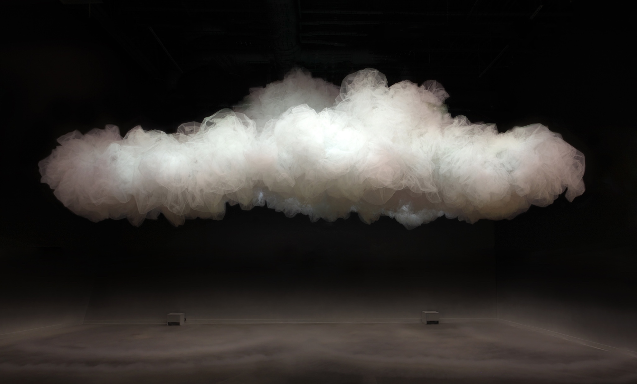
However, I watched parts of other videos about, and of them, and the whole impression I got was really patchy. I’ve come to realise, having watched a few videos of what artists say about their work, and how they speak, the way in which they come across is vitally important to their audience. Of course, I’m not saying that talking about the work is more important than the doing, but it’s a huge factor in being respected and engaging one’s audience.
I have previously had contact with the curator of the Fashion & Textile museum in London, Dennis Nothdruft, in relation to some of my own research I was doing several years ago, so I am thinking that he may be a really good person to contact again or my research…he has a daily art blog, is very knowledgeable, and may be interesting to further discuss style / clothing / and fashion with in relation to my work. So that’s the next plan!
17.2.2020
I feel as if I need to unpick a bit of a dichotemy in myself, which may help with understanding why I do what I do.
I wear a lot of black, my clothes are pretty anonymous, I try to fit in with my compadres. So, seeming to not wish to stand out from the crowd….. and yet, inside, I am pretty desperate to stand out from the crowd!
My recent work, has become freer – I somehow have given myself permission to get to the essence. Thinking hard about the essence, and why I do what I do, I think I have kind of come to terms with it – at least to not be frightened of how I express it.
The methods I am using seem to point to someone who’s frustrated and a bit angry…scouring the edges of the canvas, slashing, fraying, cutting, sometimes daubing the paint on the canvas….but I don’t consciously feel like this at all.
Yesterday, I emailed the Artworks For Change website , (Ref in link below), which features Guerra De La Paz, hoping to make contact for a short interview. The website / company itself is interesting to me as ecological concerns are a feature of their existence, and they are selling paintings and other artwork for funding for ecological projects.
14.2.2020
I discovered some pretty fabulous artists yesterday – a team called Guerra de la Paz – two guys Alain Guerra and Neraldo De La Paz, who make some amazing installations and sculptures – basically out of repurposed and found clothing. I plan to contact them (as part of the work for Unit 2 in the course, engaging with the outside world with one’s artwork / ideas / research), as I feel a lot of connections with what they do, and my own work. I have found images of their work included in a VERY good website , Artworks for Change, but no books.
Here’s a couple of images from the Art ForChange website: quite beautiful 3D shapes, and as far as I know a really original idea. They look as if the clothing / fabrics have been steam pressed or steam moulded into different shapes, according to the idea of the artwork. This makes me think that I could possibly incorporate this idea, or at least a version of it – flattening some fabric shapes with my industrial steam iron at my home studio and incorporating those into paintings.
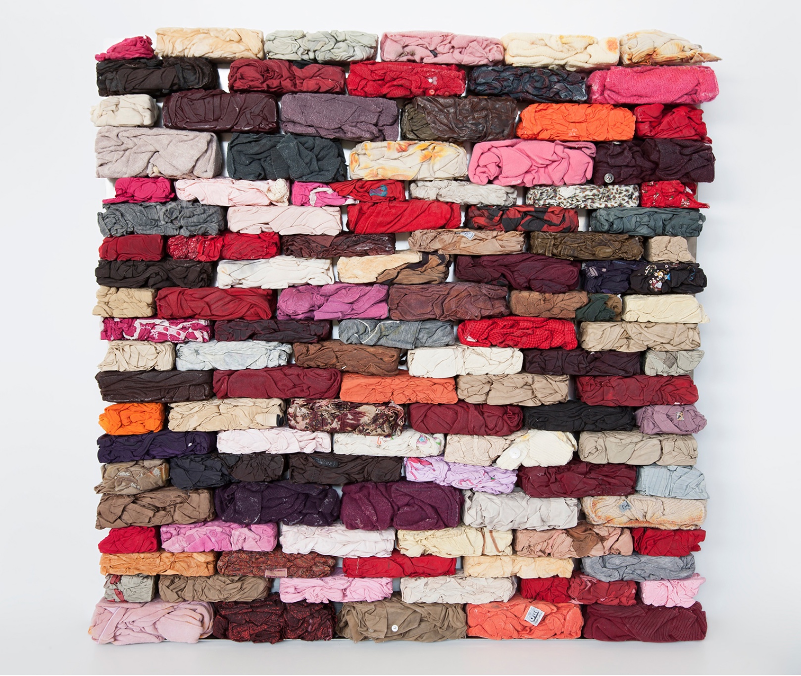
Guerra de la Paz, 2014, found garments and stainless steel, 48″ x 48″ x 4″, © 2014
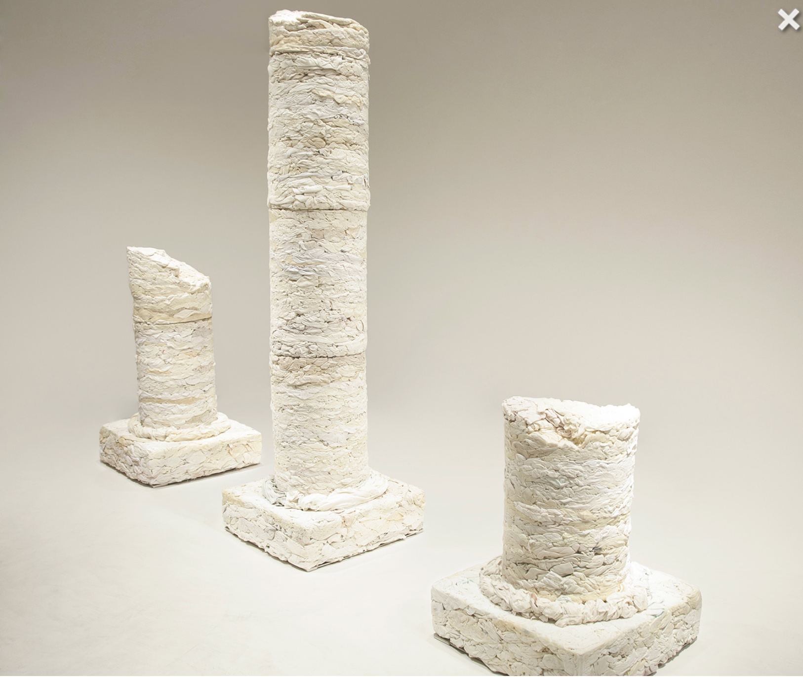
13.2.2020
We had a reading group session yesterday, which was actually watching a video of a young Francis Bacon, talking about his work – his working methods and saying how he thought about it. How people described his distorted faces as ‘wounds’. Mark Fairnington conducted it well, I thought, stopping the video every now and again to discuss what Bacon had just said.
One interesting thing was the way Bacon talked so candidly about his work and whether he thought a particular painting had worked or not. Mark pointed out that as the art market is now, i.e. buyers paying possibly millions for a painting, artists wouldn’t be advised to talk in such a way! Most of what happens now, purely revolves around money, which is a shame. By this, I mean that the example I mentioned, just wouldn’t happen now, and I think it’s a shame that more people – the ‘general public’, don’t get to hear an artist talking honestly and interestingly about their work – what the process is, and how successful they thought it was.
I have watched a few interviews with artist Jenny Saville, who is a knowledgeable, confident speaker, and who’s paintings sell for a GREAT DEAL, but I don’t get the impression that she is speaking wholly honestly – well, being economical with the truth perhaps? I love her paintings, but I feel she is speaking more in promotion of her work, sort of doing a promo gig, rather than simply speaking about her process, although she does do that to an extent.
Today, I decided to ‘prepare’ a readymade canvas I had that was on a stretcher. (This was to do a canvas version of ‘Shirt #3’ previously just done on paper as shown below).
‘Preparing’ in this case involves destroying! Or rather, shredding the edges with a wire brush to expose the threads and fibres of the canvas, and divorce it from being perfectly stapled and trimmed to the stretcher. It has a primed surface, but not very strongly primed, so relatively easy to scour away, and it’s so much easier to do it whilst still on the stretcher as it holds it firm and taut. Once it’s off the stretcher, it has to be laid on a metal table – I have been using the sculpture metal workshop to do these things as the facilities are more suitable than the studio – tools, and a dust suction table.
The act of destroying the existing perfect edge of the canvas on the stretcher, somehow makes it more ‘mine’, or shall we say, I’ve put my mark on the raw material, so that I can then proceed with more freedom. By that I mean that I don’t feel hampered by a hard edged canvas, and my ground is then more malleable to my purposes.
I never quite know how things will turn out, but I have a basic starting idea, such as ‘take the canvas off the stretcher and scour it, to show it’s materiality’, then ‘let’s slash the canvas and rough it up/ scour it to see what happens’. I guess nowadays I like to give myself a bit of a surprise, as I can work in a very controlled way, but that doesn’t interest me any more. The scary thing is to not really know where a piece of work is headed, but I think that fresher work comes out of that
It worked pretty well:
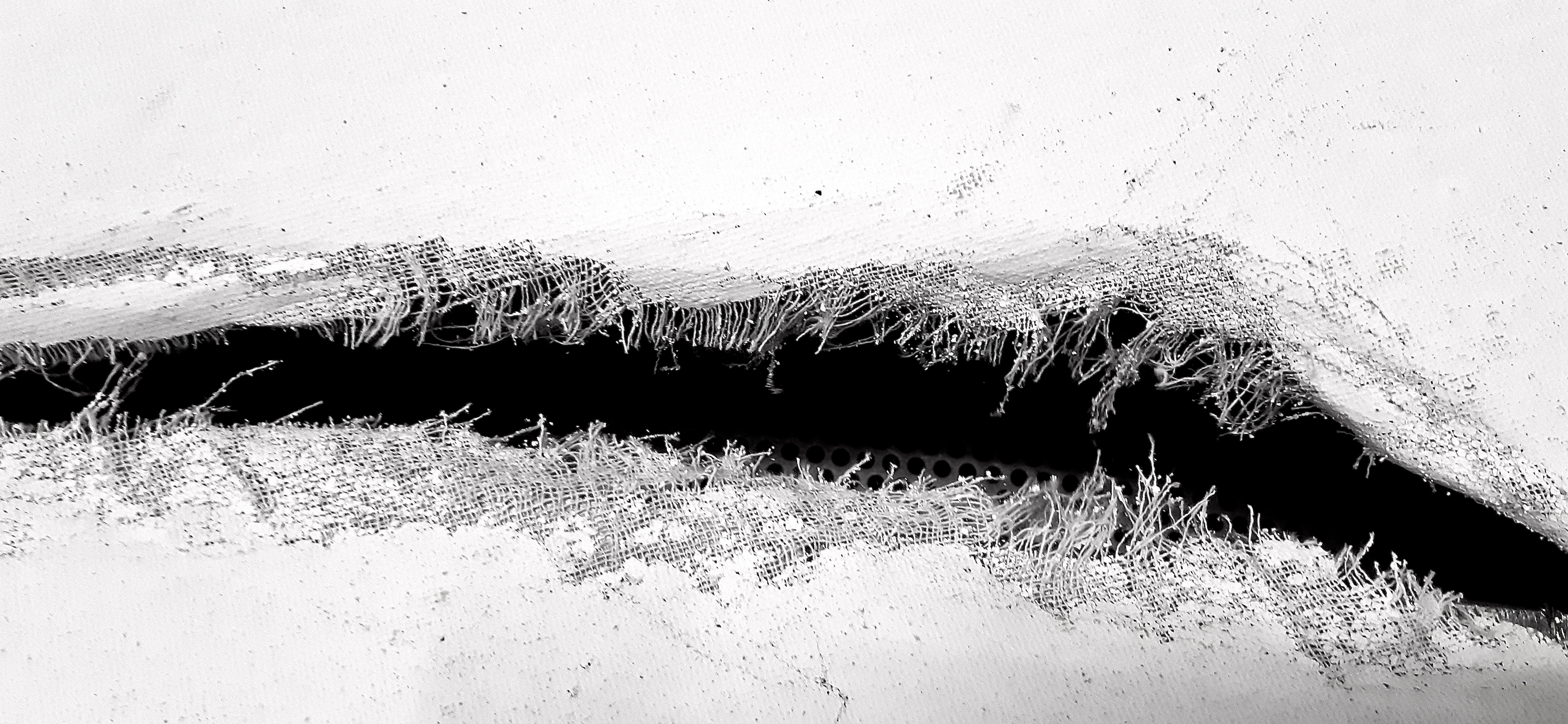
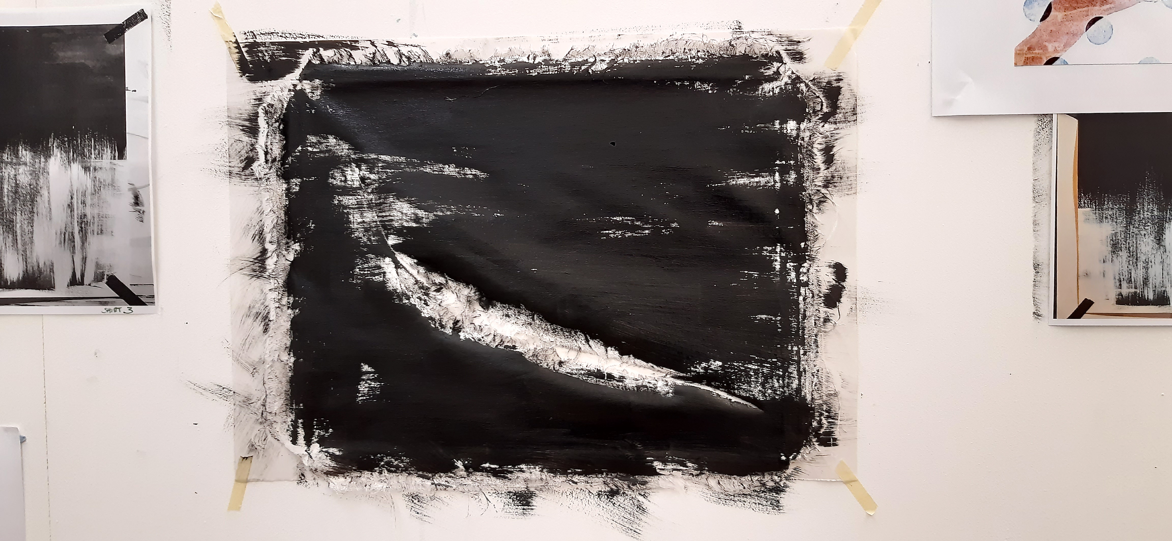
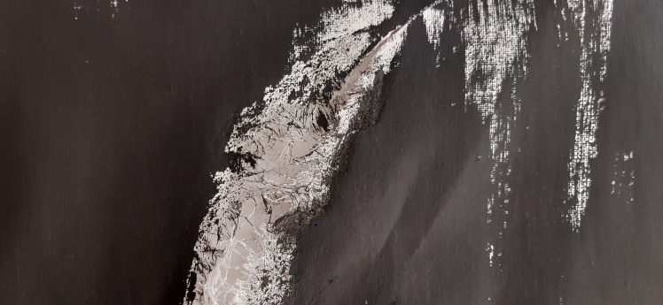
9.2.2020
Started large ‘Shirt 3’ at my home studio, so it’s acrylic on heavy paper, as that’s what I have up there to work with. It’s stripped down even more now, so will be very abstracted, monotone. I’ve realised that the brushstrokes I’ve made the lower ‘shirt’ part with, look like the weft of woven fabric, and the white brush strokes I put on tomorrow will look like the warp…kind of. In other words, the horizontal and the vertical threads in weaving, known as the warp and the weft. Kind of appropriate…
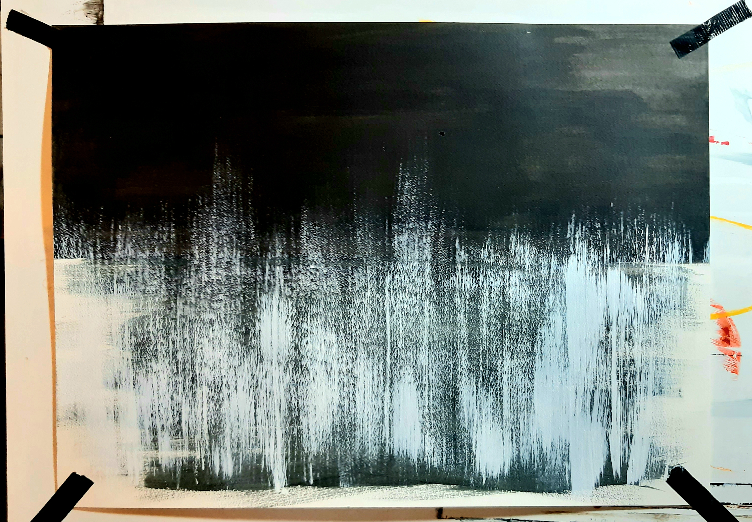
And I shredded a small cheap ‘sketchbook’ canvas that I happened to have at home. (These canvases from a high street shop are really cheap, so I use them as sketchbook pages for trials…) I’m thinking that I’ll also use this image alone as the basis of some kind of series, or a bigger work. I love the minimal / graphic / monotone quality of the photo which I edited a bit on iPhoto to increase the contrast and the ‘colour’ – turned it greyscale in fact.
The image of the canvas’s materiality displayed so starkly is really inspiring to me. I may get some more pieces, stitch them together, (a la Japanese pattern cutting methods) and rephotograph with the frayed edges on the outside.
6.2.2020
Had a very good tutorial with my course leader, Geraint today.
I explained that I was a bit disappointed at my grade (a bit lower than I hoped), for the Unit 1 assessment, and that I was pretty determined to improve it! I don’t want to be second best, and although I know that I’m not going to be top of the pile, I know that I can do better than this.
There was a bit of a revelation in that I was under the impression that I had to find artists that I had a common theme with, and that related directly to what I do. But it seems that if I find artists with whom I can find a connection, all I have to do is analyse and discuss what it is they do, show that I have researched and questioned aspects of their work, and how it might relate to me, what exactly it is that they do – not in a direct way, but in a way that shows understanding and investigation. So, a dialogue with myself.
So I’ve just been looking at the work of a writer and art historian (who I discovered by watching the Vivienne Westwood film, ‘Painted Ladies’, as she was speaking in it), Anne Hollander. It’s really interesting what is written below, as I feel an affinity with the things said about how she presented herself and how she felt about herself and her appearance
‘Many younger writers give Ms. Hollander credit for helping change how fashion and clothing are written about and studied. “It had this taint of a women’s-page subject,” said Judith Thurman, who writes about fashion for The New Yorker, “and she just refused that and insisted that it’s a subject of universal importance.” (Ref New Yorker, 2015)
I love the way she denied the frivolity/surface aspect of how people dress, as this subject was obviously very important to her, (as it is to me!), here described by her husband, Thomas Nagel:
‘Mr. Nagel said his wife was particularly attuned to her own appearance. “It was a matter of great attention,” he said. “She thought it was an art.” She believed, Mr. Nagel added, that people should be concerned with how they look from all angles: “She thought you should always use the double mirror before you leave the house.”’
Seriously, I concur on these thoughts! And whereas some people might regard this as inconsequential fussing over appearance, it matters to me as much as it obviously mattered to her.
So this makes me think – in a rather grandiose concept – that making oneself look ‘right’, to one’s own eyes – is it in some way making an artwork of your appearance? Well, I never thought of it like that before, and at the risk of severe scoffing (!), it’s an idea to consider.
Here’s the second in the ‘Shirt’ series, which I started yesterday.
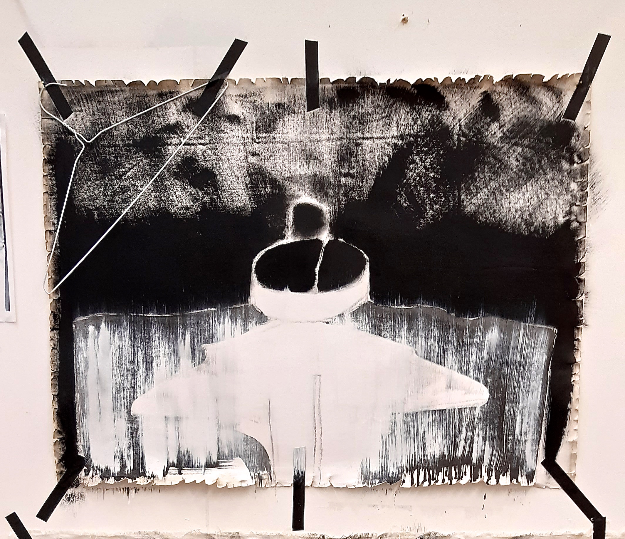
5.2.2020
Unit 2 briefing today – and the message was to do what my assessment feedback had already told me – to focus, hone down, identify specifically where I need my work to go, and how external collaborations should be formed and followed up for ‘future reference’. And what is it all about? I’m a bit panicked that I still can’t put a finger on it, but I must just keep on working and hopefully it will become apparent. I kind of know, but still not in enough detail.
Here’s a few thoughts that keep running through my head, in relation to my work, so I’m going to get them down on the page, even though they might sound a bit disjointed or unexpained:
- I hate to be labelled by what I wear, and by that I mean labelled by brand / style / colour, etc…or labelled as being a certain type of person by the clothes I wear, i.e. wearing a Barbour jacket means that you are a certain kind of ‘country’ woman- usually Conservative voting, supporting ‘country sports’ – fox hunting, shooting etc., etc……. But the truth is that the Barbour jacket I possess was given to me by my brother, and it was a freebie with some drinks promotion! So yes, a by product of big business, I am ashamed to admit, but at the time it was given to me I just didn’t think about that, and felt please to have a jacket that wasn’t showy, was functional and good quality, so it would last a long while. So I try to dress anonymously.
- I have bought clothes in the past, just because I loved the fabric, and fit didn’t really come into it.
- At home, I can tell what item is on a high shelf in a cupboard, or at the back of the shelf that I can’t see, simply by ‘feel’. I guess that’s to do with having a sensory memory. I’ve found in the past that I’m pretty good at that, and can remember colours, sounds, feelings (of objects),
- my work is VERY much about fabric, but I love the brush on the canvas or paper, so it’s about the materiality, really.
- Artist’s canvas is in fact fabric, which is easily forgotten if its on a square or rectangular stretcher. So I do have a kind of head start there…
- I pretty much like the ‘Shirt’ painting I did last week, with the scoured edges, it’s much freer, so today I tried to repeat the edge effect. But I think that because the canvas I was using was in fact gessoed on both sides, it didn’t behave in the same way, so I snipped and tore it a bit as I was wire brushing it, but I thought it looked a bit too ‘pretty/frilly’. At least it looks a bit ‘weathered / distressed’ but I think for the next painting, I’ll not use ‘double gessoed’ canvas, I’ll maybe tear it a bit more radically, and it will also be much simpler
- I have Robert Motherwell in my head when I use the big brush with black paint in big strokes. I want to do a fair bit more of that, and hope to in the ‘Shirt’ series. Just waiting for the ordered Liquin to come, as I’m now totally out.
- I’ve just had an idea to do a painting using strips of varying weight and texture canvases/ other fabrics all scoured, frayed and painted and stitched together somehow…
I also need to link my work to some current sociological / ecological idea, and the closest one that presents itself to me is actually recycling, as I think I am a natural born recycler anyway. All through my life I have always repurposed things, or else ‘preserved’ them. This doesn’t sound particularly exciting, but I may add to this in the next few weeks.
This evening I watched the first part of the Vivienne Westwood film, ‘Painted Ladies: Nobility, Virtue and Morality’ which was really good, and very interesting, about clothing, fabrics and art. In the film, a Savile Row tailor, Doug Heywood, said some interesting things about how people think about and wear their clothes. He said:
‘People have an idea of themselves, and how they should present themselves, and how they should look, and clothes can help that a lot. The most important thing is that people have got to feel right, and if he (the customer) feels right, he’s going to BE right.’ (Ref. Heywood, D.,
One of his customers wanted an aged look to a new velvet jacket to wear to the opera, so the tailor, who was about the same size, wore it for about 3 weeks to pre-age it! A direct example of feeling right due to the way you look…
I have always held the view that clothes should ‘feel’ good as much as they should look good. If they don’t you will never wear them.
So, equally, I want my paintings to make the viewer feel something – I want the image to ‘speak’ to them, otherwise why would they want to put it on their wall? So, I’m not about to make perfect paintings of shirts / dresses or anything…I just want to make an image that engages and excites…… by the image itself, the way it is painted, the presentation, the colour and tonal range, so that the viewer would want to have it on their wall and look at it whenever they want.
3.2.2020
I’m considering where I place myself in art movements / styles, as I feel I have been lacking in this, and my Unit 1 assessment feedback came through today and confirmed as much. It was a ‘Good’ result, but I was hoping for a bit better.
2.2.2020
Right, now I’m starting to do some of what Anna BB and my academic tutor Laura, advised after my assessment feedback:
- take a step back & have a good think about what is the main ‘thread’ in my work, so as to hone everything down. It may then be simpler to make a better analysis of what my important themes are.
- ‘Speak’ to my work, and ask the question ‘why did I make you?’! I rather love that idea, but I think it is a really good way of identifying what I’m trying to do.
So much of this is about psychology…. I know this, and although Anna said that a lot of how I wrote was ‘formal’ – in other words, about the actuality of my work – I think that maybe I should ask for an example of the kind of thing I should be doing…she said my style of writing was fine, but I just wasn’t speaking enough about the thoughts and ideas around my work. So this is where I start to try and change that.
(I do think that if I could somehow put a name – a word or phrase – to my ‘thread’, it might be easier to progress more quickly and purposefully. I thought that ‘Fabrication’, which was part of the title of my 10 minute presentation, was not bad – the two meanings of fabrication being to make something, and the more colloquial meaning being to make something up untruthfully – i.e. a lie. But of course, ‘fabrication’ doesn’t tell the observer a lot about what’s behind the work.)
*************************
Anyway, here are some thoughts, questions and memories of my subjects/influences that I have mentioned, which both tutors thought I should write about in this journal. I also thought it was a great idea, and I’m totally open to finding ways to operate more effectively:
- I’m still pretty mystified as to why clothing and fabrics (which a lot of my work is about), are SO important to me…in fact, thinking about it, one reason is probably because I had a big exposure to them as a child, and my favourite thing in the toy cupboard was a piece of brilliant orange satin. Maybe I should stop thinking about ‘WHY’ and just move on…??
- Why do I say that some days, I would like to ‘hide inside my clothes’?
- Why I find it hard to throw away clothes that have sentimental attachments, or why I find it really hard to throw away clothes that I love, but are worn out, or don’t fit any more? (But if I get someone else to actually throw the things away, it’s OK – if they really need to go) Clothes of my mother’s, or my own…I know they are only pieces of fabric, whether knitted or woven, but the fabric has been next to the wearer’s skin, and in my mind has absorbed some of their ‘essence’, (in my mother’s case), their personality, their body scent – things that seem intangible otherwise, I guess it’s kind of a way of preserving those things even after the person is dead. So a kind of memory, a momento mori. Maybe if I were religious, I wouldn’t find those material things so important.
- Why do I love the background and edges of things? It might be because those liminal things represent imperfections that exist in an otherwise, ‘finished’ painting or drawing, or 3D piece, and that they show something ‘real’ as opposed to what is presented in the main area of an artwork. (I recently purposely shredded the edges of a canvas with a wire brush to give it the right effect.)
- It is pretty strange that I think like this, as one of my aims in life until about a year ago was to make everything as ‘perfect’ as possible, in all aspects of my life. This was only in an effort to do the best I could, but now I realise that in fact I prefer pieces of artwork that are not totally perfect, finished items, and that I love expressive, gestural marks and painting. For me, it’s hard to resist the thought that things must be ‘finished’, but I am training myself to think otherwise, as, instinctively, I much prefer the unfinished. To me it shows the human hand or arm, and eye, which is the strength of the kind of painting, drawing, 3D collations, or sculpture – that speaks to me.
- I think that, really, all this is to do with my upbringing – ‘Do as you are told’, ‘Behave!’ etc…but why is this so ingrained in me – a woman of ‘advancing years’, who has never been much of a conformist since childhood?! It’s about time I stopped caring so much, and returned to my original non conformism. But I do this as I care a lot about the development of my artwork, and I see this as a way of progressing…
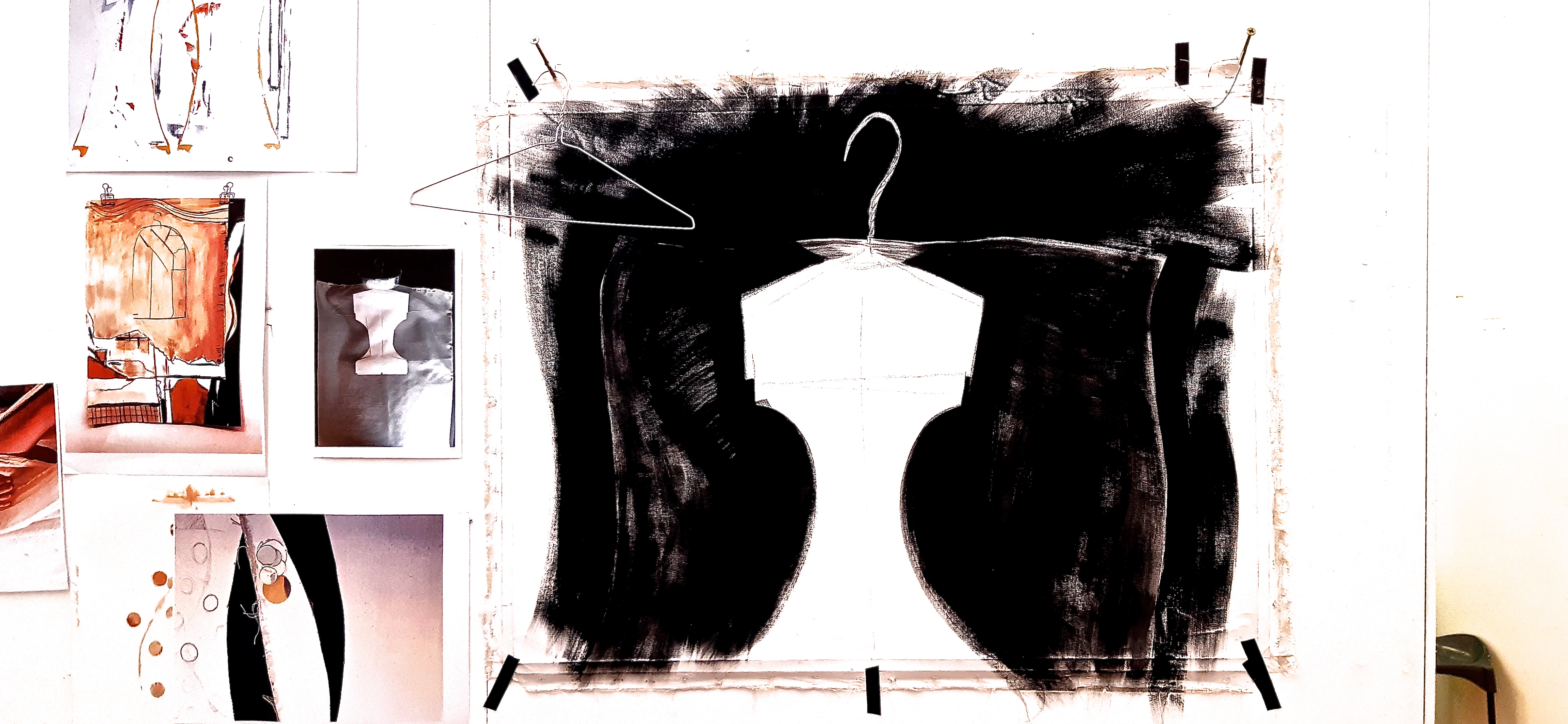
30.1.2020
So, very interesting feedback today on Unit 1 in my session with Anna Bunting-Branch.
I was apprehensive at first, as I have only had one previous interaction with her briefly, some time ago, but I needn’t have worried, as she really seems to understand what I’m about , and can probably put it all into words better than me! The word ‘Fashion’ came up, but I had to put her right, as I don’t think my work is about fashion at all, it’s actually about style, clothing, fabrics etc., which aren’t necessarily anything to do with Fashion. She accepted my definition!
She was very positive, and seemed to like how my work was going. My dismantling of the ‘Patchwork Psyche’ piece has paid off (although it was a bit worrying at the time!), as she commented that it was good to see new work up and started. (Have to say, I feel the same, having had a big hiatus with finishing the writing for the online journal, writing and preparing the 10 minute / 1000 word presentation, and then giving the presentation, which all seemed to take several weeks!)
I didn’t get as high a grade as I was hoping for though, but I think this is down to my critical reflection in the online journal.
29.1.2020
Since my academic tutorial, I now have a bit of a clearer idea of what I have to do to improve my critical writing: linking my work to other artists who may be working in a similar way, and thereby finding out what they have to say, and what reviewers / gallerist / associates have to say about their work. It was the ‘how to find those references I was having trouble with, but she suggested more specific ways of searching which should help me.
Later, I borrowed a wire brush fro the metal workshop in sculpture, and shredded the edges of a canvas I had, (whilst still on the stretcher), as I wanted that ‘anti-perfection’ look that is a current thread of my work. this worked pretty well, but then I had the job of prising off all the staples that held it to the stretcher, and that took more than an hour (!) as they were thick and deeply embedded. Anyway, finally I got it up on the wall, and started! Here’s a quick look. I’m wondering how far to go with this. I quite like how it looks at the moment…
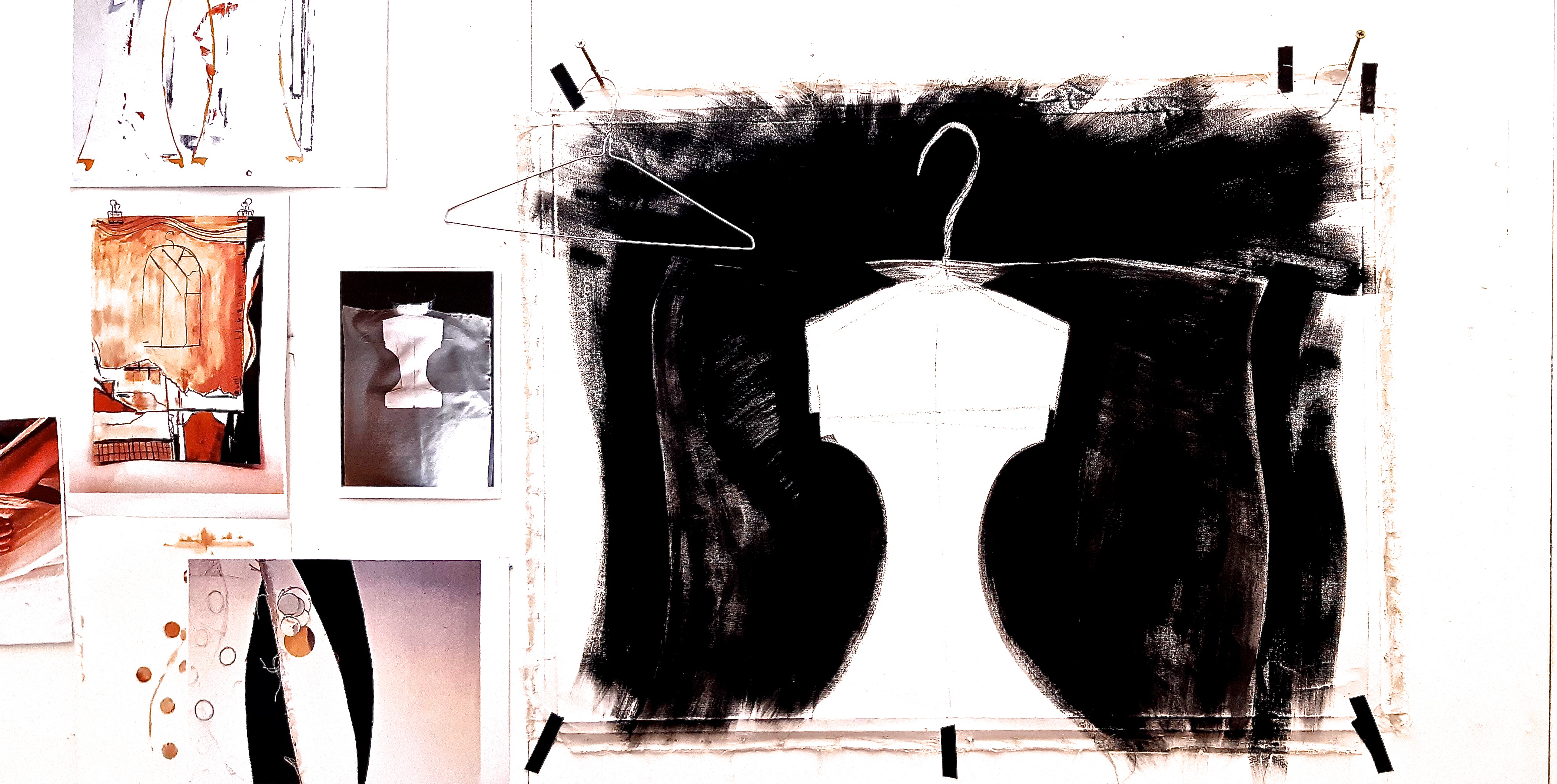
My job now is speaking to my artworks and asking them, ‘Why did I make you’?!
27.1.2020
It’s been a while! Longest gap in my writing of this journal, due mostly to meeting the deadline for Unit 1 of this course…LOTS of writing, writing, writing….
My presentation was OK, but I really have no idea until I get some feedback which will happen on Thursday. I think it was reasonable, but despite rehearsing about 15 times with the timer on my phone, and being pretty much spot on, I was a bit nervous, so actually forgot to set the timer going! I think I was about 30 seconds over, but anyway….a few people said it was interesting / good, but who knows?
So, of course I have been itching to get on with some of my ideas for new work – there’s at least five at the moment, so I just need to get some quicker techniques – oil on paper for at least one of the ideas. I’ve used that before, and I liked that because a) the paper stays flat (no rippling with water based paints), and b) I have a good range of colours in my oils… I may try oil pastel, though there’s always the problem that it never ‘dries’. I have got round that before by fixing it – using an acrylic spray varnish. Oil pastel will suit the mixture of the grainy and smooth textures of one of the images I want to start with.
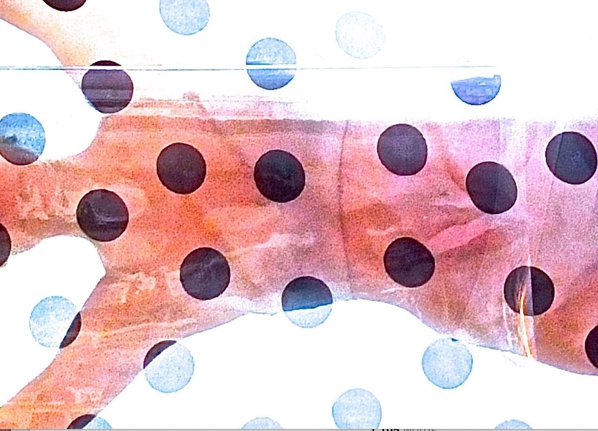
Saturday I bought a couple more colours in tubes of acrylic paint, (having bought another pouch at Cowling & Wilcox a few days ago) and yesterday and today I added to the ‘Curved and Snipped’ piece – I added the ‘drawn’ circles (polka dots / punched holes) and drew/painted more elaborate ‘shaded’ circles on the adjoining section. That gives me yet another idea for a very simple, big scale shaded circle, done with a bigger nozzle on the pouch – really plain abstract. However, I decided I didn’t like the drawn holes much, I think it looks like a textile print design….so I gessoed them over. I think I’ll re paint them plain, or even with a broad brush stroke, as I was painting today (29th Jan). I’ve devised a method of mounting this piece, which is what I intend to do with every piece from now on so as to avoid the difficulties with ‘Patchwork Psyche’!! It will be fixed to a piece of 2″x1/2″, with something like panel pins down the seam, or staples, depending which looks best…
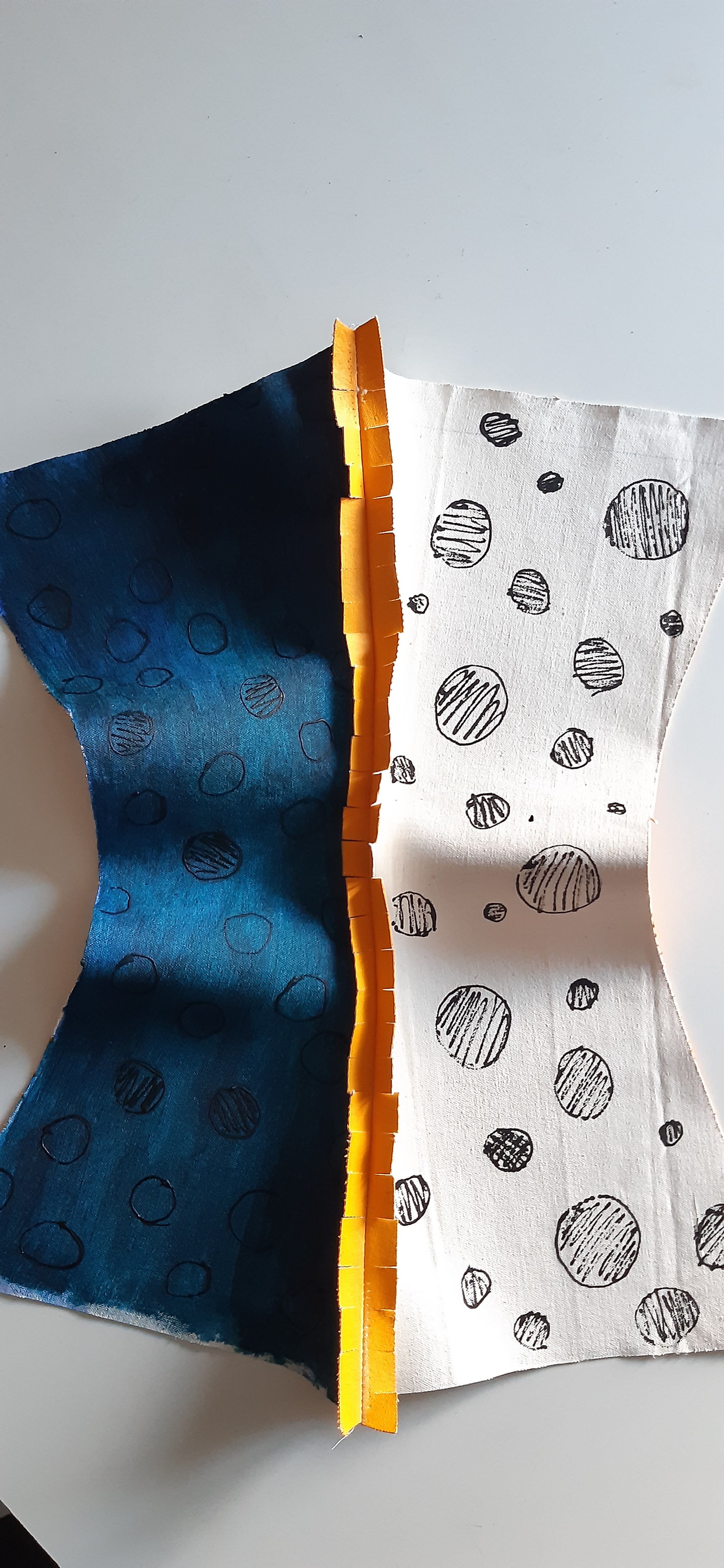
About 10 days ago I went into the local ‘Men’s Outfitters’ (formal conventional menswear shop!) to ask them if they had any card shirt inners and collar supports I could have….they were very helpful, and yesterday, I started on a piece I had an idea for, based on these elements. I’m aiming to paint this, a it’s quite an interesting, unusual image – abstracting it a little bit, and scrubbing / shredding the edge of the unstretchered canvas with a wire brush or somesuch…
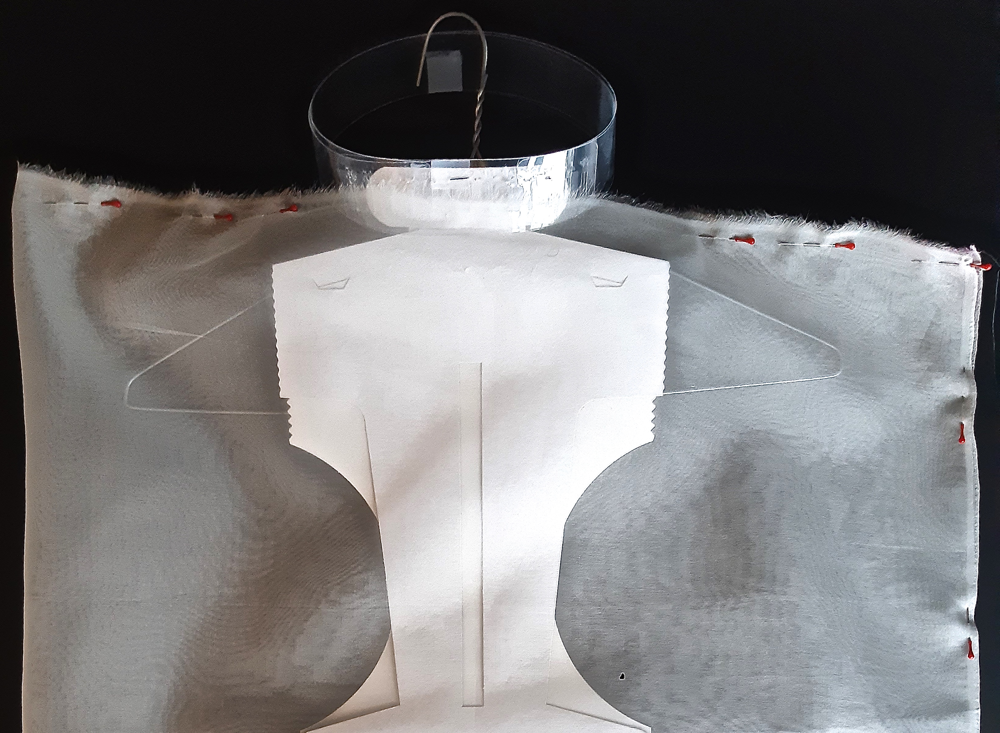
UNIT 2 STARTS HERE AND ABOVE
8.1.2020
I went to the South London Gallery this afternoon to see the Bloomberg New Contemporaries. A few of my fellow students didn’t seem to be that impressed, but I thought it was pretty good! Some interesting work – video, photography, painting, sculpture. Really varied and good to see recently graduated artists and how they presented their work.
The only problem was that although there was an expensively printed (I assume) sheet in a choice of two colours, with the list of artists etc., there was no plan/ map/diagram of where each piece was so not easy to identify sculptures in the centre of the room. (NB Remember this if I am involved in setting up an exhibition in the future!)
Here’s some images from the exhibition – click on each for caption:


7.1.2020
One to One tutorial with my course leader, Geraint Evans.
This was VERY useful, as G had a quick read of my script for the 10 minute presentation, and pointed out something very important i.e. that in that document, I hadn’t actually talked about the essence of my thinking about my work, in other words what it’s really about, and how I could develop the work in future. I was talking about it with him in the tutorial, but I hadn’t put those thoughts down in the presentation ‘script’.
I was thinking of the document as a shortened, stripped down version of this online journal, but that is not the case. So, I will have to rewrite! Glad I found out now than nearer the deadline.
My only problem is that now I have a lot of ideas about new work, and I know that I won’t have time to do much of it before the presentation, but I may be able to do something, and can put this in the presentation and write about the ideas.
I’ve decided that one thing I should certainly include in any new work, are my disintegrated garments – things that were perfect at the time I was wearing them for various reasons: either that the fabric was so lovely, (‘lovely’ being a very woolly word to describe a thing, but it can encompass quality / colour / design / functionality), that I just wanted to wear it continuously, or that the garment fitted perfectly, so was a joy to wear.
Also, decided to do a small informal survey about why people wear certain items of clothing. Of course my work is not about people generally, but I thought that this may give me some insight into my own presentation to the world….
2.1.2020
I discovered the artist Sheila Hicks this morning via the Artsy website, which was sent in the excellent Guardian Art & Design blog that I subscribe to. She has a large textile element of her work, but she really uses it in an ‘art’ way, not so much a craft way…I feel an affinity therefore to her perceptions of how fibre and thread can be used as part of artworks (paintings?), rather than the artwork being simply a tapestry, or a woven piece. She does some work on a large scale, which I am intending to investigate, and says this about some of her site specific work that was installed in buildings when she was working with two architects, Mathias Goeritz and Luis Barragán. “I like the way architects work,” she says. “They share, brainstorm together.” I also like her quote here from the Guardian article:
“The idea of it’s monumentality (a large scale work) is to envelop you. You’re not thinking about the grains of the sugar—you’re in a huge lemon meringue pie.”
There are some really interesting things said about her work in the article regarding scale (which is one of my strong interests), and how artworks are perceived by others depending on scale:
While such site-specific commissions helped promote Hicks’s artistic profile on a grand scale, some proved to be vulnerable to the whims of designers and developers. As the TWA terminal evolved, (it’s now a hotel), Hicks’s work was torn out.
While these large-scale projects are particularly visible, Hicks doesn’t necessarily view them as the core of her practice. At times, she noted, no one even bothered to contact her when they remove her work from a building—they don’t consult her or ask if she’d like the piece back. In this way, her smaller works tend to be more lasting.’
So, this is something to consider – whether a ‘lasting’ element of my work is important to me, or whether scale is of primary importance.
31.12.19
New work plan continued:
I plan to make two BIG paintings, (one stitched), each based on one of these two images. The first is from a photoshoot a while ago with fabric wrapped loosely around the model. The image is rotated by 45 degrees, and looks to me as if she is floating, with the black transparent organza fabric looking like the surface of the water seen from underneath. I love the fine detail of the fabric enhanced by photo editing on iPhoto. As fabrics feature so often in my themes and motifs, I’m very interested to do this as the image really makes the fabric the main subject matter. I think I’ll make this about 5 ft x 3ft (150cm x 90cm), as I want the scale to be slightly bigger than lifesize.
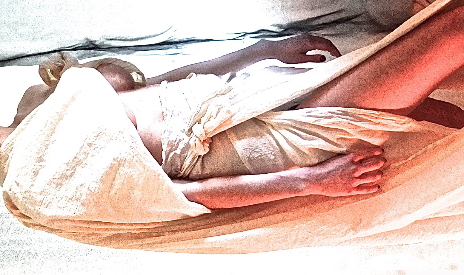
And then I plan to make a really big version of this, below, as I think it’ll work well at about 8ft (96″/ 245cm) high. It’ll be ‘stitched’ with something about the size of a bed sheet. I’ll give it a go, and see what transpires. Scale has always been of interest to me and I need to start really investigating it.
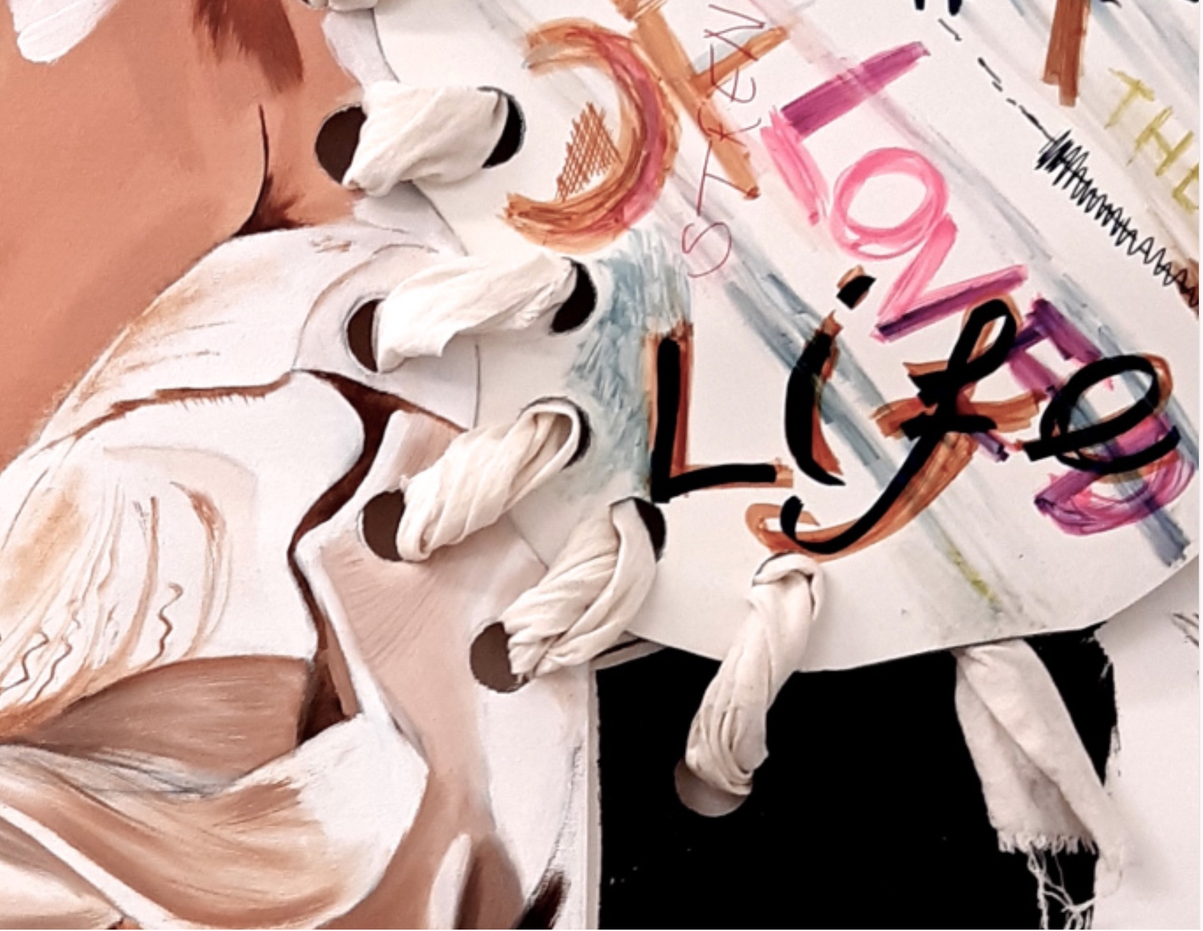
Other new work plans:
I found an image of something I did in the 2nd week of the course, the style of which I would like to repeat / develop. It was done really quickly from one of my building site photos, with scene painters charcoal and oil on paper, and I pinched an image I had of an abstract drawing of a jacket by Richard Diebenkorn, (Diebenkorn, R. 1990) to put on the plain plaster wall – a bit like graffiti – although the idea stemmed from a fresco – a painting made on raw, wet plaster.
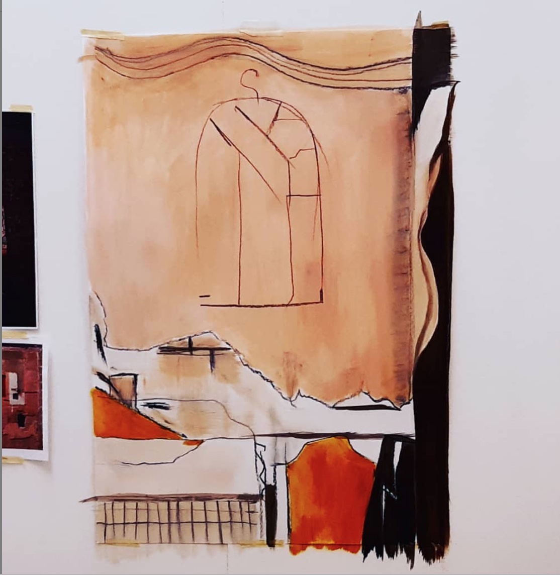
I love Diebenkorn’s big scale abstract paintings from the 1960’s and 70’s, which consist mainly of geometric rectangles and strips in almost luminous, transparent, light, clear, sea and coastal colours – the Ocean Park series, painted in oil and charcoal, but one of the things I noticed about those paintings was the contrast of the scratchy charcoal lines and the large areas of smooth oil paint.
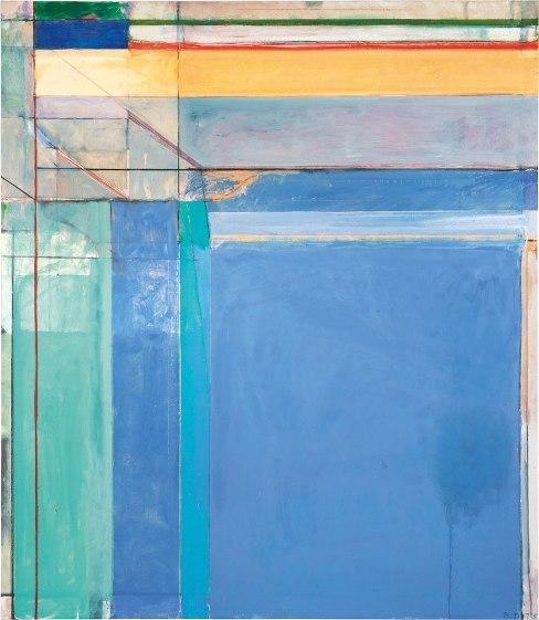
(Richard Diebenkorn, Royal Academy of Arts, London, exhibition catalogue, 2015, p.143 – 157).
So I wanted to try the combination of charcoal and paint for myself, as I thought that was pretty unusual for a painting. Reading about RD in the book, I see that drawing was always an important part of his work, though not as plans for his paintings – more it was a separate thing altogether.
This drawing of his that I found accidentally was a real aberration, but it stuck in my mind, partly because it was an aberration, but also because it had a relationship to fashion drawings and pattern drafting – the connection was all there for me.
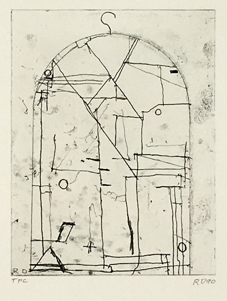
24.12.2019
Christmas has got in the way a little bit, but…even artists have to participate in the real world sometimes!
I went to the Kiki Smith exhibition at the Museum of Modern Art in Oxford today, as the Anselm Kiefer exhibition at White Cube, Bermondsey was closed!
Pretty disappointed (about the Anselm Kiefer), as I was really looking forward to it. I feel some definite connections with my own work as quite a lot of his work involves ‘scavenged’ and found items, even though his scale is often massive! I have a constant aim in mind to make some bigger pieces than I currently do, so Anselm Kiefer’s work is a big influence and pretty awe inspiring too…I will go in January, but I hope there is still time to include my thoughts in this journal!
Anyway, the Kiki Smith exhibition didn’t do a great deal for me really. The machine made tapestries were impressive in size, and number – twelve – and were useful to me regarding seeing how they were hung (on big brackets screwed to the wall), but I ended up wondering why they were tapestries in fact, and why hadn’t she just showed the original collages/collations? In the text on the gallery wall it was explained that she photographs the original artworks which can then be digitally worked on, and then sent to be made into tapestries. But I think it might have been interesting to see some originals, alongside the tapestries.
She does a huge variety of types of artworks – drawings, prints, photography, paintings and sculpture, (prints probably being my favourites), but even so, I’m afraid I wasn’t overly impressed.
The thing I liked best was the small room of this great building, part new, part old with interesting abstract shapes on the floor, plus the painted cast iron pillars….


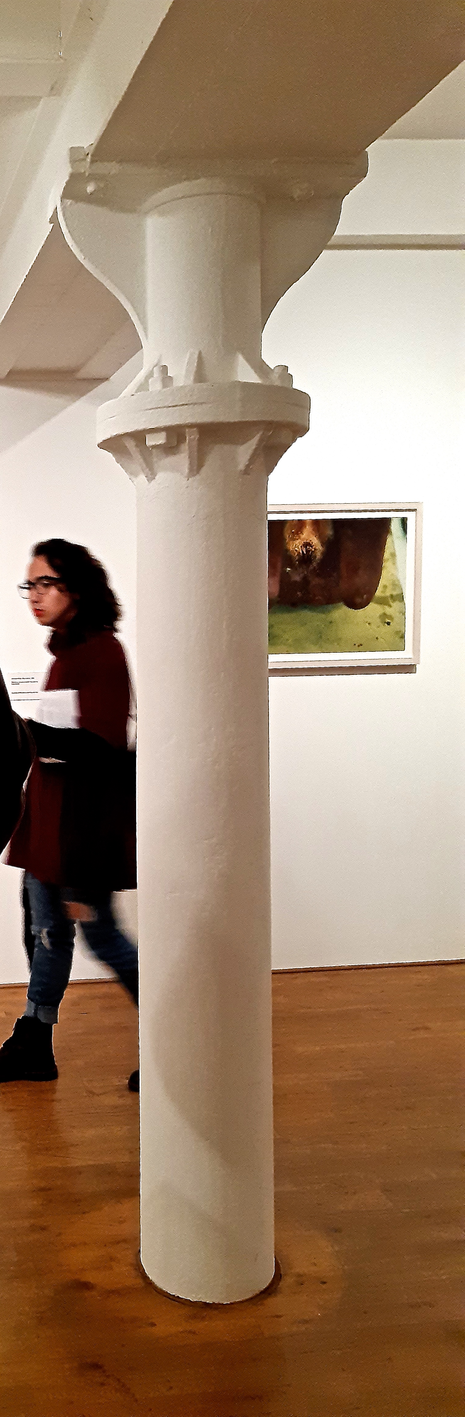
17.12.19
I made this test piece (below) for the very simple painting idea that follows. I was just trying out a different scale to see the result, and also testing the drawing properties of the fine nozzle paint pouch. I liked the effect a lot, and plan to do more as soon as possible, and to refine and develop the painted ‘stitches’.
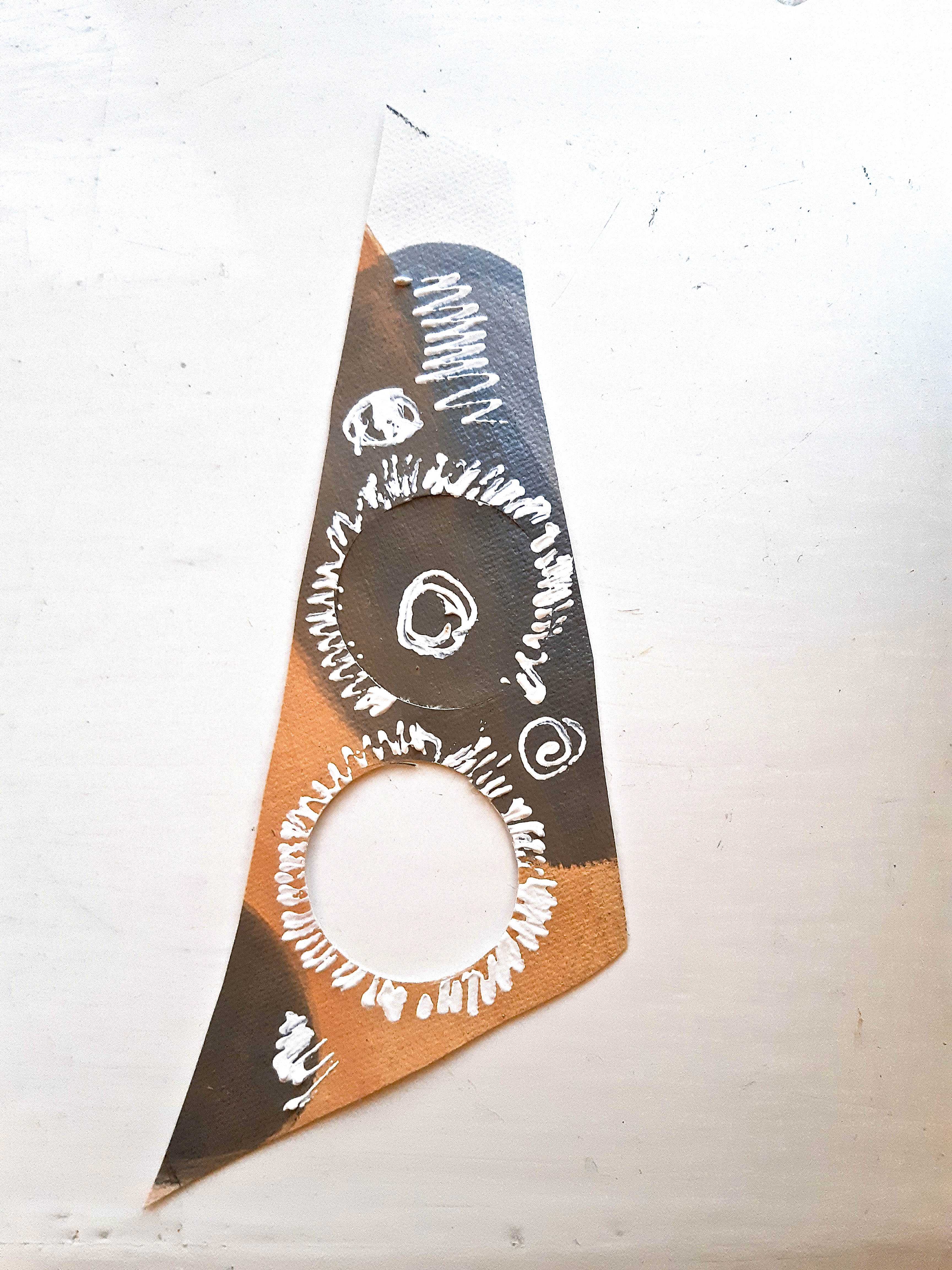
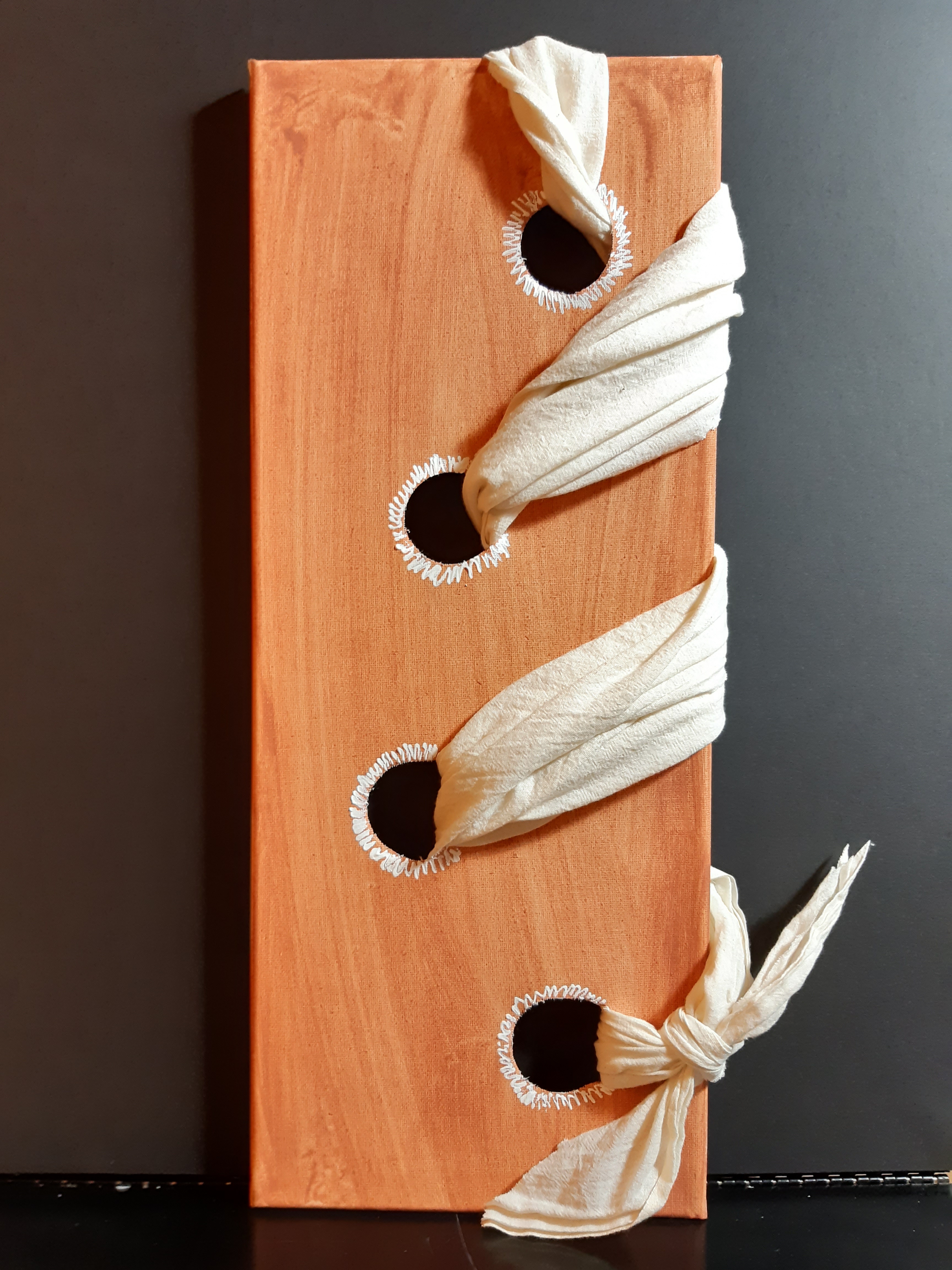
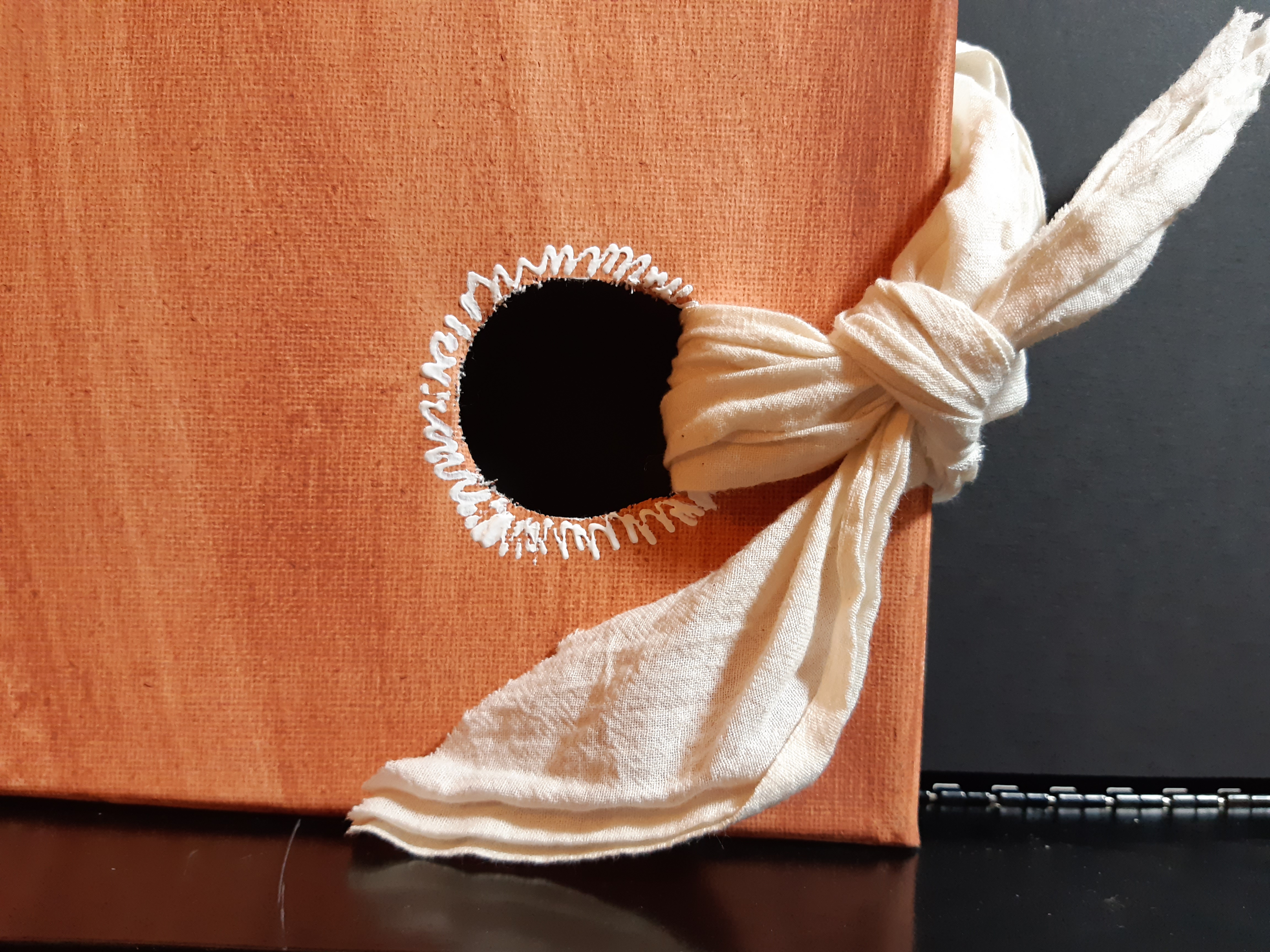
And here’s another test using the fine nozzle acrylic paint pouch – just a doodle to see how it feels. Hardly having used acrylic paint before, I found this perfectly manageable, and the great thing is to be able to use the fine nozzles for drawing effects…
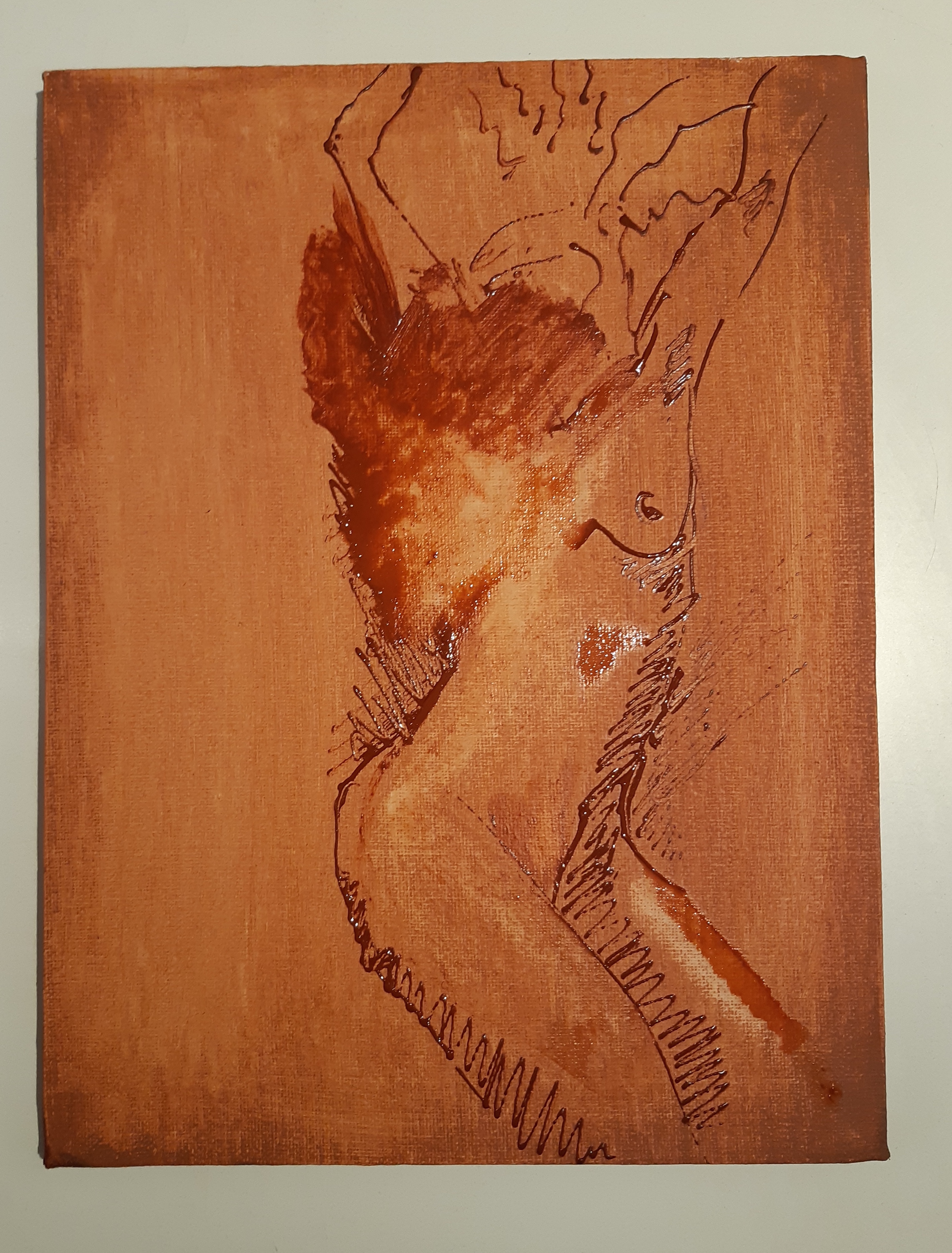
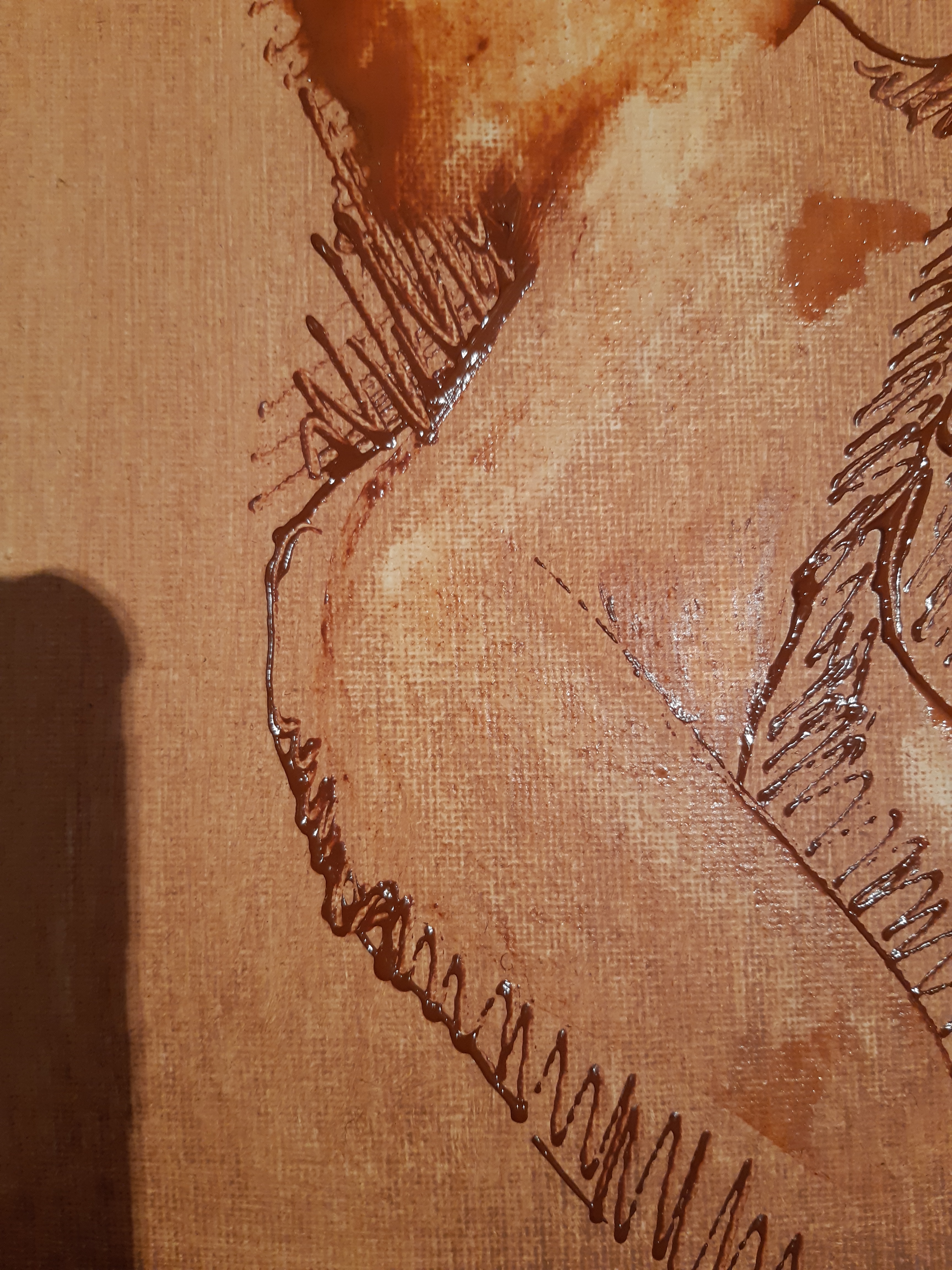
14.12.2019
New ideas
Having to speak about my latest piece for the group crit, and the things that my tutor said in response, and putting up our Pop Up show, has really got my ideas working as to new work.
I’m intending to use the Japanese pattern cutting techniques as I mentioned before. They were developed by the writer of the book, Pattern Magic by Tomoko Nakamichi, (who was a lecturer in pattern cutting at the Bunka School in Tokyo), (Nakamichi, T., 2005, p.42) but the sequence below shows a piece that I developed myself using the basic techniques, but with a shape that I designed. This was for an integral ‘back pack’ on a piece of clothing, but the same method could be used for anything at all where a 3D shape is wanted.


As an experiment, I used this pattern (above), to make a piece in recycled painted canvas, just to see how the idea worked. It wasn’t that interesting, but the best view of it was from behind, showing the graphic image of the seams.


My ideas then progressed to joining curved sections of heavyweight primed canvas, (snipping the curves so when sewn together it could lie flat), continuing the idea of making pieces that could possibly be free standing, or hanging – as ‘soft’ sculptures, although they are pretty rigid, but softer than stone or wood or concrete!
These have yet to be finished but here’s work in progress:


13.12.2019
Thoughts on Textile Art
In a review of ‘Vitamin T: Threads and Textiles in Contemporary Art’ on the Artnet website, Janelle Porter says that ‘Textiles exist at the intersection of the new and the old world, bearing the twin distinctions of ancient history and untrod, radical potential. Because of their long-entrenched association with craft, they have also been too often excluded from critical discussion and coverage, an oversight that inspired Phaidon’s multifarious, comprehensive approach to this list.’ (Porter, J, accessed 29.12.2019, <https://www.artspace.com/magazine/art_101/book_report/the-vitamin-t-list-113-artists-on-the-cutting-edge-of-textile-art-55986>)
This is interesting writing by Janelle Porter for Artnet, commenting on the status of textile art which has not been well regarded in the contemporary art world and indeed has invoked derision. Interesting from the point of view that the art world now seems to be thinking that textile art should be taken much more seriously.
I have recently been looking at several artists who use textile and fibre elements in their work, and I realise that there is a world of difference between the clunky, crude work that I have seen in many provincial galleries, (and that I personally would dread being associated with), and the light, bold, graphic, textural work I now know about, thanks to the recommendations of three different tutors on my course.
Artists such as: Kati Heck, Beth Semmens, Caroline Achaintre, Eric Mack, and Diedrick Brackens as well as two of my favourite artists, Mark Turner and Oscar Murillo. What the linked article above, (Henri Neuendorf, about Eric Mack says is especially interesting to me as he speaks about what is the nature of a ‘painting’, which is something that particularly concerned me when I first started this course in October 2019. Since reading about and investigating these artists who use some elements of fibre or fabric in their artwork, I realise that the word ‘painting’ is simply a useful, ‘catch all’ term to use when speaking about something that isn’t a sculpture, or a tapestry. I also definitely think that how the artist themself refers to their work – the words they use, should be respected. For example, here’s the description of Mack’s work, and afterwards, what he says about it himself from the article :
‘Pieces of fabric, rags, moving blankets, piles of books, magazines, and photographs are strewn across the floor, loose components that go into the artist’s paintings. While he refers to himself as a painter without hesitation, Mack’s work rarely, if ever, takes the shape of the traditional canvas-on-stretcher format. Instead the artist’s work resembles drapey assemblages of sewn-together bits of painted-on fabric that take on architectural and installation-esque characteristics.’
Mack’s own description:
‘I think painting can go as far as we can think. There’s a kind of utility to the idea of painting as a medium that I love, because of its particular setting, the variations of lacquers, the points of manipulation, the spacial aspects. The way that I think about painting is as a combination of gesture and the trace of the hand and the way that the painter manipulates shapes into a kind of emotional space.’
I specially like this piece (below) by Eric Mack, and the ‘permission’ it gives me to make pieces of similar work, silly as that may sound. With my fashion background, this really appeals, enhanced by the fact of the artist being in the photograph, and the clothes he’s wearing.
In an article about ‘Fiber’ artist, (US term & spelling), Diedrick Brackens, Jori Finkel says:
‘Fiber artists tend not to get a lot of attention from the contemporary art cartel, but Brackens is proving an exception: He’s one of the few working today who makes the age-old craft seem relevant, even urgent. He draws, too, as preparation for his tapestries, but the loom is his tool and instrument for improvisation. “Weaving is where the invention is for me, where I do things on the fly,” he says. “As much as you’re acting on this machine, it’s acting on you too. But there’s so much room to coax out these emotive qualities and lines and gestures from these simple yarns.” (Finkel, 2019, https://www.wmagazine.com/story/diedrick-brackens-artist-interview)
I really like the graphic look of Diedrick’s woven tapestries:
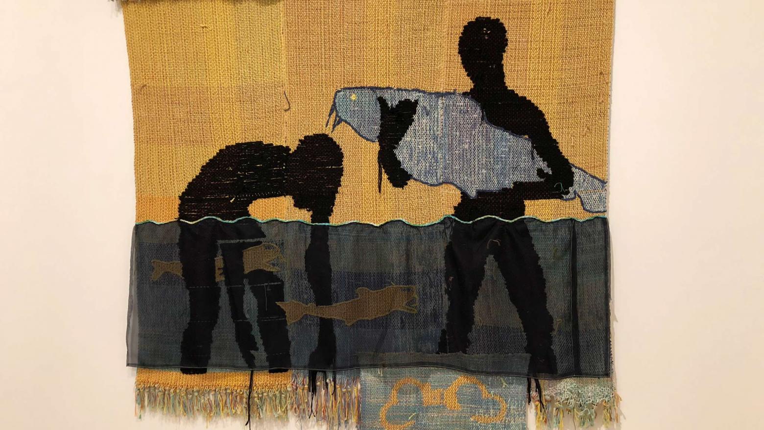
Of course, I then wonder as to why ‘textile’ art seems to be gaining more respect and attention? Is it to do with women’s position in society generally growing stronger as time passes, so that occupations traditionally performed by women are better regarded, and therefore ‘women’s work’ is more respected, both from a creative point of view and from a practical point of view as it could provide income?
The word ‘textile’ itself seems to provoke a resistance in some conversations I have, so I’m hoping to find a better word, (fibre)?….or maybe it’s just my own prejudices. Somehow, to wield a paintbrush implies a lot more skill than wielding a needle or a sewing machine. Maybe this is because historically, artists (painters) worked in a separate, studio in isolation, whereas women traditionally worked in a domestic setting – the kitchen for mending, or for more wealthy women, they made their embroideries or tapestries in the drawing room.
11.12.2019
MA Painting, Drawing and Print Pop Up Show
This was a bit of an eye opener!
And it was a very good learning curve regarding curating, collaboration, presentation, and preparation.
We had a professional curator, Dan Howard-Birt, who gave us a quick run down on basically what curation was about, which I found really useful. Elements such as motifs, themes, colour and scale were all discussed in a short time and this was hugely useful in putting our work alongside others in our group, so that everything was hopefully shown to it’s best advantage.
One of our group, Sinde, had thought of the bigger picture – positioning of the boards, so that a) our current equipment could be masked off, and b) the space was used effectively to create more surface area of the boards depending on how they were angled. This was done pretty quickly and efficiently by planning and working together.
On a personal note – my big piece was the first I had ever done in that style, so I was totally inexperienced as to how to present it. It was free hanging canvas and paper from a length of wood, and it had to hang away from the wall to look right. I had originally worked on it by resting it on two very large screws angled upwards so it didn’t fall forwards. But this looked pretty unsightly for the exhibition. To cut a long story short, I had it up on the wall a bit precariously, but it didn’t hold, and it fell off at the last minute before we were about to open!! One of my fellow students, and two of the tutors rescued the situation, and it was secured about one minute before the deadline! I was nearly in tears as I knew it was too precarious, but didn’t have time to fix the situation.
So…my lesson is learned about timing, but I suppose I was just wanting to get this new idea up for this exhibition, and it had taken a heck of a lot of preparation to get to that stage. (See previous post about trying to make holes in the leather, etc.).
Conclusions and plans!
Anyway, to try and make things a little easier, I plan not use the cowhide, (which has proven to be incredibly tough to punch or cut holes in), and try instead using closed cell foam and I’m sending off for a sample. It has similar properties to the cowhide, but loads easier to cut. The only disadvantage is the marker pen doesn’t seem to take as well, but I’ll have to experiment with that. Thinking a bit further on from this, I could actually use Napa leather (thin soft leather, easily cut, which I have used many times in clothes making), glued onto a closed cell foam base. Then I could hopefully have the properties of the leather surface to ‘paint’ on, with the rigidity of the closed cell foam to keep it’s shape.
Having investigated the closed cell foam however, it appears to be really expensive to have sent, even though it’s really light, so my conclusion now is to use thin, soft Napa leather glued to something like mount board to keep it firm.
In the pop up show, the big piece I showed was ‘Patched Psyche’ (see ‘Group Crit’ show post, below), plus this tiny piece which was originally just a test to see if an idea worked – ‘Stitched, Hole Punched’.
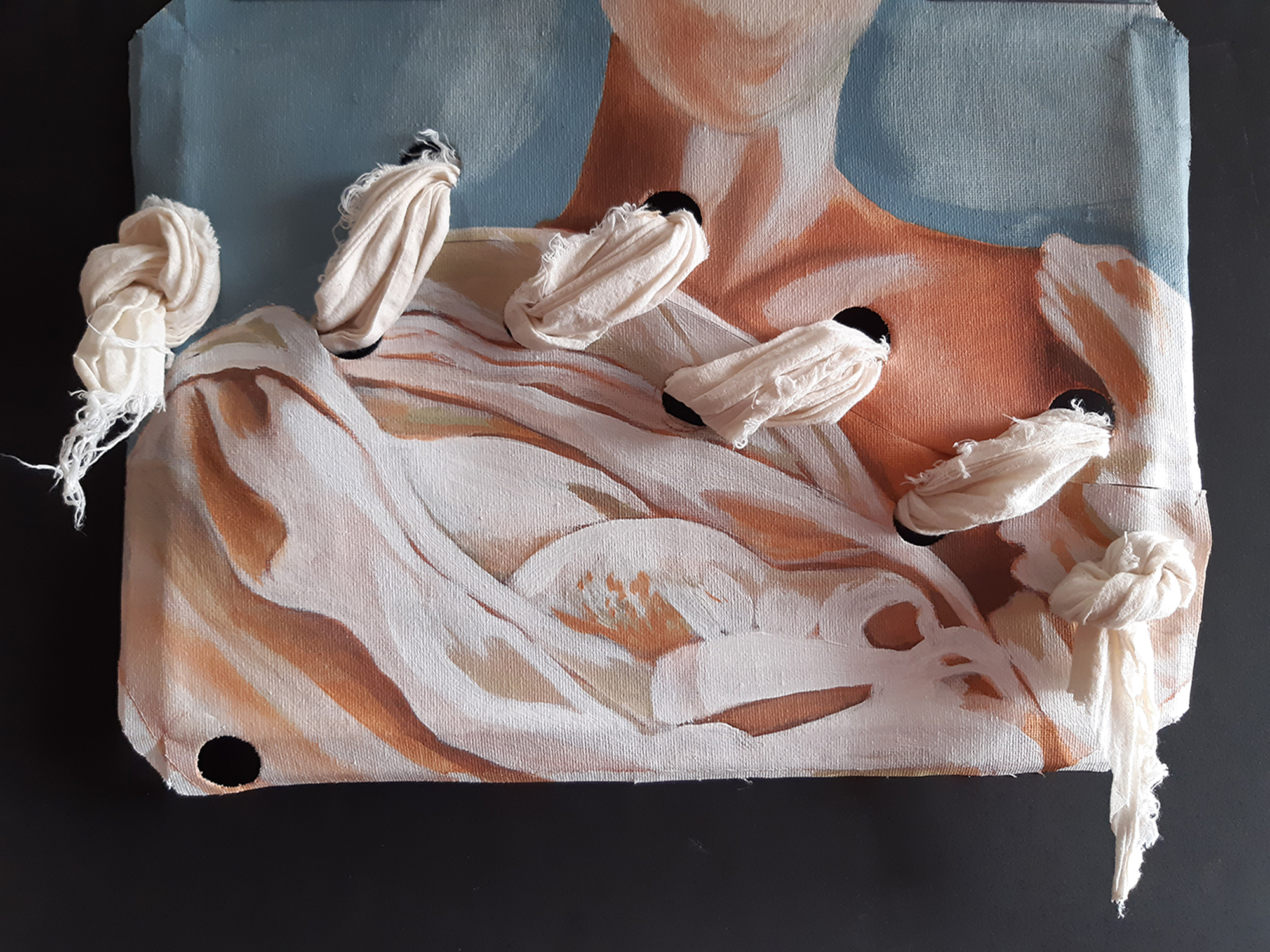
Here’s a couple of shots of my space in the exhibition:
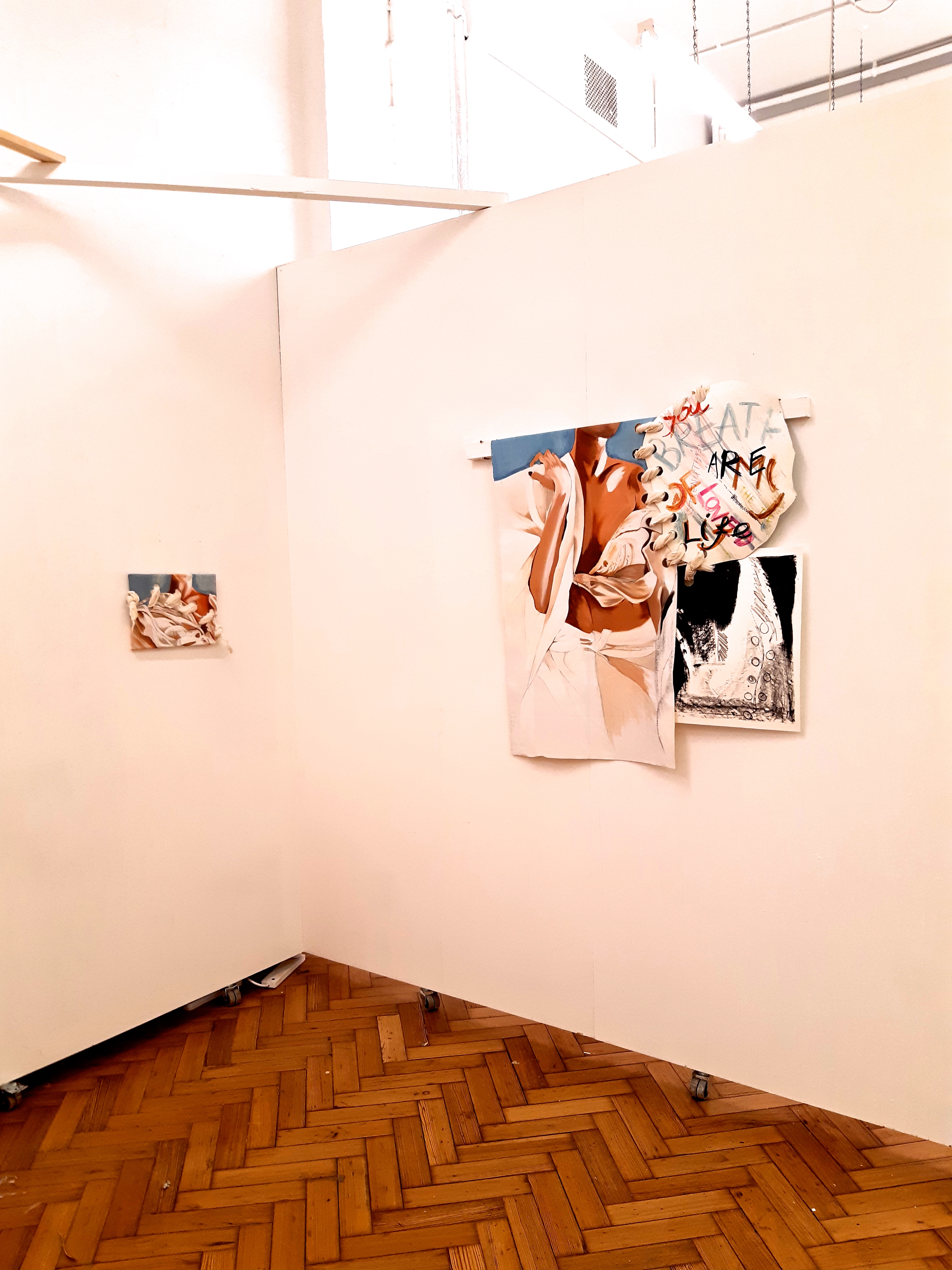
4.12.19
Group crit with Mark Fairnington
The piece I showed was this, called ‘Patched Psyche’, which is composed of: Oil on canvas, marker pen on cowhide leather, a litho print, and soft calico ‘stitching’. 120cm x 130 cm
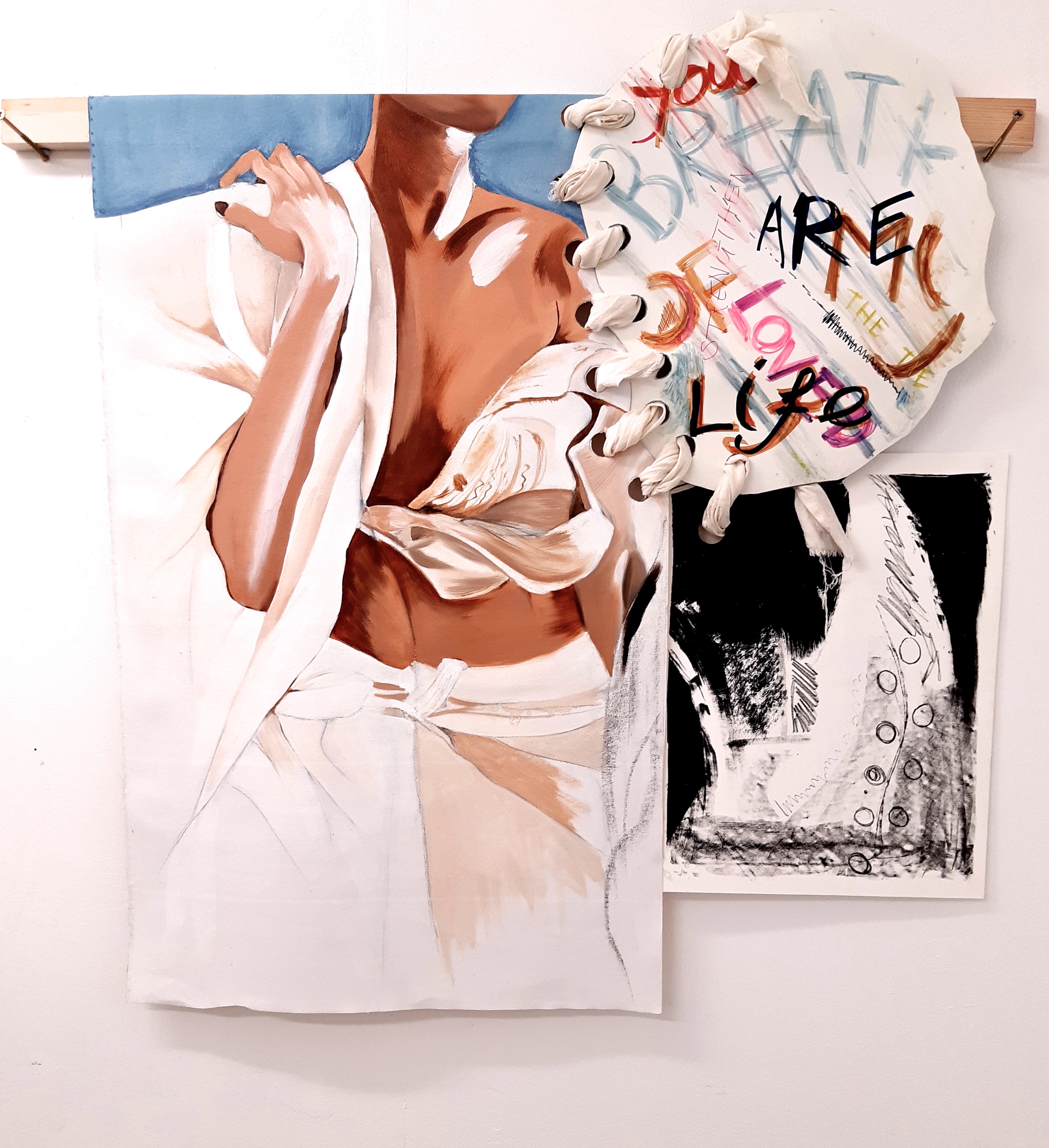
Detail
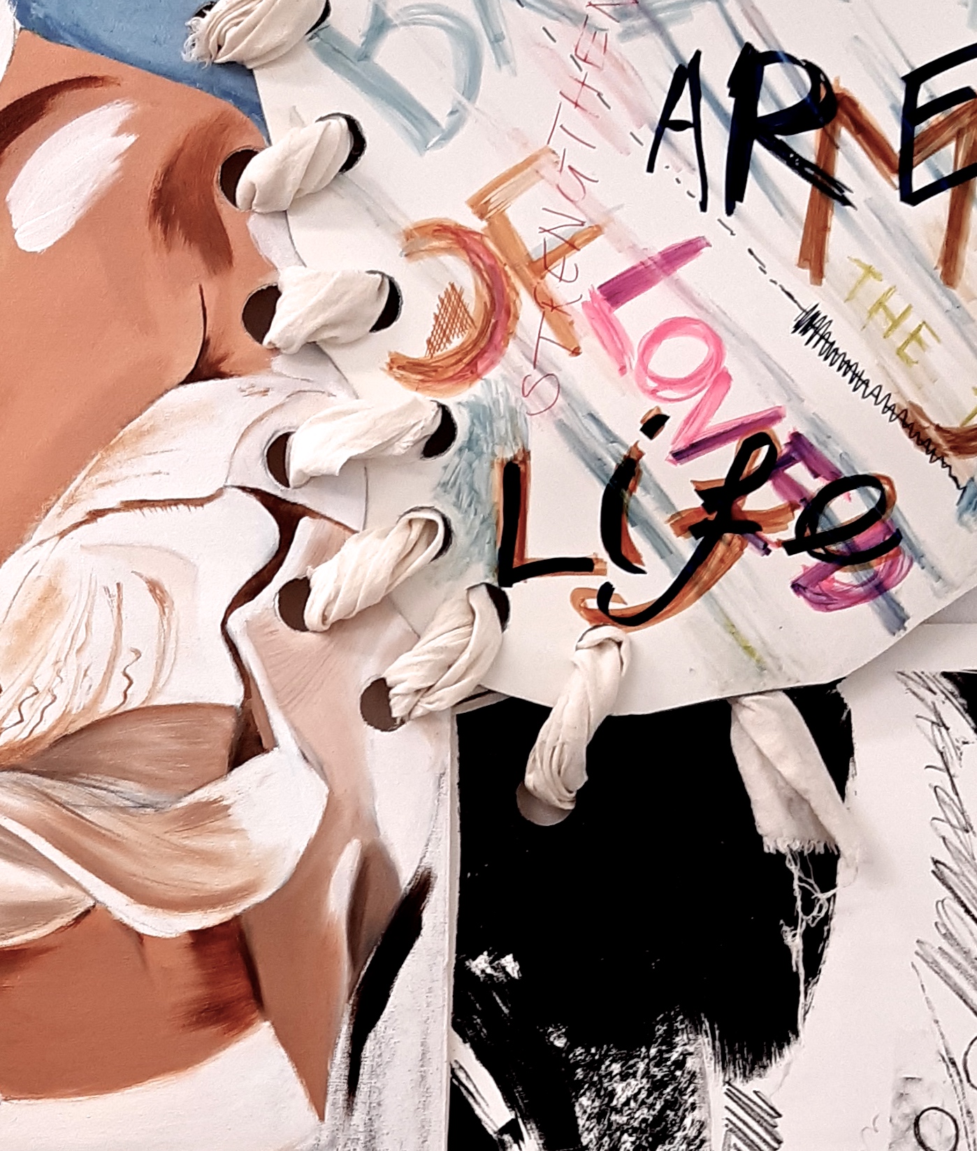
This group crit was the second of the term. It’s interesting to see your work in the context of your compadres, and the variety of styles is mind boggling.
This piece of work has taken some assembling…hole punching the leather piece has been the most problematic, as the leather is quite thick and tougher in some places than others, and in the absence of any very large hole punchers – either in my possession or the college’s – I’ve tried several different methods:
- Laser cutting – this worked pretty well, when the technician showed me how / helped me to do it. But it’s quite a technical exercise – a vector file has to made first, and a slot has to be booked with the 3D workshop. So fast or spontaneous work isn’t easy.
- I bought a tool similar to a set of compasses, but where a pencil would be, there is a point of scalpel blade instead. This was not brilliant as it sort of ‘dragged’ the leather as you had to press quite hard, so you ended up at what should have been the completion of the hole, with the blade not meeting the starting point! I practiced this a lot, but most of time the same thing happened.
- I then bought ANOTHER tool, which was a better quality item, with a rolling blade (and considerably more expensive), but it didn’t cut holes small enough!
So maybe I could possibly use thinner leather, but support it on some kind of framework?
It’s a shame that there’s not a reasonably easy way to do this. BUT….Having just discussed this with someone, I think we have found a solution! A large clamp (cramp) positioned over a punch, and gradual pressure applied. This way a larger piece of tubing could be found to make the right size hole.
Further experiments with hole punching / stamping as described above: this idea didn’t work either! The surface of the cowhide was so incredibly tough, that it couldn’t be cut with gradual pressure either….well, one very small cut resulted, but this was obviously not going to work well enough to do the whole job. So, my plan now is to use some much thinner, softer Napa leather which I know is easy to cut (as I have used it for clothing purposes), and to glue it onto a firm backing, such as mounting board, so that it will hold it’s shape.
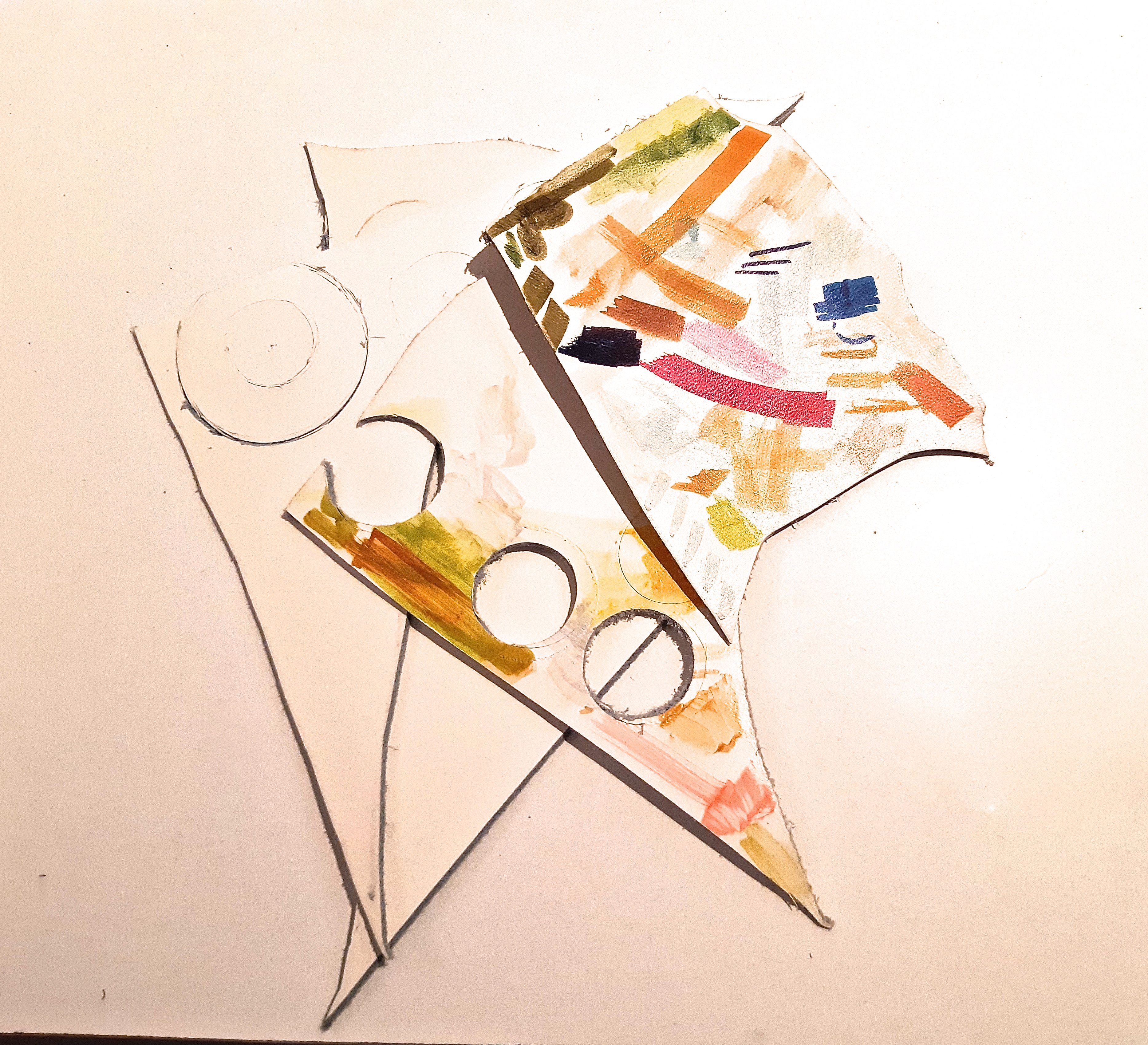
THOUGHTS and SOME CONCLUSIONS
The thing that struck me about my work, seeing it against others, (and maybe I’m wrong), is that I felt that mine didn’t show much emotion, which is a surprise, as I think I’ve usually managed this in the past. I could speculate as to the reason for this, but…..! But I feel I have to rectify this, and thinking about the ‘Photography and Drawing’ lecture last week, I think it’s down to the materiality of my work, in other words how I use the paint or drawing techniques.
I’ve just bought a couple of acrylic paint pouches with a set of varied size nozzles really thin to broad, so that I can use the paint in a kind of ‘drawing’ way. I haven’t used acrylics much, and I wish that oil paint could be used like this, but that’s not possible. When I was wondering why, it struck me that of course you can’t do that unless you had a tap of running thinners, which you could rinse the nozzle under after use! Acrylics are water based, so there’s the difference….it would also get very expensive with oil paint.
So I think and hope that these will help with the materiality, but I’ll have to do some tests first with the acrylics…
Mark Fairnington also suggested I look at an artist who makes a variety of work related to women and clothing. I thought that this was a great idea, and investigated Beverley Semmes
I like some of these a lot, partly because of the variety of media – painting, sculpture,(in crystal, fabric, and ceramic), but also because she seemed to manage to combine some of the elements that relate to women, and how they present themselves, a subject dear to my heart – there are images that seem to represent women’s sexuality, mood, aspects of femininity, Clothing, types of fabrics used – opaque as well as sheer/ see though, some very ‘pretty’ items – perfectly made clothing, and ‘accessories’ (the crystal sculptures), and some clothing presented as graphic shapes, like an abstract painting. There were also some much freer pieces – the ceramic sculptures, and the paintings. So I kind of gleaned from this that it’s OK to use such a variety of media in your work. (I don’t know why I ever thought that it wasn’t OK to do so….?! It’s not like I’ve spent my life doing as I was told (far from it)…I guess this could be that I’ve read articles about getting your paintings into galleries, which say that you should have a ‘coherent’ body of work, if you are to be taken seriously. I take ‘coherent’ as meaning that it should have similar styles of painting or sculpture, or have a thread of obvious subject matter or colour palette…. I think the reason that I think such things is that I haven’t had enough experience of the art world in general. Anyway – I’m learning…
This consequently gave me an idea to make painted ‘reliefs’ / soft sculptures using pieces of painted canvas either stitched or glued to a flat base, to make these sculpted paining shapes I know from the Japanese Pattern cutting book series, ‘Pattern Magic’ by Tomoko Nakamichi, (Nakamichi T, 2007, p.37). I really want to get started on these as soon as possible, and the Christmas break will hopefully give me the chance.
Here are some of the shapes I made in calico, but I want to use this idea translated into ‘paintings’, on primed canvas on a flat base, or maybe as free hanging objects, or soft sculptures.


28.11.19
Reading group with Mark Fairnington: Nikolai Gogol ‘The Nose’
Very good, wide ranging conversation, around a great book. Gogol raised an issue about about how physical features of one’s body (Gogol had a big nose himself, which he was apparently very self conscious about), and in our discussion, this started a conversation about whether any artist or musician has a ‘responsibility’ to their audience in the case of minority appeal or bizarre subject matter. The general consensus was that the artist does what he/she does, and then finds the audience for it, not the other way round…
I was wondering whether Gogol’s publisher had made any objection to this seemingly bizarre subject matter, and this promptes a discussion about minimalist art (compared to free improv music) – do you have a responsibility to your ‘audience’ to ‘entertain’?
One of my fellow students gave a good quote: ‘In making art you will always find someone who loves what you do, someone who hates what you do, but most people don’t care’. So the thing is to just make what you want, and find the audience that will appreciate it.
27.11.19
Unfortunately, Robert Storr from Yale University with his talk on Philip Guston was unwell, so Dan Sturgis stood in and gave a very interesting (to me) talk on a British abstract artist from Cornwall / who went to live in New York in the 1960’s, Alan Uglow. I have to admit that his name wasn’t familiar to me.
I liked the humour of some of his work – some pieces were photographs of paintings – sometimes printed (on canvas?), then put on a stretcher…so they were strange items, being not completely a painting or completely a photograph. He did a whole series of paintings ‘Propped’ which were not intended to be hung, but instead were propped against the wall. Could this have evolved from the fact that in the end, before the exhibition was about to open, he just could be bothered / couldn’t organise enough help to actually get them up on the wall??!! So they remained propped…
I specially like this photo of him propping himself against a wall in the gallery! It’s a great photo, and follows the theme of ‘propped’:
With a series of paintings that were called ‘Low Line’, he felt that they looked wrong when hung at a ‘normal’ level – i.e. at eye level or above, so they were hung very low down on the wall. Here’s a shot of him lying low:
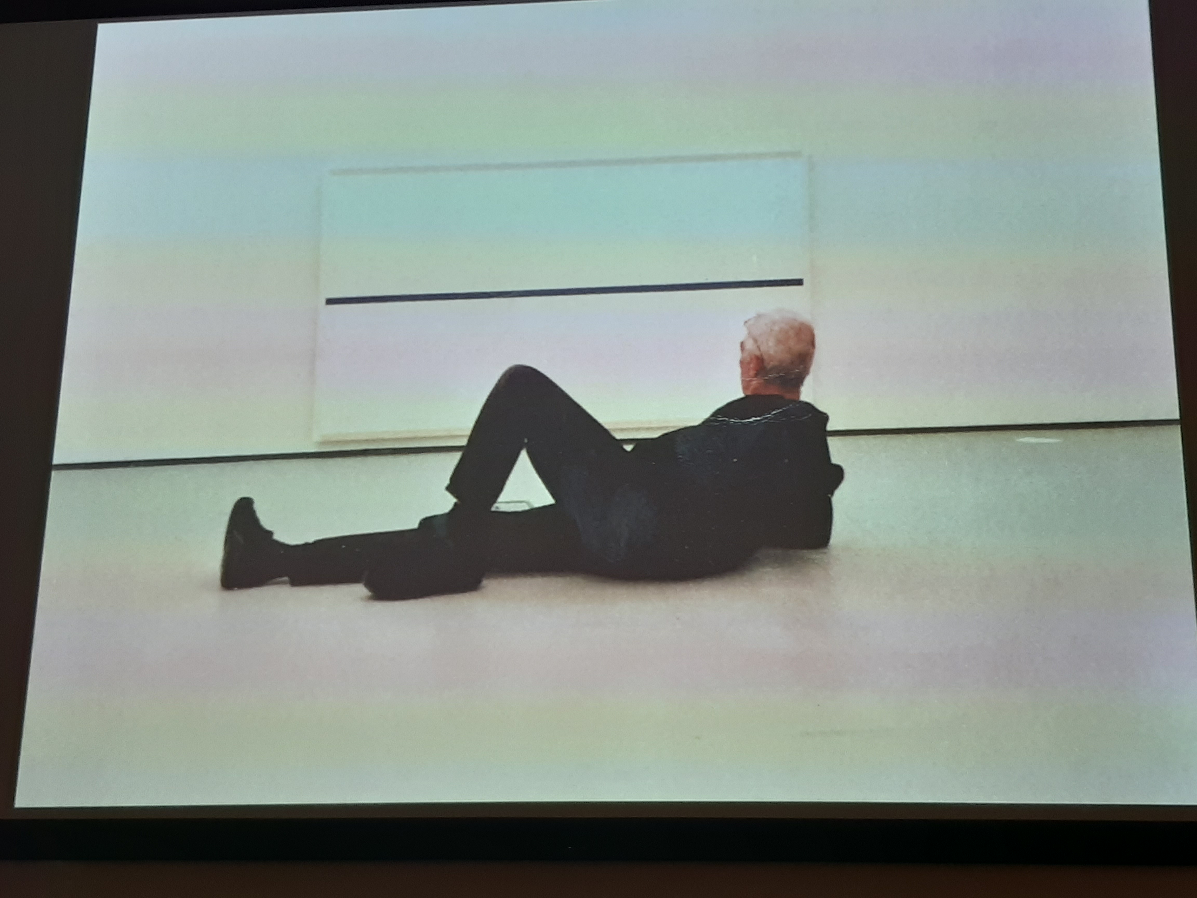
I have put these images here as they show a sense of humour in art which I think is important, and something I aspire to show in my own work, in other words, art does not have to be ‘serious’ to be good. It could be disputed that this is ‘good’ art, or that it’s admirable in any way, but the ironic sense of humour is evident.
Look at someone like artists Grayson Perry, or Banksy who manage to bring humour and irony into a lot of their work. For example, Grayson Perry’s luxurious rug that depicts a homeless person sleeping on the street in his exhibition ‘Super Rich Interior Decoration’ at the Victoria Miro gallery 2019. Or Banksy’s stunt of shredding a painting of his just after the moment of selling at Christies in London in 2019. It was more shock than humour though, I think, and was definitely holding two fingers up to the art establishment. But of course an amazing publicity stunt, which certainly upped the value hugely!
So, I am setting myself some goals here which I aim to achieve somehow: projecting a sense of humour, and some emotion into my pieces.
Of course I have to have a plan as to how to progress with this idea. I think emotion may be easier to show than a sense of humour, but neither is easy. I think that I should experiment with brushstrokes and use of the paint – the materiality of the media used – to show some intensity in the feeling behind what I do, and I have a plan to make some larger scale (but not huge in themselves) paintings in which I can include more detail in the actual painting, to show my regard for the forms. Here’s a very quick rough drawing of something that I’m thinking of:
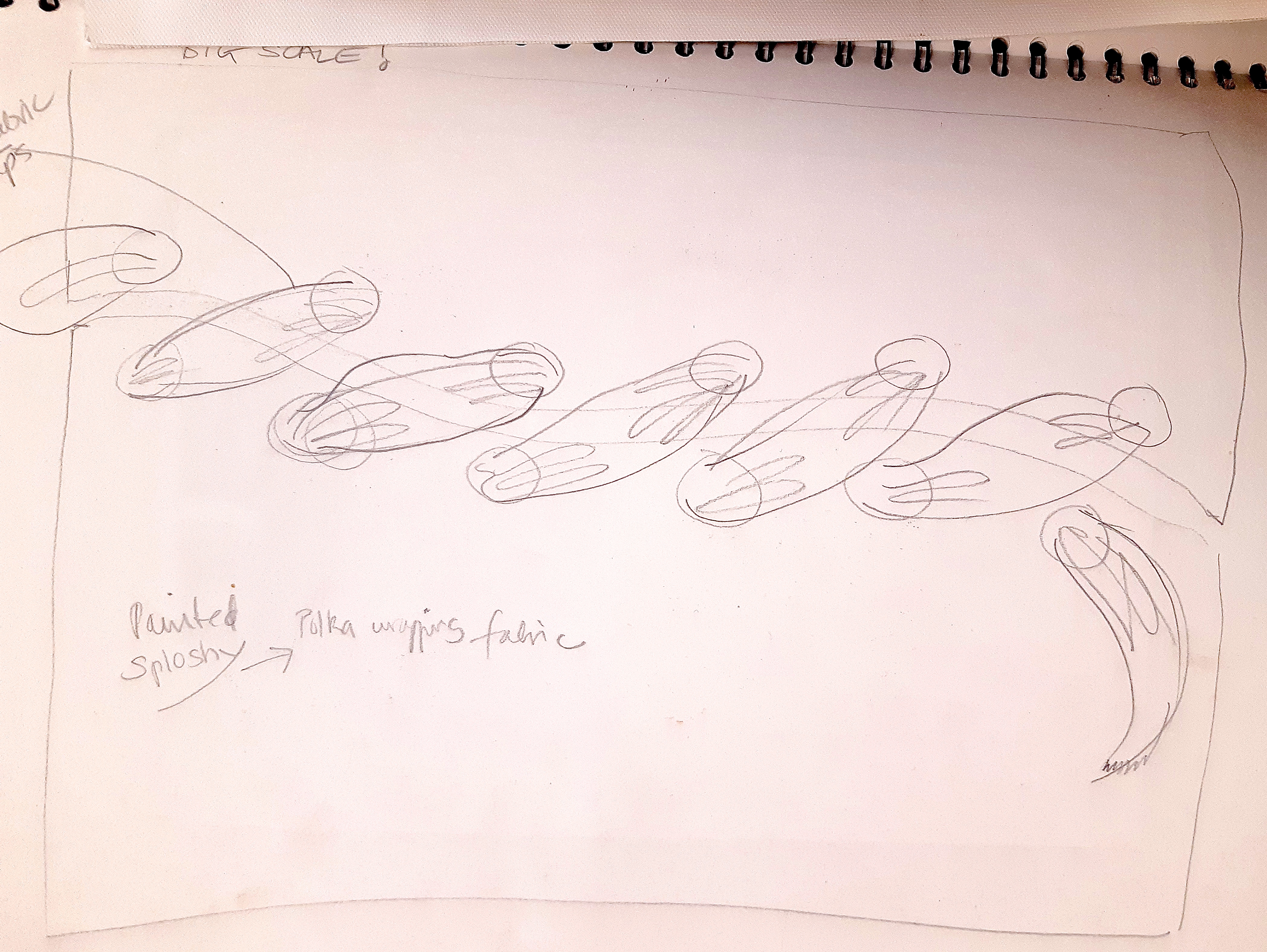
The afternoon lecture by Kelly Chorpening – ‘Drawing and Photography’, was really great, and she showed some very impressive images in pencil / graphite of news stories which were the basis of drawings by Anyango Grunwald. Her ‘time lapse’ drawings of a woman in a wheelchair dying in Aleppo were heartrending, as were the drawings of a young black boy shot in the US, and who was left lying in the street for hours: ‘Live, Moments Ago (The Death of Michael Brown)’. I have looked for an image of this last drawing, but it seems to unavailable, as is a video of the drawings of the woman in the wheelchair dying. (Anyango. C, 2012)
I love this series of drawings because they show the tragic emotion of the situation (the woman died for lack of medication and space in a hospital), and are also really effectively drawn by using different techniques within the work – the hard edged black lines combined with smudging to show the ‘fading away’ and alongside that, the eraser bits left on the image, to show the process of disappearance, i.e. the rubbing out of the original image = the death of the neglected woman who was a victim of horrible circumstance.
This is an example of how feeling and emotion can be put into an artwork – using the actual materiality of the medium and the process of using it. I feel that I learned quite a lot from that lecture, and just need to use some of those things in my own work now, it’s given me lots of ideas, and I’ll try and get going on some of these over the Christmas break.
21.11.2019
VISIT TO MARK CHISENHALE’S STUDIO at Chisenhale Art Place, Bethnal Green:
This was a very interesting visit, on a very cold day, so after 2 hours, everyone’s feet were numb. But Mark’s work, and his information about the studio itself, how it’s run, and his talk about some exhibitions he’d curated (and was currently curating) was so informative and engaging, we forgot the cold.
I was impressed by the huge variety of his work, in terms of scale, and subject matter. From figures to birds and animals to landscapes, to still lifes, (in a broad sense), to garden buildings (sheds) , and to learn about his methods of working. He seems to encompass a lot of different styles, and to look at his landscapes you would imagine they were pretty true to life, which in a way they are, but he told us about the fact that he takes many, many photos, and somehow amalgamates them to make the images from all the different views.
I asked quite a lot of questions, and couldn’t quite get exactly what he meant, but then he’s the artist, and that’s his prerogative. I imagine that if you watched him work, you might understand it better.
He did one amazing painting of lots of birds in a tree, which apparently took 8 months to do. He paints meticulously, and I admire his fortitude!
But, one thing that stood out, as with Dan Sturgis, was that he mentioned repeatedly the things he’d been thinking about while planning his paintings. So I really must try and identify what exactly it is that drives my ideas forward….
Thoughts and conclusions:
- there is always the ‘3D making’ that inevitably comes forward, based on my background of fashion – patterncutting ,sewing and fabrics and the fact that I was always surrounded by women making clothing – my Nana knitting, and my Mama making dresses. (My Dad also drew a lot – portraits of my Mum, and also made detailed anatomical drawings of grasshoppers and moths as part of his work as an entomologist at the Natural History Museum in London.)
- With the artwork, I somehow want to express what makes me tick, because I think that when people look at me, they make certain assumptions based on my appearance. Most of the time, I feel that I look a certain way, but that it isn’t always a representation of how I feel inside. Maybe I should start trying to look like how I feel, but I think that then I would maybe look like some kind of wild woman – fragmented and falling apart at the edges.
- So it’s all self centred and inward looking? Well maybe, but then surely all creative work is a kind of selfish thing. I try very hard not to be selfish in my daily life, but I think that by it’s nature, creativity is a selfish act.
20.11.19
Dan Sturgis’s seminar in the morning was very interesting. He talked about his painting work, and his curatorial work.
He showed us many images of his paintings, the geographical location in which they were made, (the northeast of the UK and Scotland), how the abstractions came about, and he even showed us some paintings of his that he didn’t think were very good or didn’t work very well.
I think that was a brave thing to do, but I guess he wanted to show the progress of how his work developed which is very useful I think to students such as ourselves. I like some of them a lot – they are abstract paintings done in a very controlled way, and he said that the elements of the paintings – the chequerboard effect, the shapes in the ‘Boulder’ (Bolder!) paintings have many, many coats of paint to make them look opaque and flat, all hand done, and these are very precise graphic shapes, so no room for ‘mistakes’ here – they have to look perfectly formed to work in the painting. For precise, graphic images they have a lot of movement in many directions, and the more you look at them, the more you can see.
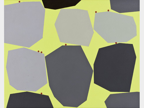
Bridget Riley, Op artist of the 1960’s, certainly springs to mind with these paintings, and I know that she employed Fine Art students to fill in the shapes on her paintings.
He had a quiet but forceful, unrelenting enthusiasm which came across, and he talked almost non stop for more than an hour. I noticed that a lot of what he said included the phrase ‘I was thinking about….’ I feel that somehow I don’t consciously think when I’m painting, which is probably a failing. I think I do think when I’m planning works, but it’s more to do with practicalities – what I might need in terms of types of paint, what I will paint on, (the ground), and practical matters of assembly of the pieces
20.11.2019
Had a one to one tutorial with my tutor this afternoon based on my comments and thoughts on my last journal entry, i.e. not making quick enough progress with my artwork.
Basically I need to be less tentative, and just to really go for something in a bolder way. This is exactly what Dan Sturgis said last week, so I must do it. My tutor suggested getting a large format print done of the big dress which I’d used, so that I could make better progress, quicker. (This reminded me that I do actually have some test print pieces of the big dress, that I could use as well, even though they are only strips.)
Some interesting thoughts from him on me getting a handle on my work:
- My work is possibly about craft combined with digital
- I should take everything off the wall and work bigger and bolder
- I should dye some fabric instead of the dribbled canvas section on my test piece
- I need to think about bigger leather (which will be expensive), so maybe think of a substitute.
I don’t know that I agree with some of the suggestions, but then that’s how it goes – they are only suggestions, not instructions! I am dubious about using the image of the big dress for a digital print, as I only used it on my ‘rough’ for the bigger piece as I wanted some representation of a painted piece for the final thing. I’ll see if I can find another good quality image to use instead, but it must be something that looks ‘painterly’. Maybe something like this:
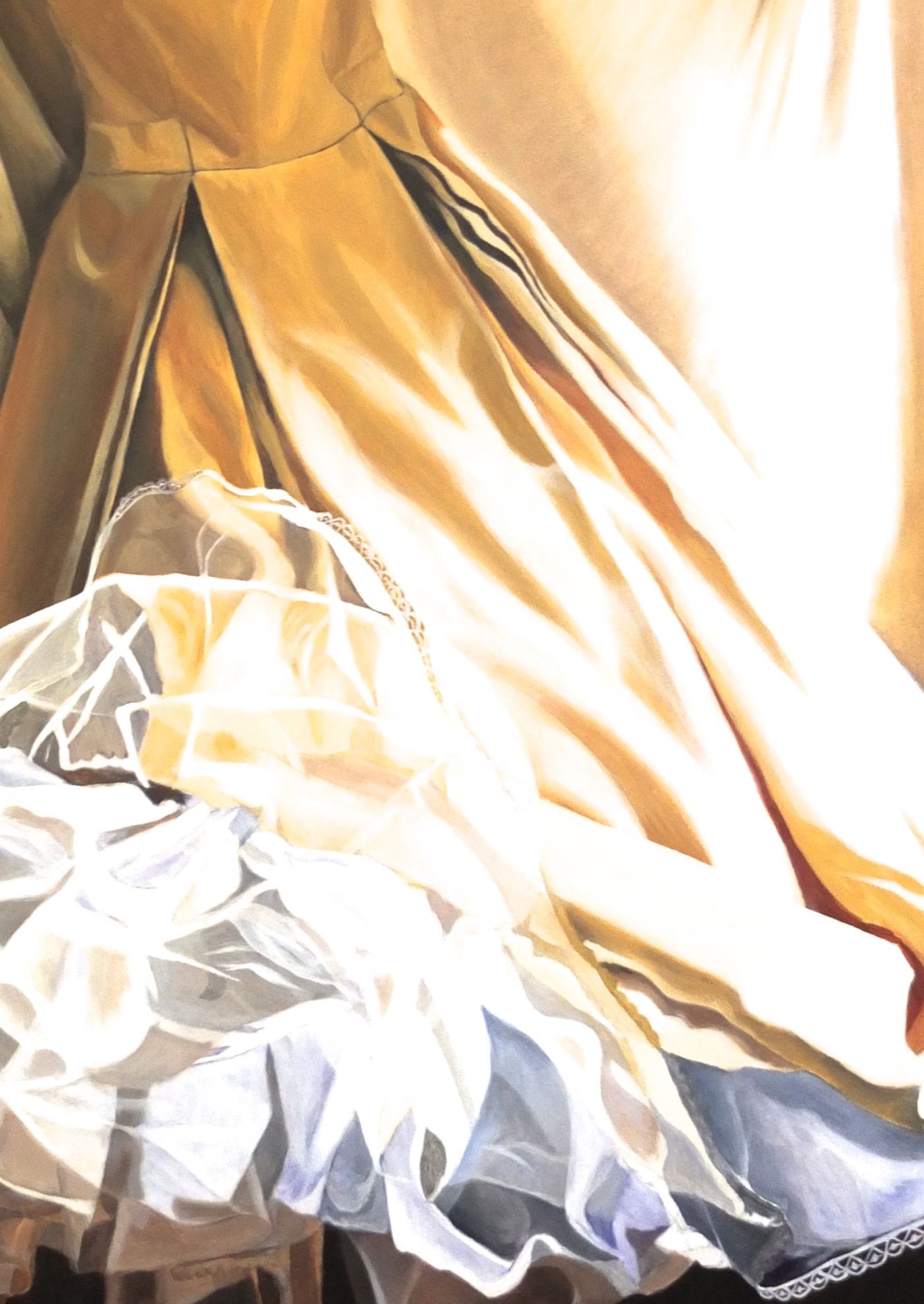
THOUGHTS AND SOME CONCLUSIONS
I started painting what I thought might be my finished piece (Patchwork Psyche) yesterday. I’d cut the leather central piece, and thought I knew what I was doing, but after moving loads of the ‘noise’ on my wall at my tutor’s suggestion, (very glad I did), and looking at it in greater isolation, it’s amazing how differently you can see things. Geraint did mention in passing that I should maybe simplify things, and looking now, I totally agree with this. That thought had gone through my mind, but everything around the piece was so busy and complicated, it was impossible to ‘see the wood from the trees’, and I managed to make a good bit of progress at last with the painting ‘Patchwork Psyche’ after this…deciding to simplify it has been a huge help.
I’m beginning to think that my work is a kind of portraiture….when my tutor said this in my one to one tutorial today, I was puzzled as I had never considered it to be that, but the more I think about it, the more I think that may be right, based on the above thoughts on my work.
At the moment I feel slightly inadequate, in that fact I can’t put a name to my visual work, or see it in context to anything, but then, I am working in a totally different way to the way I’ve worked previously. So I suppose I shouldn’t be too hard on myself, and I should wait to see what transpires with the work. ‘Painting as Research’ is a method that we have had lectures and seminars about, and I should remind myself of this, as I guess that this is what I’m doing.
It’s a bit of a ‘rollercoaster’ kind of journey so far, and I’d love to feel as if I had a more definite direction, but anyway it’s ‘painting as research’, in other words, just do it, and see what you make of it when it’s done. Scary, but I didn’t come here to be in my comfort zone.
19.11.19
Etching workshop
This was really good, and I loved the result.
There’s something about prints, and I don’t quite know what it is, but I seriously love the end result, in this specific case, the etching. And weirdly, it’s the backgrounds I like more than anything, just like on some of my paintings.
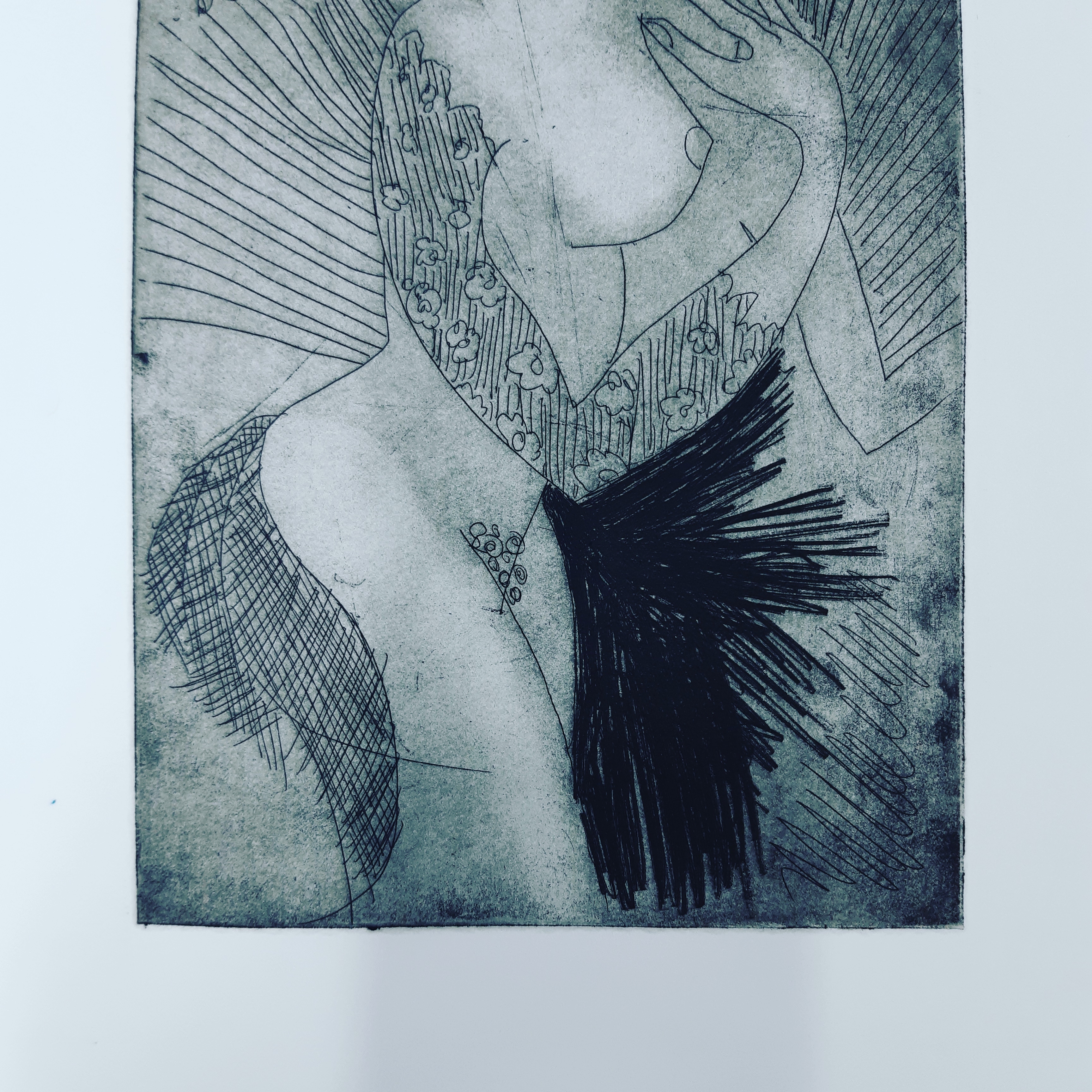
So I think I will keep the ‘background’ idea as something to use for the foreground, as I love it so much, and wonder why I haven’t thought of doing this before?
Here I am looking very happy to be printing my first ever etching – I was so excited! (Photo credit Nick Rooney)
14.11.19
I’ve made a decision, based on the speed of production of my artwork (i.e. not fast enough), to work on different but linked styles of work alongside each other.
In any given week, I spend quite a lot of time travelling to and from London, (as do a lot of people), BUT, I also end up spending a good few hours every week sorting out places to stay for the following week, as I don’t commute daily due to cost. Consequently, I’ll have to produce work more quickly. So I’m thinking that I could use collage, and ‘constructed’ pieces that don’t involve a lot of time consuming careful painting, much as I like pure painting…..
13.11.19
A pretty eventful, customarily packed day at Camberwell! The visit to the Bones Collection at the museum of London with Mark fairnington and Geraint Evans was potentially really interesting, with a fantastically knowledgeable archaelogist, Elena. It would have been good to see some more actual bones, though, because there were hundreds if not thousands of boxes, all meticulously documented, but sadly not seen. The information given was somewhat continuous for 11/2 – 2 hours, and it may have been good to have a little more interaction.
But it finished a bit earlier than expected, so I was able to go to the college and catch the lecture by Ian Monroe about materials used in artworks and everyday life, their meaning, symbolism, branding etc. It was really thought provoking, regarding the origin of materials used, and tracking them back. i.e the realisation that plastic toy dinosaurs in fact come from real dinosaurs that walked on earth: the original dinosaurs, died and decomposed on the earth, and their remains became part of the substance that the earth is made of – rock. Deep down in the earth, from the rock comes oil, and the basic material used in the manufacture of plastic to make the toy dinosaurs comes from oil…….
I finally got the leather yesterday, for the central piece of the ‘Patchwork’ so was able to start it today. I still feel very unsure of doing this kind of work, though very determined and interested to try and make it work, (which I think it will!), so the only thing is to just forge ahead with it, and discover ‘how’ to actually do it as I go along. For example, the pieces could be be joined by: hand stitching, machine stitching, eyelets & cord / string…I also need to divine someway of joining that doesn’t show any obvious stitching for elements where it wouldn’t look right.
Just looking at the images in my ‘Frescos’ folder again – I did some research when I was making a website for a business of mine painting wedding dresses, which was called ‘Dressfresco’. I realised that I could use some / one of the photos I took of a model swathed in loose fabric, like the fresco image here below, for the main painted image for the left hand side of ‘Patchwork’.
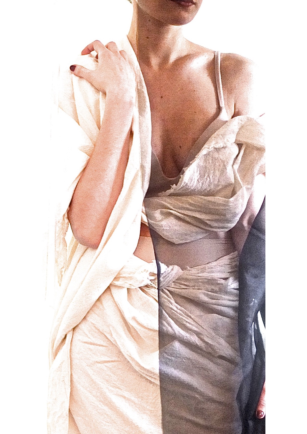
It will be one of the same series as my tiny ‘Stitched, Hole Punched’ painting I did a couple of months ago, which was threaded with the soft calico fabric. I didn’t know what image to use there, but I’ve realised that what I’ve mentioned here will be absolutely ideal, and links up more of my elements for the finished work.
Woman picking flowers with a cornucopia in the ruins of Pompeii, 1-45 AD
I realised, although I really knew it all along, that nothing in a piece of artwork is ever decided / finished.
11.11.19
After working on the ‘Patchwork’ piece, (below), I started photo editing the image of the ‘rough’ to create some further ideas for paintings, as I like the variety of different kinds of pieces – paintings (though what constitutes a painting, nowadays?), assemblages, reliefs, collages, patchworks…call them whatever, there’s so many things now, (thankfully), that can be called artworks. I say ‘thankfully’ as I think I’ve been very constrained in the past about what constitutes an artwork. I have had the experience of thinking something I’d created was an artwork, and other people didn’t see it as that at all! But that was just one audience.
Here, I came up with something minimal and with lots of white space….this idea is a kind of ‘relief’ from the busy Patchwork piece. I like the balance of one against the other. See below:
To elucidate a little: I write lyrics as part of my music life, I have a love of language, and the red, central letters seen in this image above form parts of words from the lyrics of a song I co- wrote. The text in the top left hand corner is from an advertising leaflet for Japanese made needles – ‘A needle for every need’.
I see my work as (strangely as I now live in the countryside), urban/city related. I think this is because I grew up in suburbia, often visited London as a child – my Dad’s workplace, shopping with my Mum and then myself, etc…and always liked the buzz of the city. So I guess that I feel pretty much at home there, my head is there, and I want my work to reflect that energy.
On more mundane matters, I think I’ve finally managed to track down a big enough piece of leather so as to make a start on the full size Patchwork piece. I’m still bothered by the fact that it IS leather, and I am vegetarian. But I wear leather shoes…..and have a very nice leather biker jacket….what to do? I have to come to some sort of decision before anyone asks me about it? The problem is, it’s perfect for the ‘fresco’ idea, and I do love that idea – sparked by Dan Sturgis at my one to one tutorial, after he’d asked about my scabby plaster walls photographs, taken in the building site. The smoothness of new plaster is so well represented by the matt, smooth finish cow hide.
Here’s some tests I did on a scrap piece of leather with marker pens to see what looked good. As I thought, having used marker pens quite a lot before, it was perfect:


So then I went on to the full sized piece of leather with holes punched, but doing a paper test first:


Seeing as I am not a vegan, maybe I could think of the cow hide as the skins of old cows that had been used as milkers….?!
9.11.19
Came down to London Tuesday evening, having at least managed to put together more of my small scale rough version of ‘Patchwork’ earlier in the day. This was helped by accidentally coming across my planned sewing pattern ‘making up instructions’ drawings I did a while ago.
Between lectures and seminars at college I’ve managed to get a bit of visual work done, but a fair bit of my time has been spent assembling my components (or at least sourcing them) for the planned bigger piece. I’m pretty sure I kind of know how to put it together now, apart from the printed bit (etching) which I will learn about in the print workshop hopefully next week. But in the meantime, the tryout version will show what I mean. This is the state of the rough as I left it a couple of days ago:
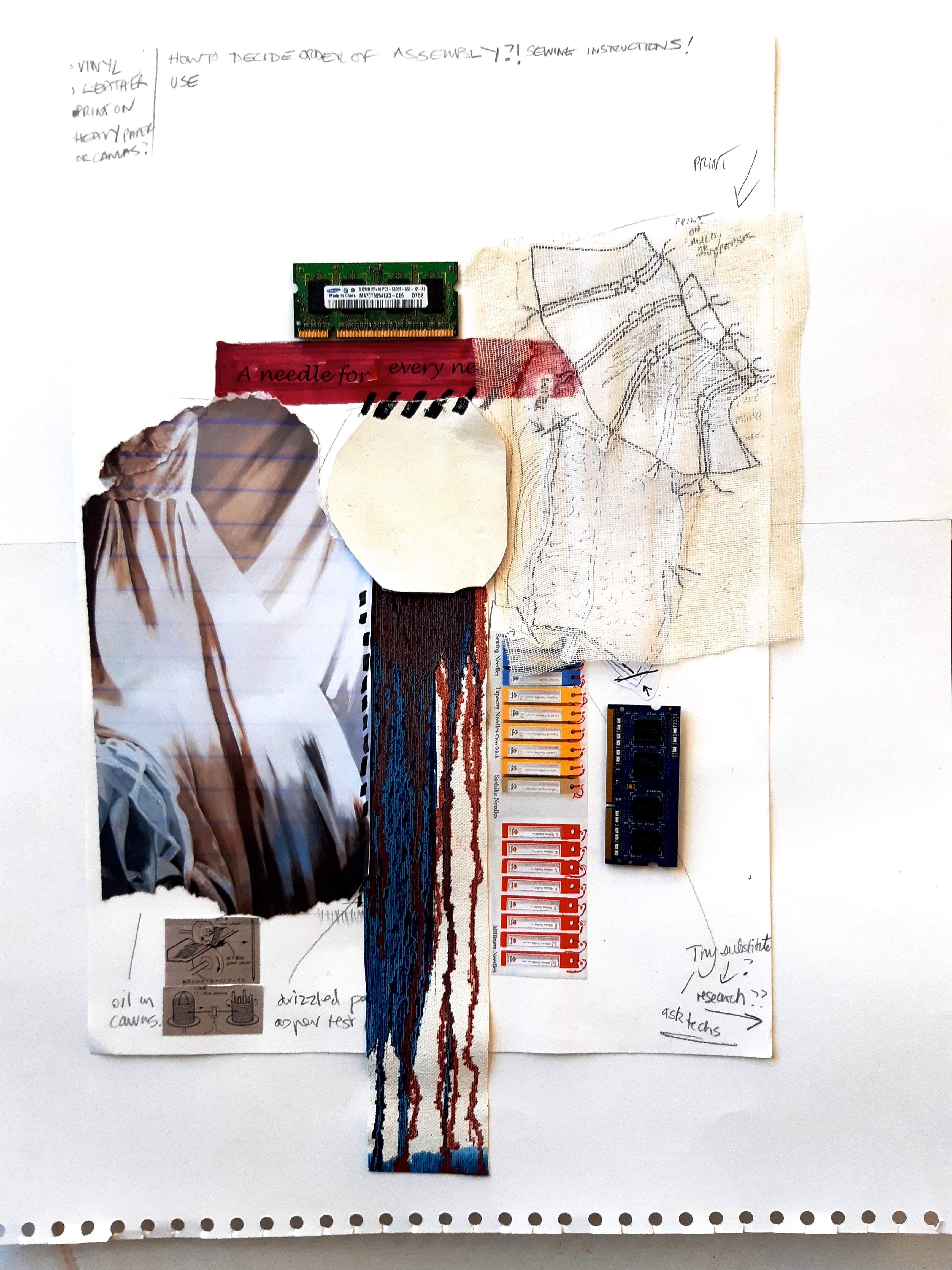
I feel OK about this, it’ll do as an idea, but I’m dying to get on to the real bigger thing now!
I’ve never really put anything together like this before at all, so I’ve felt unsure all along, but I feel that I just have to go for it, or there’s little point otherwise in me being here at all!
4.11.19
Have done some research on tracking down items for my planned trial piece. Looking at using different base materials – calico / primed canvas / vinyl / and leather. Of course I am instantly alerted to the ‘non pc’ aspect of leather….although the surface of the leather is perfect for the look I want, and I’ve tested the marker pens on it successfully (they merge easily with the blender pen) and are permanent when dry, I feel I’ll have to investigate other materials, unless I have a very good reason for using leather….
In the course of doing a very rough, small scale sketch for a bigger piece, I was thinking about how or what I’d use for a drawn / scribbled element for the patchwork, and I was thinking about putting all these pieces together – the ‘order of make up’ as it would be called in making a garment. This brought to mind the little diagrams that illustrate commercial pattern ‘making up’ instructions….and the fact that I did a fair few of these for my own planned patterns, before I realised just how much work would be needed for even one pattern, and had to give the idea up!
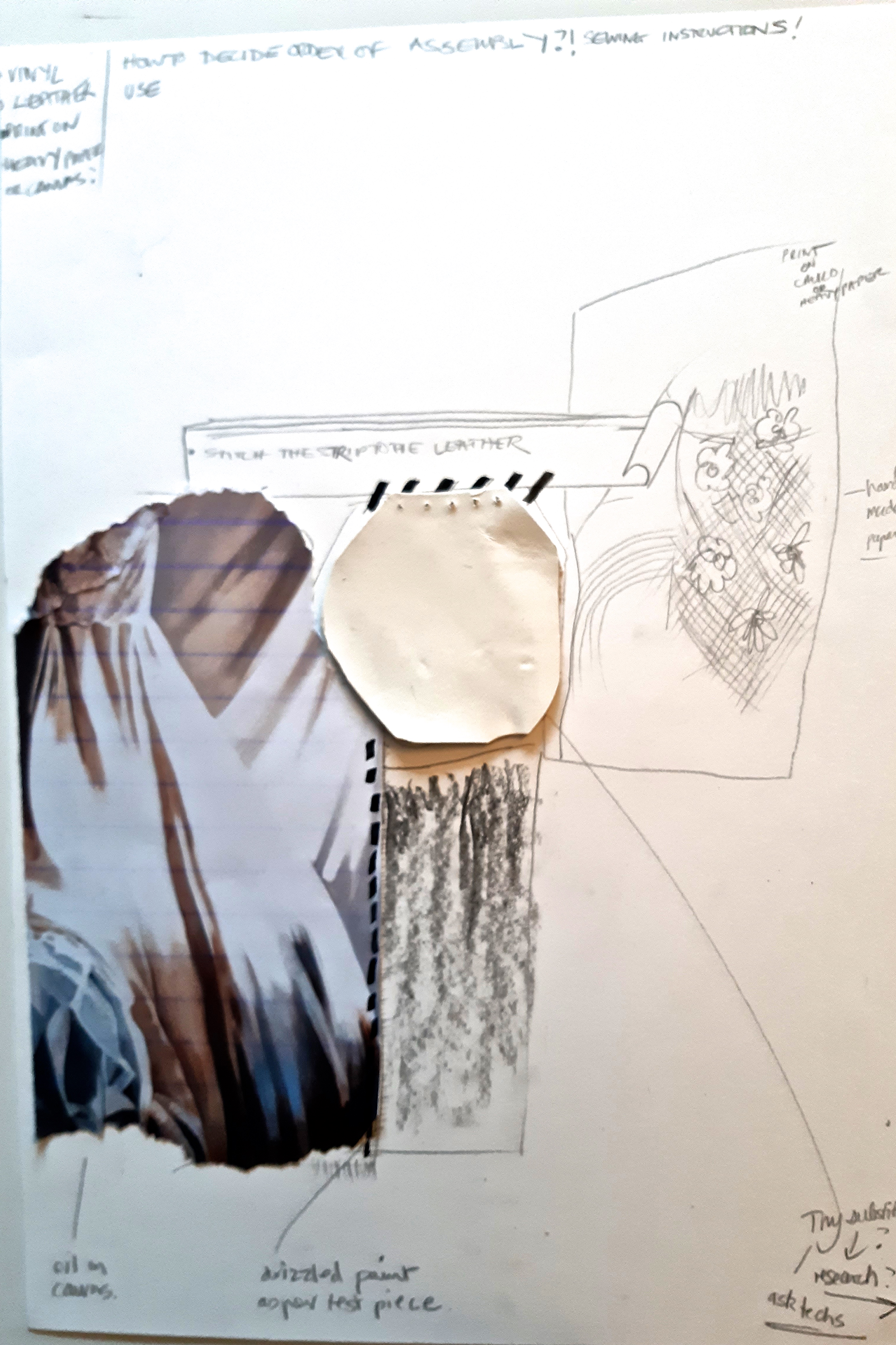
But if those little illustrations can be used in my bigger pieces, they haven’t been wasted, and would be an interesting graphic insert to the piece. My aim is really to try and bring together lots of elements that go to make up my larger ideas, and hope that these will work.
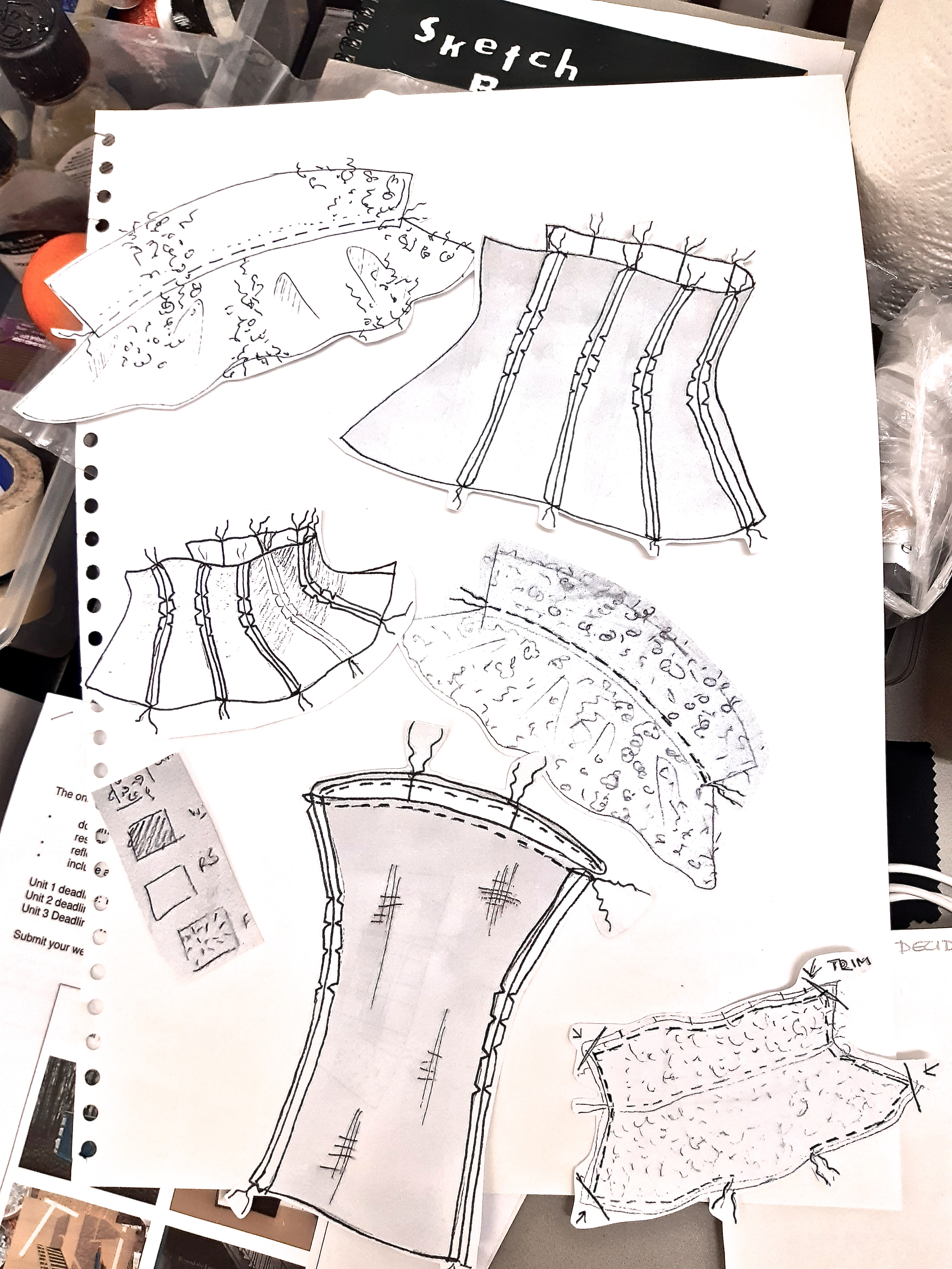
I photographed some of the drawings, printed them out, cut them out and used them on the rough for the bigger piece. These are just to give an idea what the finished thing will look like, (when stuck on the rough version).
1.11.19
I found another artist today, Cullen Washington, after googling ‘Painting as Object’.
In my 1-2-1 tutorial yesterday with Dan Sturgis, he mentioned this term in relation to my small ‘stitched’ painting (below, threaded with a length of soft calico) – a test I made just to try out an idea. I found a definition which told me that it was the act of making a painting into an object, which I guess the ‘threading’ activity does…it makes it 3D. I really like this idea, and it was great to have it named and brought to my attention by Dan .
Very interesting to find Cullen Washington and his work as it seems to have a direct relation to the other artists I feel an affinity with – Oscar Murillo and Mark Bradford, and the ideas that seem to fit with me – those of scavenging, using found objects.
Here’s an article from March 6, 2014 by Paula Sokolska quoting Cullen Washington speaking about his work and working methods. http://www.bu.edu/articles/2014/challenging-painting-as-a-three-dimensional-object/
What he says about his work isn’t too revealing, but his comments on just using materials that came to hand, connect with Mark Bradford and Oscar Murillo’s early life experiences – in Mark Bradford’s case, the use of cast away / unwanted items from his mother’s hairdressing business, and in Oscar Murillo’s case the use of just whatever he could find to make work with as his upbringing was not privileged, and he didn’t have a lot of money to spend on art materials.
These facts connect with me, even though my background was privileged by comparison. I guess in my case, I had ideas to make perfect and beautiful things, and was good at tracking down what I needed in the way of materials, but the cost of them was just too high for an ordinary middle class girl! So that is why, in my teens, I started to make what I couldn’t afford in the way of clothes, and household goods – so that I could make my own version of what I saw in glossy magazines, such as Vogue and Harpers. Determination and I guess passion has got me a way down the line so far. I am not easily deterred!
I also feel a strong connection to urban landscapes and environments. I see my work as (even though I now live in the countryside), urban/city related. I think this is because I grew up in suburbia, often visited London as a child – my Dad’s workplace, shopping there with my Mum and then myself, and always liked the buzz of the city.
I used to love the ‘behind the scenes’ view of suburban / urban life that you could see from train journeys though the suburbs to central London. The disintegrating brickwork, cement, corrugated iron, wooden structures, cladding and suchlike could be seen from this privileged position, people’s windows lighting up at twilight, so I guess it was a kind of being curious or ‘nosey’ with no comeback at all, as you were very quickly transported on and away from the view.
‘Disintegration, mending, patchwork’ are all words I’ve used in connection with my work, and these activities seem to go on constantly behind the fascias of buildings, in the surrounding land – gardens, yards, carparks, roads, pathways etc., and one of the best ways of seeing such things is from a slow suburban train.
So I guess that I feel pretty much at home in the urban environment, and I want my work to reflect it’s diversity and energy.
31.10.19
So today, my first 1-2-1 tutorial…a big event for me!
This was the first occasion that someone who I don’t know at all, Dan Sturgis, a professor of painting at UAL, has looked at my work and discussed it with me. I was a bit apprehensive, but he was very relaxed, (so that relaxed me), and he just asked what my work was all about. A BIG question….! I talked a bit too much, as I usually do, and tried to put him in the picture re my background.
He made some really useful recommendations about other artists to look at, one of whom was a fresco painter – Francesco Clemente, and also suggested that I should be bolder in my elements, which I totally agree with. I’ve just got to do this now, and I have more confidence as a result of the tutorial. For instance, yesterday I was stitching some of the canvas pieces together with a bradawl to make the holes, a wool needle and waxed upholstery thread, and after I’d struggled for a good while, and kind of managed it, I decided that it looked ‘weedy’, not bold enough for the size of the whole piece. So I went looking for some bolder cord from the college shop for the next bit of stitching, (they didn’t have any), so I bought some black insulating tape, and cut it into ‘stitches’. to stick on. It looked not bad, so the lack of what I wanted to use (the cord), had actually resulted in a totally effective outcome, which was quicker, easier to manage, and looked sufficiently ‘bold’.
This is an image of a current piece by Francesco Clemente, who was recommended to me by Dan Sturgis in relation to fresco painting, but he works in many different media, one of which combines threads, cords and strings with other elements, so I also see a link to my work through this. Here’s a ‘threaded’ constructed piece, which reminds me of lace or knitted fabric, currently on show at Blaine Southern, but in Berlin! So not accessible to me unfortunately…I must do more investigation about Francesco Clemente.
One idea I had as a result – with the smooth plaster element, was to render it in leather with marker pen as the ‘paint’ which should sink in, a la fresco…I will try this over the weekend. I must also try and discover whether I can get a technician in metal (maybe) to help me to hole punch some of my pieces of the whole work, so that I can ‘stitch’ it together.
This photo of mine (above) shows the smooth plaster, rough textured brick, shiny ceramic tiles, rough concrete pieces, and graphic painted pieces. All elements to be ‘translated’ into a 3D / painted / printed form.
30.10.19
In this interview with Mark Bradford – https://www.ft.com/content/7165e822-ce5a-11e9-b018-ca4456540ea6 Jonathan Griffin ft.com there are a couple of interesting quotes by Mark Bradford himself: ‘ “I don’t know what my work is about,” he says. “I don’t represent anything.” Instead, (writes Jonathan Griffin), he might place two pieces of paper together and find it sends him “down a rabbit hole”. He likens his process to that of a swinging gymnast, gathering enough momentum to reach for the next ring. Process is everything: “I’m working through painting.” ‘
I’m feeling a bit similar to this myself….kind of like I’m swimming in the sea, and no land in sight….
I’m trying out a totally different technique, well totally different subject matter to my previous work as well, a different scale (much bigger) and it’s pretty hard!
I’ve been trying to ‘plan’ (as much as you can with this kind of work), on a smaller scale. so have started to put together some test pieces.
I had a roughly A3 sized piece of canvas, and decided to apply some layers and pieces of different ‘fabrics’ before applying some very thinned down oil paint, partly to reproduce an effect I liked on some panels of the big painting I started, where the rivulets of thinner (Zest It in this case) made a patterning that looked like hair.
I stuck the fabrics on – the only glue I had was Spray Mount – but it seemed to work pretty well as the fabrics were quite coarse and a bit delicate….so then I whacked on the very thin paint, and let it dribble down – looking pretty good so far.
My big mistake, which I realised when I came back a couple of hours later? The thinner, had actually rendered the glue inactive as it had effectively washed it off!! When I touched the fabric pieces, they just fell off….. So, lesson learned, and I’ll have to find another way of making the fabric stay ….stitch it on?! Thicker paint would glue it on also, but then I would have to work on the flat – probably on the floor, and there’s not a huge amount of floor space around here. I will try this next… One more thought – I think this would work pretty well big scale – the simplicity of it. The blood red colour has got me thinking as well – more tomorrow.
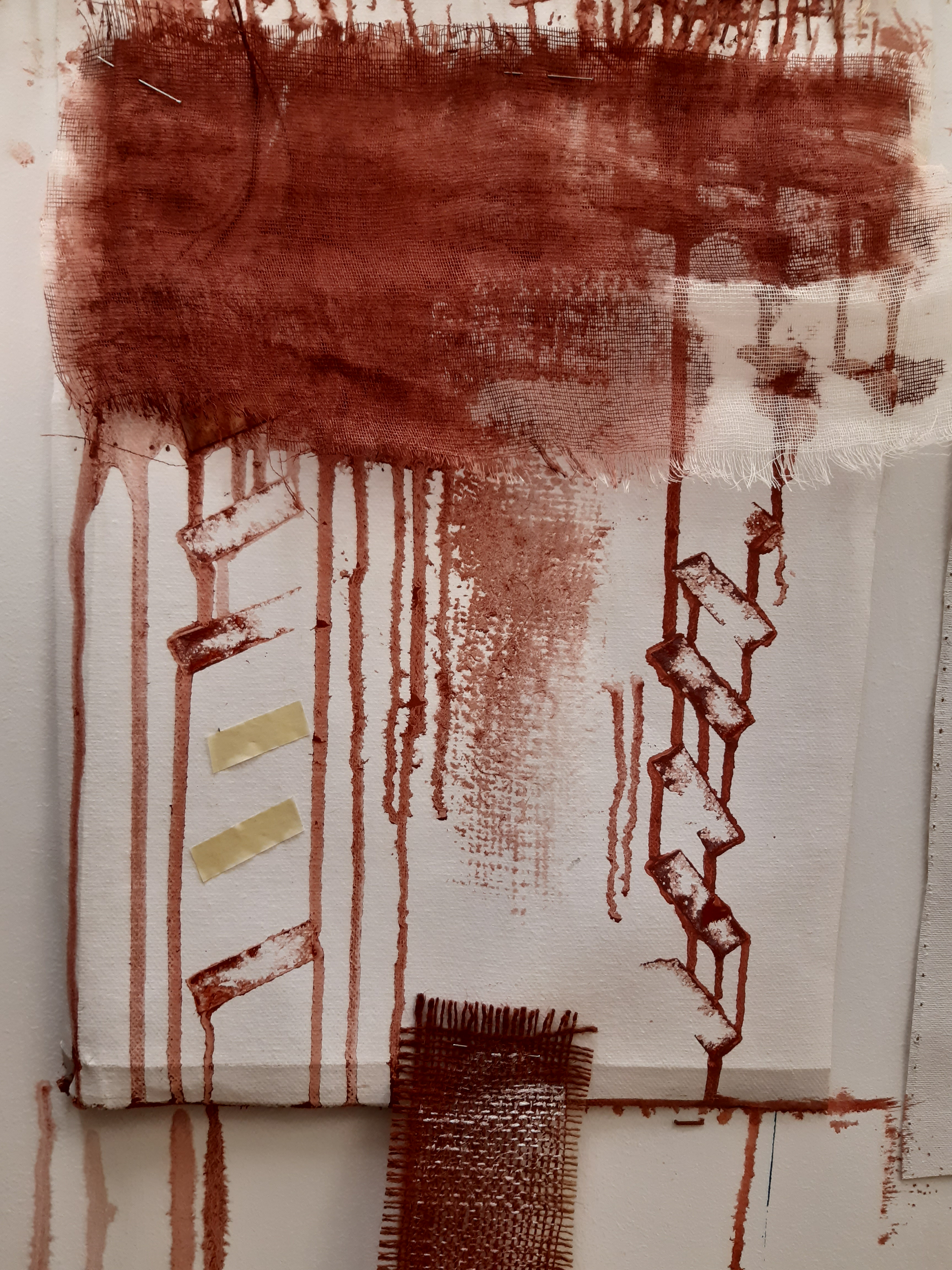
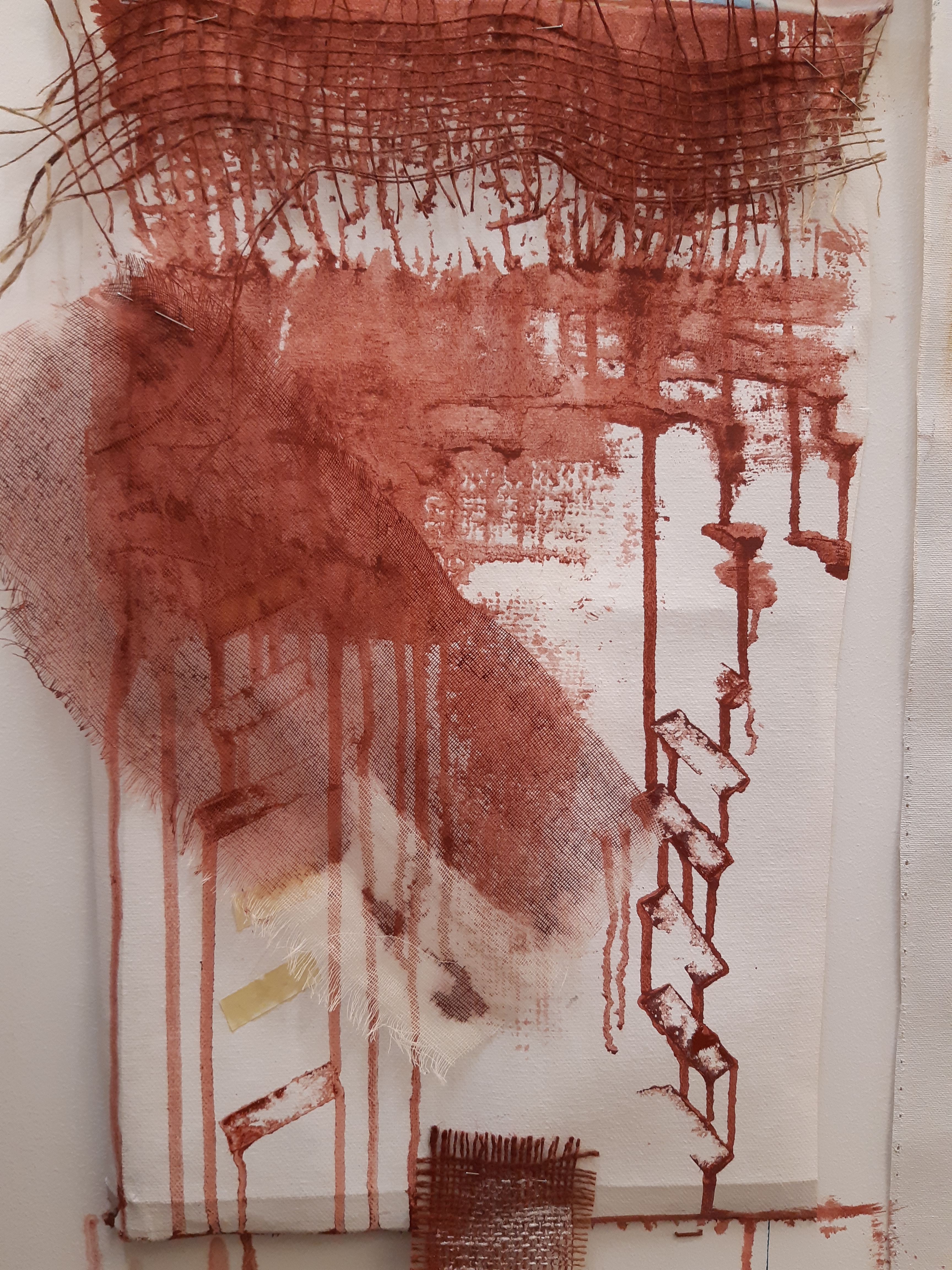
26.10.2019
Made the decision the other day to get ALL my equipment down to the college, as it’s impossible to work from both locations unless I duplicate ALL my equipment! Not financially possible…so J will bring me and the car down on Monday. Then my concentration will be better.
So did a freehand more abstracted version of my big wall painting , (below), much smaller than the original (slightly bigger than A4), on a scrap of heavyweight primed canvas from Russell & Chapple, just to see how it looked painted in a freer style, and on that canvas. I wasn’t very impressed with my effort, it just didn’t do anything for me, but it was useful just to see what happened. Maybe the image itself isn’t very interesting, and only works on a bigger scale. I wonder if Mark Rothko’s paintings would be a tenth as impressive if they were A4 size? I’m pretty sure they wouldn’t be….so this was probably a good exercise.
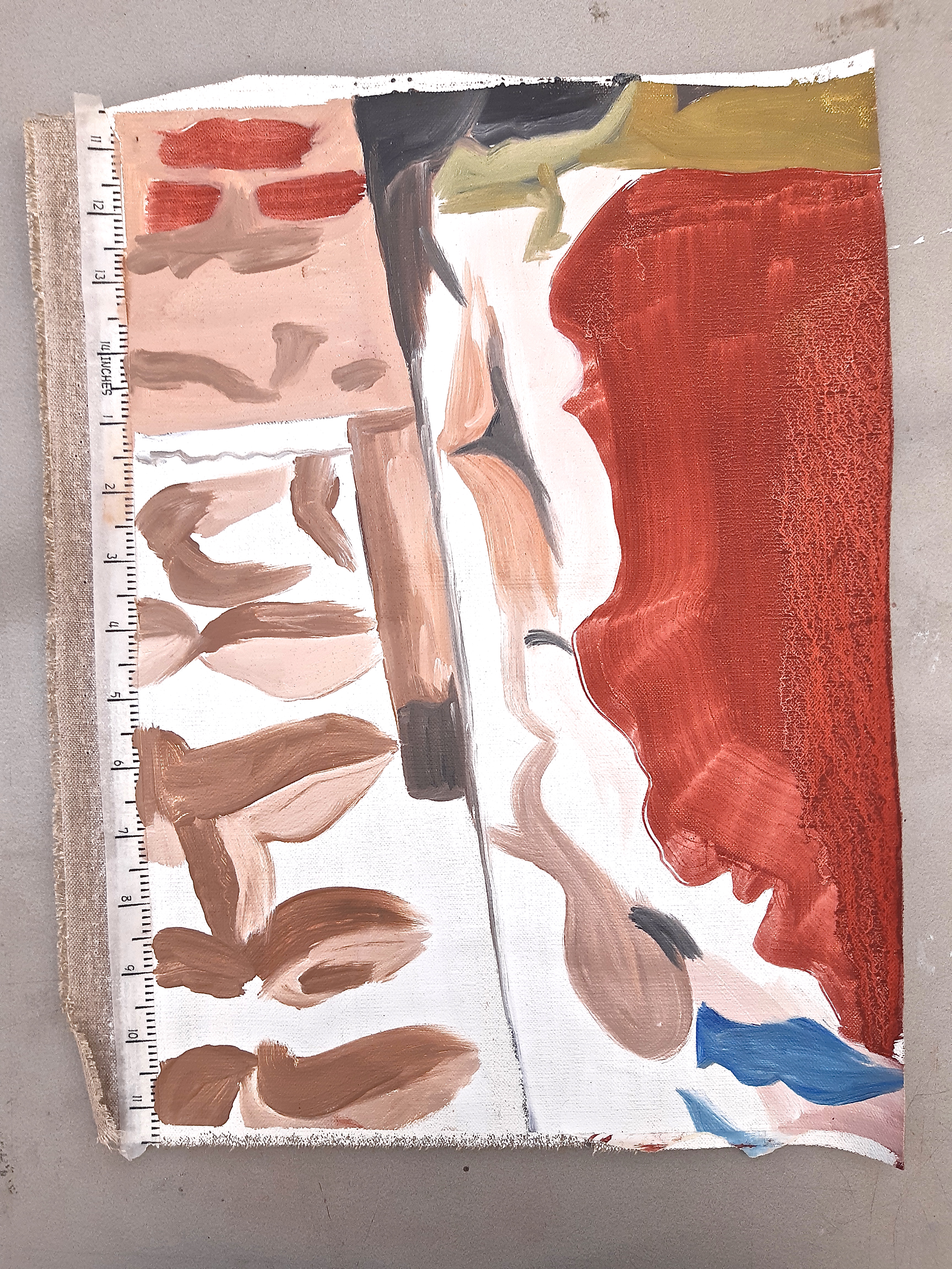
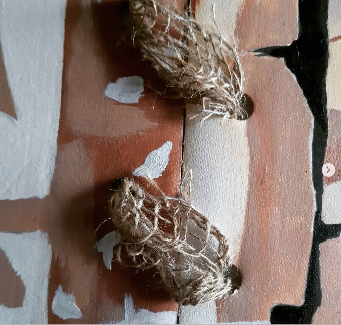
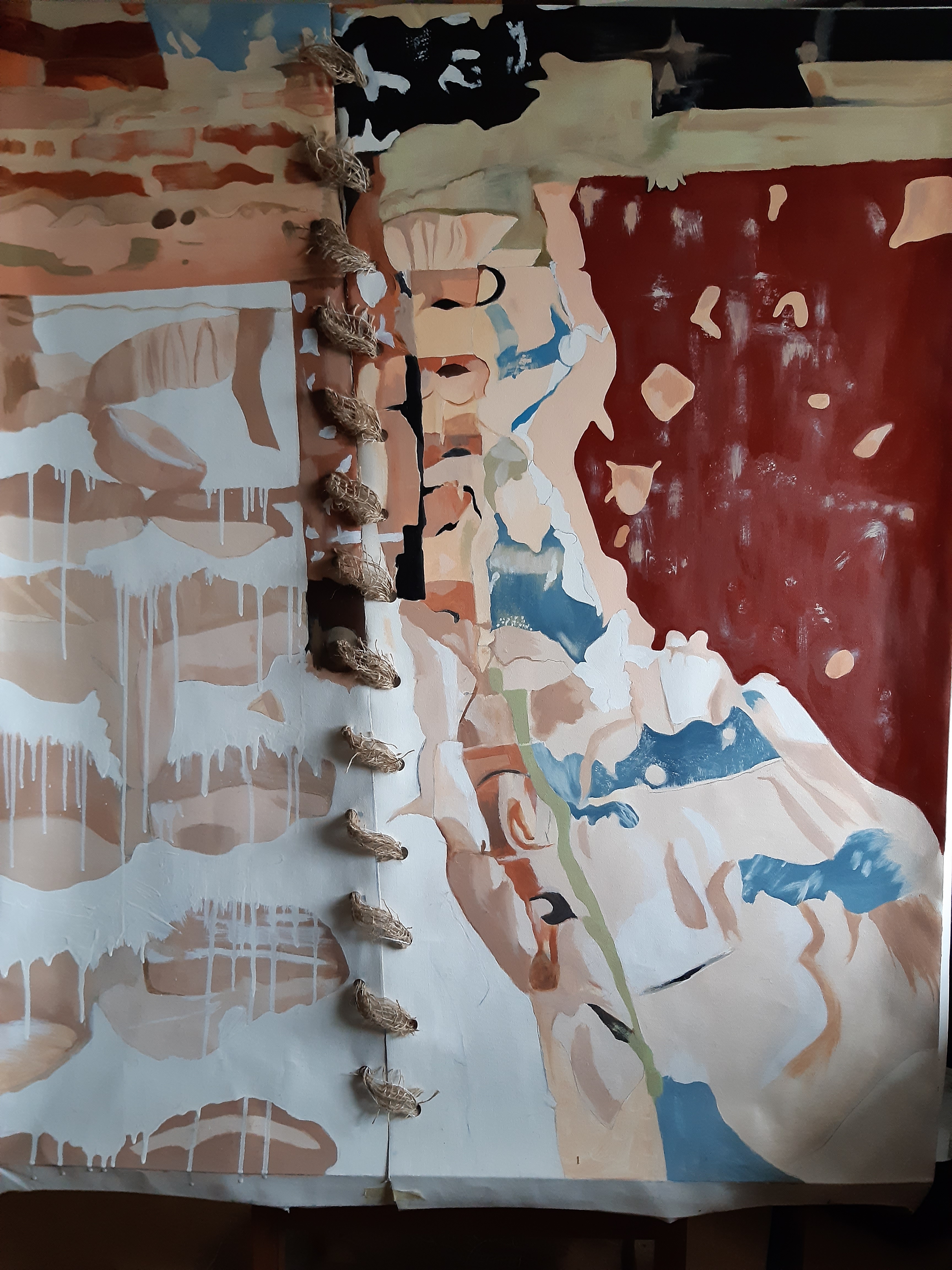
Did a bit more on the big patched painting on my wall, but ran out of time after the requirements of the day. One thing that’s come out of the bigger-than-I’ve-ever-done before-painting, is that because I have to block in areas in watery paint (heavily thinned with Zest it or other, the paint of course trickles down, and dries looking like strands of hair. I love the effect, and plan to make a sizeable piece of that effect so that I can cut / rip it up, and us in the patchwork paintings.
I also plan to make a scaled down version of my planned multi patched piece, so that I can visualise where it is I’m going with the idea. Say, A2 / A1. Also, maybe a long rectangular ‘strip’ piece, using the white ‘net’ fabric / scrim / hessian / painted / drawn / printed elements too. Finally, maybe I’m seeing a bit of a way forward. It’s scary, but trying to do something different was never going to be easy.
Discovered ‘Clean Spirit’ a turps substitute, (sourced by Craig Horspath in the Wood & Metal workshop), courtesy of Tim, the guy that did an amazing demonstration of Materials and Methods last week. He was so hands on and comprehensive in his demonstrations, we gave him a round of applause at the end. Absolutely brilliant! And very useful – I recon I could stretch a canvas now if I had to….
22.10.2019
Just watched this video. Really interesting project Oscar Murillo has on the go where he gives a piece of canvas to schoolchildren, and they do whatever they want on it – I guess he’ll be putting them all together in some way – watch his space. https://turnercontemporary.org/whats-on/turner-prize-2019/
Also, getting on OK with the Project Proposal, which is good for identifying and organising your thoughts about your work, and the why’s and wherefores of it all. I just need to edit and organise it all.
So, resolving to just try and get on and do whatever comes to mind, in other words to try and get a stream of consciousness going. If I can possibly train this person that I am to be more like that I will be very pleased….I’ve spent FAR TOO LONG doing things for others approval. I’ve stopped thinking like that because I’ll be dead soon!
Helen Cammock (also a Turner Prize nominee) is pretty inspirational in the way she works – with multifarious media – photography / moving image / text / print and performance.
Seeing this short film on the Turner Prize website has again, given me a bit of confidence in bringing together disparate elements. Other people do it, so it must be OK for me!
17.10.2019
Today started out great – I didn’t have a set arrival time at college, so I planned a visit on the way to Russell & Chapple for some primed canvas off cuts.
I’ve had ideas about stitched paintings for about 6 months now, and when I saw the work of Oscar Murillo, with his randomly shaped and fixed (?) together works, I immediately saw a link. Unfortunately there’s no exhibition of his work on at the moment to go and see exactly how the pieces are attached to each other. The Yorkshire Sculpture Park is too far and therefore too expensive to visit….
Another artist I’ve discovered in the last week (thanks to the group tutorial, and Geraint’s helpful information) is Simon Callery who does huge, primarily fabric based artworks, but he calls them paintings – they have distemper on them, so I guess they are. But come to think of it, all paintings are fabric based, as they’re usually painted on canvas, or linen! What qualifies as a painting now?!
So having acquired some pieces of canvas – the more random the better – I started something – more of a ‘patchwork’ of the canvas pieces, (as in ‘a patchwork of fields’ from an aerial view described by pilots), even though I didn’t have my hole punchers (or the other tools), but I carried on regardless. Being resourceful is one of my strengths I think, so I had to find a way forward despite lack of tools! I stuck some pieces together with ‘stitches’ of masking tape, stapling the rest to the wall, and then drew the main shapes freehand from my reference photo from the building site in my local town.
I have now decided that I’ll have to bring most of my equipment to the college, despite thinking I could work between home and the college equally. It’s just logistics that are making it difficult to bring everything at once.
I am really looking forward to my 1-2-1 tutorial which happens on Thursday with Dan Sturgis. I’m sure it will help me to identify my ways forward, plus define my Project Proposal title, which should be a question…something about making work, whether in paint / fabric / with stitching and the tricky question (for me anyway!) about textile art…
16.10.2019
So, I had a couple of hours working time at college today after a pretty full on main part of the day…
But first, the group tutorial.
This is the WIP I showed:
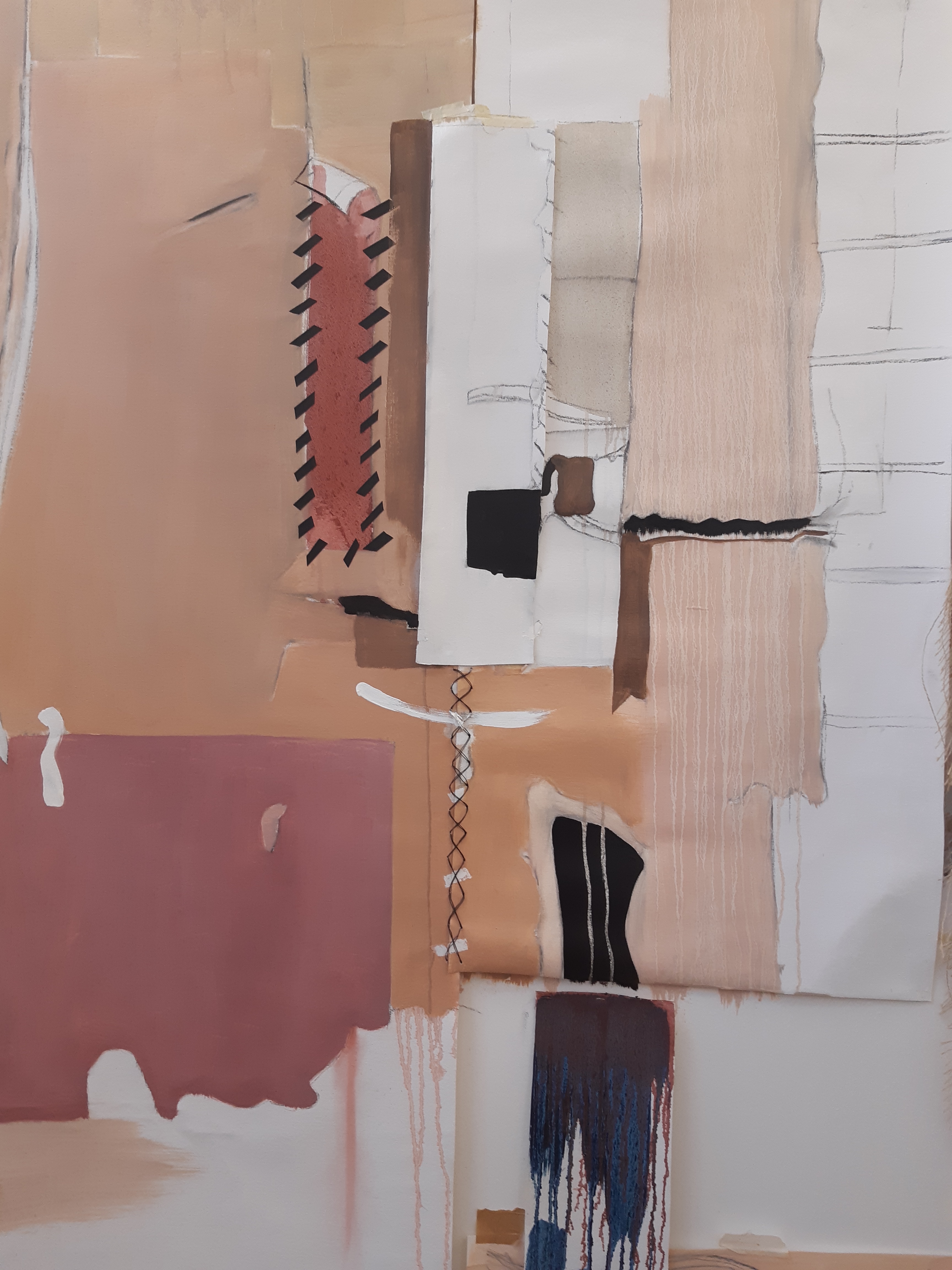
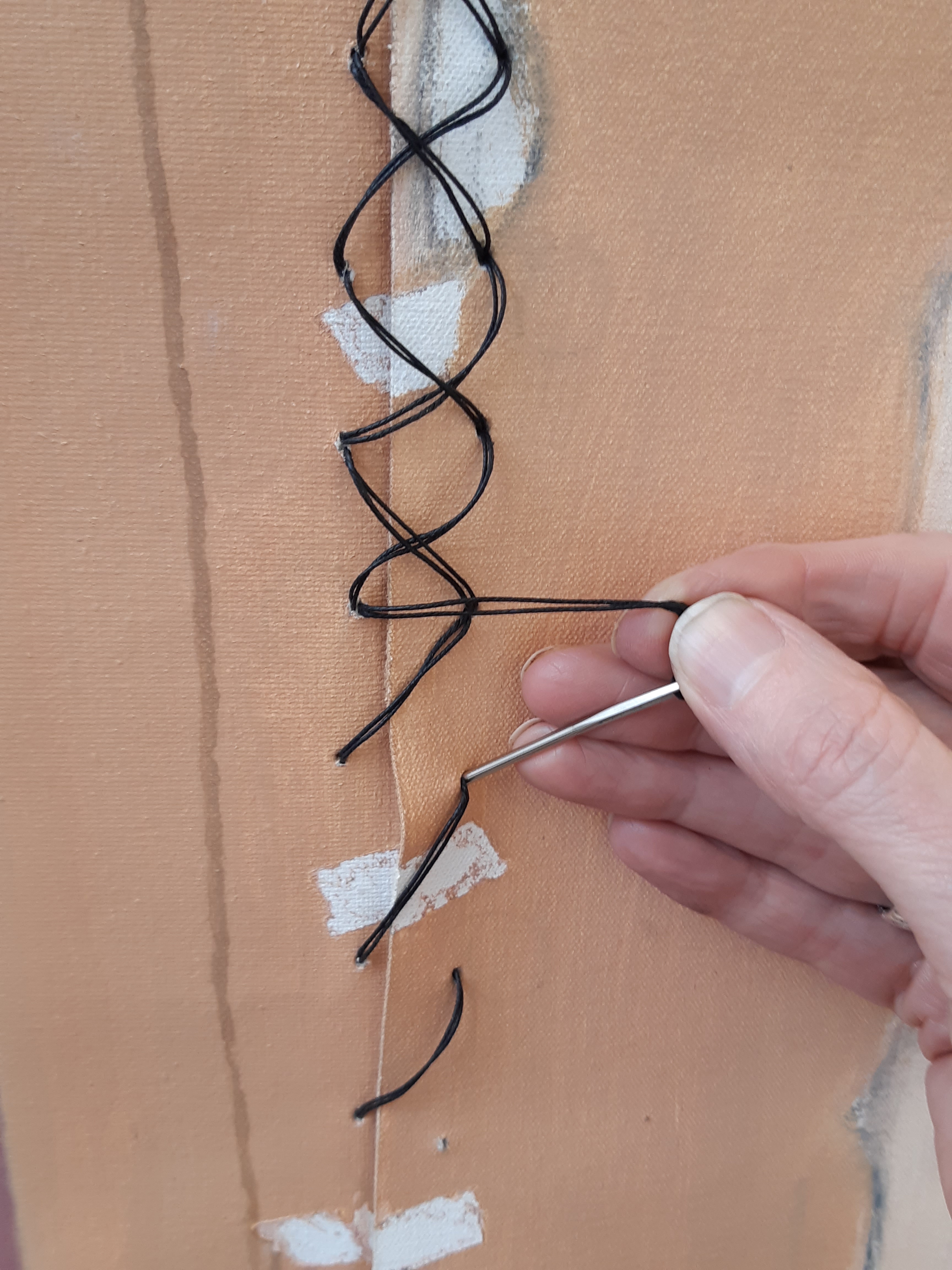
This was really good in a few different aspects: actually having a discussion about my work with people who I didn’t know all that well, and who are all immersed in painting and their own projects was great, as they know how important this is to all of us, so they seriously consider the work presented.
Great to have the different opinions of about 6 people, and great to see their work too. Really diverse styles and subject matter, and in doing this, we got to know each other better.
Our course leader, Geraint Evans, was really helpful in suggesting other artist’s work each of us could look at contextually. I love doing this as it’s a bit like having a mate who has the same starting point as you, and who kind of shares or bolsters your ideas / methods / and inspirations.
I think I talked too much – feeling as if I have to fill the available space, as I don’t feel entirely at ease with my fellows just yet. But everyone is so supportive and positive, and that generates confidence.
I feel that I don’t know really what I’m doing yet (!) but I guess that’s to be expected. But I do have a plan for tomorrow, when I’ll actually get a whole day in the studio! It’s to do with the disintegration of what were perfect or ‘finished’ surfaces – from my series of photos from the building site. It suddenly occurred to me that, looking at my chosen few photos from that shoot, the fabulous fragmented surfaces were a kind of ‘patchwork’, in effect. So I’m going to get some ready primed canvas offcuts tomorrow before going in, and try to paint / sew / assemble somehow the fragments of ideas which are important to me: maps, walls, fabrics and clothing. Also, in the spirit of using what’s available in a recycling/reusing environment, I’ll take what’s available in the way of offcuts, whatever the size and shape, according to how much it all costs! This way I can avoid my natural inclination to make everything too ‘perfect’, and I can deal with the unexpected.
This afternoon we had a good lecture in a curtained ‘room’ in part of another studio. Not ideal, but OK. Locating your work in a broader context, reflecting and planning for the next action were the main topics. I tend to do that anyway, all the time, but it was great to see the quotes from other artists / scientists about art, and how you work at it- your methods and your methodology.
14.10.2019
Did a fair bit of investigation yesterday into Oscar Murillo, who I only just discovered in the last week or so, though I’d heard the name.
The great thing is that he seems to produce artwork / paintings that have a lot of connection to my work – joined pieces of canvas? (…not sure if they’re sewn / stuck together), various themes going on, so I’m VERY pleased to see something in the contemporary art world that I see as directly relating to me and my stuff. And they are definitely NOT textile art (god forbid!), but they are paintings with many interesting aspects. INSPIRATIONAL!!
Unfortunately there are no current exhibitions of his stuff in London or near me at the moment, as I’d LOVE to go & have a ‘real’ look…
DETAIL OF THE HUGE BLACK PAINTING, APPROX 13 M LONG (with rope stitching etc.)
THE BIG PINK PEEL AWAY.
Also, a painter I discovered last week through the Hauser Wirth gallery on our tour in the first week of the course – Mark Bradford. His work is HUGE – his studio must be the size of a warehouse – and I also felt a connection to his work, as he layers in rope and various other items into the layers of paint, and then seems to strip some of it away revealing surprises underneath.
LOVE THE BROOM!
DETAIL OF THE HUGE BLACK PAINTING, APPROX 13 M LONG (with rope stitching etc.)
THE BIG PINK PEEL AWAY.


